Quantcast
Channel: Shades of Grey
Viewing all 552 articles
Browse latest View live

SLIDING SASH WINDOWS

$
0
0
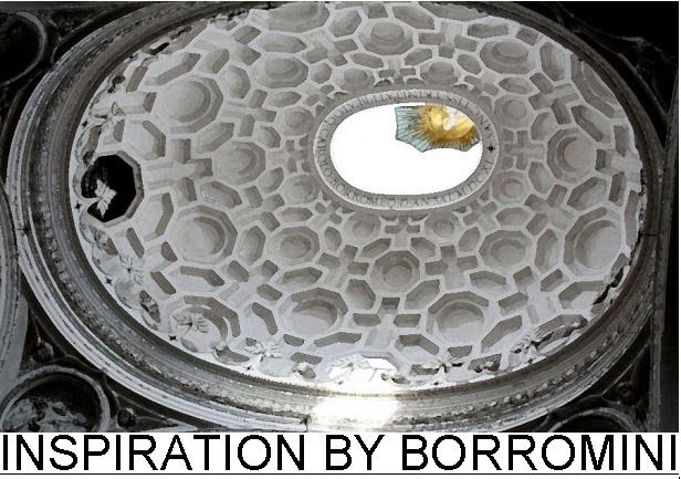
A recent post took me back to the traditional sliding sash windows that I so admired as a young man engrossed in the practicalities of building work.  I decided to set about building a typical sash window in Revit ... piece by piece.


Let's start with the sill section.  A nice chunky piece of solid wood with a fairly simple section.  You need to cut some notches out at each end to take the linings that define the boxes.  These boxes house the weights.  In the windows I dealt with, the weights were always cast iron, but we'll get to that.


Between the linings is the pulley stile, rebated down both sides to fit into grooves in the linings, and with a groove down the centre for the parting bead.  This is a slim section of wood that serves to keep the two sashes apart and guides them as they slide up and down.  The parting bead is removable to enable maintenance operations such as replacing sash cords.


The sashes themselves are moving parts, so they need to be quite robust.  You don't want the joints to shake loose.  Hence the use of mortice & tenon.  The weak point of this kind of joint is the end grain directly above the mortice which can split and open up the joint.  The best protection is to "leave horns", extensions of the sash stiles which are often given a decorative shape.


I'll come back to the mortice & tenon in another post, get into wedges etc, but for now let's move on. My model is coming together quite nicely now.  You can get quite a good idea of how the parts fit together.


Generally speaking, stiles are vertical elements, rails are horizontal. Double doors have meeting stiles, sometimes rebated so they fit together nicely.  Sliding sashes have meeting rails, which also could be rebated, to avoid a wide open gap like the one below.  Notice the stiffening blocks to support the linings along the top of the frame. If you think about the way the parts fit together you'll see why this is necessary.


Once the sash boxes are fitted into the wall, we will need a way to access the weights.  Cut out a pocket with a half-lap joint at the top and a splayed joint below.  I've actually put this on the wrong side by mistake.  As shown below it's exposed to the weather.


Made myself a little nested family to represent the pulleys.  Notche out a housing for these in the pulley stile.


Fit the outer sash first.  The sash cords are nailed into a groove in the side of the sash.  We used to use short galvanised nails with a nice flat head.  Once upon a time the weights would have been lead, but all the windows I ever worked on used mass-produced cast-iron weights.  Slot the parting beads into place to hold the outer (top) sash then you can fit the inner (bottom) sash.  This is held in place by the staff beads.  These have a nice bull-nose profile which leaves a convenient slot where you can fit a screwdriver to level them out again for future maintenance.


Now you wouldn't want to make a detailed model like this to insert into a model thirty or forty times.  I'm doing this as a research project, for didactic purposes, but it could be a "typical detail" file in a real project.  The window families deployed in the project would be somewhat simpler in their modelling, more use of symbolic lines.


You can see the rebated meeting rails clearly in the image below, and the linseed oil putty creating a weather seal around the glass.  The glass is first bedded in putty, then held in place with small glazing sprigs (nails).  The outer putty is applied and cut off clean with a glazing knife.


Moving on to how these windows fit into a wall, my example is a typical Victorian or Edwardian terrace from the north of England.  Housing for the masses during Britain's industrial heyday.  Construction is load-bearing brickwork.  A "one brick wall", ie 9 inches thick, equal to the length of one brick.  The widow sits on top of a shaped stone sill.  A rebate is formed in the other 3 sides of the opening. The window sits snugly into this rebate so that most of the frame is concealed.  The outer lintel is stone and often has a bit of decorative carving.  The inner lintel is timber.


In the next image you can see the internal plaster going on to the wall.  This will finish flush with the frame and then architraves will be applied to cover the junction.  In the houses I worked on (and lived in) the plaster was black, blast-furnace slag mixed with lime.  That was the thick levelling coat.  To finish, a thin skim coat of lime putty.  That was in the olden days.  For our renovations we were using gypsum plaster.  By the way I'm using the "Parts" feature to split the wall into its separate layers and cut back the inner plaster.  It's a great feature when you need it and living proof that the factory is still busy extending the capabilities of our favourite software in significant ways.  (I slipped that in for the moaners who think that the annual releases aren't exciting enough :-)


That's as far as I've taken it.  Not quite finished.  Shows the power of a BIM application like Revit.  If I had drafted this in 2d, the results after a couple of hours would be more impressive, but after a full day the BIM advantage is kicking in and you're starting to get "views for free".  And of course when you discover mistakes or change your mind it's much easier to make changes and update the whole drawing set.


I'm going to finish with some sash windows from my photo archive.  There are examples from New York and London in there, plus a couple of other towns.  Windows built to last, both in construction and style.  I love them, and I love knowing how they work.  But there is always more to learn so please send in your comments, corrections, snippets of knowledge about how things were done in different times & places.


AUX DUBAI 2014

$
0
0
Looking forward to attending the second edition of this event tomorrow.  Organised by Omnix International and sponsored by various technology suppliers with HP & Intel heading the list.  A number of guys will be jetting in from Autodesk again, including Lynn Allen of course.


We are sending along a core group of BIM fanatics from GAJ for the day.  Apart from the sessions themselves it's always a great opportunity to network with people from other firms as well as suppliers and resellers.  Life in Dubai is starting to get hectic again, lots of new projects coming up and of course Expo 2020 is bound to have an impact.  So it will be interesting to sound out the buzz tomorrow.

Omnix kindly invited me to act as judge in a student competition that forms part of the event.  I'm always excited to see the next generation coming through and it is great to see young designers from the Arab world expressing themselves creatively with Autodesk products.  Would love to show some images, but that would be a serious breach of protocol :-)

I am hoping to get a look at Infraworks.  I'm vaguely aware of this product, but have never seen it in action.  There are a couple of sessions tomorrow.  Dubai is well known for mega-projects and we get our fair share of master planning work, so I'm always looking for BIM approaches to this kind of work.  Sadly I think it's oriented to engineer-led "infrastructure" than architect led "urban design".  But it's worth a closer look.


Here's a link to my post earlier this year.  Experiments in using Revit for Urban Design,


THE EVE OF DISRUPTION

$
0
0
Christmas Eve and New Years Eve have come and gone.  I had a wonderful time in London the next 2 generations down.  Jack my grandson was 5 times older than the last time I saw him, walking around and getting into everything.


Back in Dubai, the local authority has announced a BIM initiative which has caused a bit of a stir.  We have renamed out local Revit User Group to Emirates BIM User Group (EBUG ?) and lots of chit chat going on.  One of our members wrote a short article which the magazine editor chose to title "Agents of Disruption".  Which sparked off a bit of discussion.

Is disruption a good or a bad thing ?  What about innovation, change, technology ?  Events like AU & RTC always include celebrations of the latest cutting edge gadgets, they're always looking to predict the "Next big thing".  I am not against this, just mildly suspicious.  As a species we have hurtled down the road of population increase and habitat modification at an alarming rate.  1000 years ago, more people and more technology seemed to be a desirable goal, not that people thought in those terms.

I'm just going to copy-paste a comment that I posted to "EBUG" this morning.  It conveys my attitude of "mild suspicion."


It's interesting how people latch on to "buzz words". The term "Disruptive Technology" is tossed around with gay abandon. Everyone wants to ride that wave. Shades of David & Goliath. But do we really want a world of continuous disruption, accelerating consumption, constantly changing value systems? 

Those at the forefront of BIM are talking about people being more important than software. Those resisting BIM are saying that we shouldn't abandon hundreds of years of experience. Perhaps they are saying the same thing from a different viewpoint. 

It seems to me that the "push it downstream" attitude is in many ways a relatively recent development. Forty years ago when we drew with pencils, we had to make decisions in a logical order. There was no undo button, no cut and paste solution for rehashing the design at the last minute. 

We should beware of thinking ourselves to be superior just because we are "early adopters". Let's not get drunk on the idea of grabbing "market share" by being the first in the queue. BIM will "succeed" if it becomes an inclusive way of working, accessible to all. Perhaps we should be focusing on continuity rather than disruption.


PS  For those who remember, the title refers to a rather strange song by Barry McGuire which dates from my mid-teens.

STEEL & GLASS

$
0
0
Steel takes an edge.  For centuries it was the material of tools and weapons: carpentry, warfare & agriculture.

I grew up in South Yorkshire while it was still a land of coal and steel. For most of my twenties I lived in Sheffield, birthplace of crucible steel, and later the of the Bessemer process.  By 1850 steel had become the material of bridges, machines, railways.  Cast iron predated steel for structural use in buildings, notably in "fire-proof" factory construction.  Cast iron columns carried beams similar to railway lines in section, with brick jack-arches spanning between the beam

 
5 or 6 years ago I photographed some of the famous cast-iron facades in Soho, New York.  These were an early example of prefabrication: modular facades created in the factory and assembled on site.  It's interesting to note that behind the decorative/structural cast iron there are often timber sliding-sash windows. 


One of the best known examples is the Singer building.  It seems to me though that much of this is not cast iron, but steel: heated and bent, riveted together.  Even the window frames seem to be steel. We are approaching an era when steel seemed to be the ideal material for window frames, and glazing of all types.


Charles Rennie Mackintosh got in there early, using steel windows in 2 school buildings in Glasgow (Scotland Road & the School of Art)  Is he a modernist or a traditionalist ? abstract geometrist or arts & crafts flower person ?  Nobody seems to be quite sure.


Just over a decade later Peter Behrens and his former employee Walter Gropius designed buildings that have become famous for their steel-framed glazing.  Technically I think this is very similar to Mackintosh, but they did without his subtle decorative flourishes and projected the glazing in front of the masonry.  So everyone is quite cetain that they are modernists.


Mass-produced steel windows in standard sizes, ("off-the-shelf") became very popular in the 20s and 30s, rapidly replacing the wooden sliding sash.  But the heyday of steel windows in Europe lasted barely 50 years.  Disruptive innovation or blip on the screen?  By the 1970s it was clear that condensation related corrosion was a serious problem, and U values were becoming important.


So when I moved to Southern Africa in 1981, I thought of steel windows as an anachronism, an outmoded technology.  But in a dryer and warmer climate, where neither central heating nor air conditioning are needed in the average house, steel windows dominated the market.


I spend my first decade in Africa as a teacher & curriculum developer, returning to architecture as I approached 40.  As an architect, I used steel frames most of the time.  They are the ideal solution for the Zimbabwean climate and economy.  (We used to have an economy in the first 80s & 90s)

So this is the next installment in my "window technology" series, standard steel windows: the Crittall Hope variety.  I should explain once more what I am doing.  For BIM to really succeed it must become second nature to all participants in the Construction Industry.  We should use it as naturally as picking up a pencil, or sketching a detail in chalk, on the wall inside a building site.  So my focus is not to track the latest devices and software tools.  Others do that much better than I could.  I am trying to use Revit like a pencil: a tool with which to explore ideas, clarify my thoughts, make sense of what I have learnt over the years; in short, an aid to visual thinking.


I am using BIM techniques to explore how buildings work, how they have varied in time and place, the processes and trades involved in making them.  I am NOT making families for everyday use in projects.  That is a separate exercise.
Typically, an experts advice on making families will start with an injunction to plan ahead, to sit down with pencil and paper to plan out the parameters and reference planes you will need.  That is not what I am about here.  Revit IS my pencil, my planning tool.  I am using it to work something out.  In the case of the brass handles and stays, or the steel hinges, there are elements that belong to the sash and elements that belong to the outer frame; elements that move in space and elements that stay where they are.  There are pivot points and angular movements.  Ultimately it would be nice to articulate all that, to make it parametric and represent top-hung or side-hung lights with the sashes in different positions by punching numbers into dialogue boxes.


 But first I need to understand how these things work.  I have to get the sizes and shapes right.  That is an exploratory process.  I don't have any steel windows to hand.  I can't just fly back to Zimbabwe and measure the ones in my house there.  I have to work from grainy photographs and internet downloads, plus my memories of fiddling with windows that didn't close properly or had loose handles.

Let's take the handle for a side-hung sash.  A door handle sits in a horizontal position when at rest, but you don't want the window handle to spoil your view, so it hangs down when the window is closed.


In making this handle, I wanted it to look fairly convincing, without getting sidetracked by Revit technicalities.  The goal was to understand the main points of the design: how it works and why it is shaped like that.  So  I haven't rounded off all the sharp edges and I haven't gone to the trouble of using conceptual massing to capture the complex curves.  I made do with an extrusion cut by a couple of voids.  Building components should be "fit for purpose", not under-designed or over-designed.  The same goes for drawings: be they pencil sketches or BIM models.  (I could have said "BIMs" but I think that would have been both clumsier and less clear)  So my aim here is to do just enough to capture the essence of how these fittings work. 

But let's look at the window itself.  If you look in text books, you can find all kinds of refined details, with weather stripping and aluminium glazing beads.  Steel windows been reborn in a higher-tech form.  But this post is staying low-tech, the basic window that I know from my time in Zimbabwe.  Standard "Z" section, putty glazed.  The same "Z" section serves for outer frame and for hinged sash.


 Notice the little heel on the back of the "Z".  This forms a groove to channel water around the sides. In case of driving rain, you might get some water that needs to be directed in this way to the bottom and out again.  The same groove it the outer frame helps to key the frame into the internal render.  Internal plastering in Zimbabwe uses a sand-cement mix, not the lightweight gypsum base coat that I was used to in the UK.  Again it has to do with climate and the economics of material production.


I'm going to break off there and post this.  I've been far too quiet this last 2 months, got to get something out there.  Part 2 will follow shortly.


WINDOWS 2.2 ... MORE STEEL

$
0
0

This is a continuation of the last post about Steel Windows.

So I got the handle done & it rendered up nicely.  Next in line was the peg stay for a top-hung light.  (sash, light, casement ... what's with all these seemingly interchangeable words ... truth is that's just the way language works: lot's of redundancy & overlap, constantly shifting ground, rules that bend)


I was still feeling may way into these components, modelling by trial and error, but by the time I got to the screws I decided to make a separate family that could be copied around.


It was actually rather fun trying to model from memory and then finding references on the internet to guide me through the confusion.  You can use something a thousand times and think you know it well, but drawing it out in detail is another matter.  Try drawing a map of the world from memory for example.  Any teacher knows this very well.  You don't just stand there and talk to your students.  You have to get them doing something that challenges their abilities and understanding.


So I've captured the basics of these brass fixtures.  The dimensions are still very approximate, and to be honest I'm still not 100% sure how some of the moving parts work.  i.e. how are they held securely in place while permitting angular movement ?  This has to be done with the minimum of fuss, allow for manufacturing tolerances, plus wear and tear.  Low tech by current standards but 100 years ago these were important contributions to daily life.


There are fixing lugs on the sides of the windows that are built in to the wall by the bricklayer.  I'll do another post sometime on how this works, something that was once a part of my daily routine.  For now I am content to make a family that cuts a hole in the wall and place my window into this.  I'm keeping the two families separate for the moment to reduce my confusion while working in family editor.  The opening family uses voids (not cut openings) This allows me to step the opening in plan and section. 


The sill detail I chose is fairly common in Zimbabwe.  It uses special, small size clay bricks with a bullnose edge, sill bricks in fact.  I modelled whatever is visible from the outside, to a reasonable degree of accuracy, and filled in the hidden detail with drafting.  Classic BIM methodology.


A short aside.  Many of you will be familiar with the ribbon glitch that has been with us for some time now.  While making a sweep and clicking on "edit profile", the buttons you want disappear.  You'll see a greenish tab at the back, click this to restore normality.  I'm assuming this is a rogue behaviour that is difficult to track down in all the lines of code.  That's better than believing that the factory can't be bothered to fix it.  While working on this study, I noticed that this problem only occurs when working in plan view.  If you're working in section/elevation everything works fine.  Curiouser and curiouser.


More benefits of the BIM pencil: throwing views on to sheets.  This always draws a gasp of amazement when teaching newbies, and rightly so.  I've said it before, but Revit is my favourite DTP software ... but it could be even more favouriter, if only they would add some extra DTP features with each new release (hint to the factory)  By the way, see how I am adding subtleties of expression by bending/breaking the rules of language.  We all do this, all the time ... but if you're a secret language pedant, you just block it out and pretend that language is strictly logical.  Duhh !!!


And so to the end of my post. (no verb in that sentence, nor in this one actually)  I rounded it off by assembling a window with side-hung, top-hung and fixed panes.  It's a standard type from the catalogues but it's not fully parametric & the opening is still separate from the glazed frame.  Still it serves my current purpose amirably: fit for purpose, the golden rule.


I have a couple of images of the hinge family that I made, so I'll throw those in to finish off.  Timber sashes and standard steel windows, that covers the types of building I lived in for most of my life.  So I guess aluminium sliders are next, that's what I've had for the last 10 years, here in the middle east.


GHERKIN REVISITED

$
0
0
I am revisiting the Gherkin following a request from David at the University of Ulster.  He wanted to share my Revit model to use with his first year Architecture students.  As usual I felt it was necessary to clean things up again before uploading, and learnt quite a bit along the way that seems worth sharing.

So the idea here is for a research project using BIM processes.  It's a learning experience for students of Architecture, or just anyone who is fascinated by what makes buildings tick.  It's supposed to be hands on.  You model the Gherkin in Revit and you get a much deeper insight into the design & the technology along the way.  Also maybe learn some new Revit skills.  There are several earlier posts you might want to flip through.  Just type "Gherkin" into my search box and you'll get a list of links something like this.


Design is a bit like calculus.  You start with a rough approximation, which then points the way to a more exact definition, leading to something closer still, and so on.  As the iterations increase, you get closer to your goal.  When I was at school we called it tending towards infinity. So I'm going to start with a broad brush interpretation of the Gherkin & when you understand the geometry of that we'll start to introduce various subtleties to draw you closer & closer to the actual thing.  We'll never actually get their of course.  It's just a learning exercise.


So let's get to it.  We will treat the building as a set of Russian dolls representing the glazed skin, the diagrid steel frame and the floor plates. The first two will be half-dolls in order to reveal what's inside (and to save on processing load)  The two halves will be rotated at 90 degrees to each other to even better see the relationships between the 3 major elements.


I'm not going to describe every step in the process here.  Instead there will be a pdf "handout" to download.  Getting into teacher mode here.  There will also be a download of the Revit file.  Be patient it may take a couple of posts before the downloads are ready.  Here are the parts, shown separately and then combined.  This is the first approximation.


Each of the shells is made in the same way.  A series of circles with different radii and vertical offsets are used to loft a form.  Revit has a habit of breaking circular volumes into two halves.  You can see the seam in the image below.  Using "tab select" you can pick one of these curved surfaces and divide it.


Divided surfaces start off as a 10x10 grid, but then you can change the numbers (U & V) and you can also select a different pattern.  We will be using "Rhomboid" in this first exercise.  Later we will use "Half-Step" for the structure.  For the frame we need an 18x18 grid, for the skin 72x72. It's a bit more complicated than that, but we'll get to that later.  4 panes of glass for each leg of the frame.


Next step is to make simple curtain panel families.  I keep them simple as possible, because when you load them the computer is going to go into thinking mode for a couple of minutes.  Don't want to overload systems which may not be state of the art.  The structural skeleton is based on "A frame" components bolted together.  I came up with a family that fits an "A frame" into the top half of a rhombus with no geometry in the lower half.  That geometry will be provided by the row below. 


This seems to work, but later on we get a slight anomaly when the family is loaded into the project.  You get an extra "phantom" row at the top.  Basically Revit has to chop edge panels in half (making them into triangles)  When it cuts the bottom off an A frame it is cutting "nothing" away.  This seems to cause confusion.  I should mention the floor faces.  For simplicity I start with 40 levels, all equally spaced, 4.2m apart. That will do for the first pass.  Most of these levels get a floor face, but there's a double height ground level and some plant floors near the top that don't follow the gherkin shape.

The next image illustrates the "second pass" as we build a bit more sophistication into the model.


Firstly, the skin is lofted in two parts: the "main body" and the "top cone". The grid is relaxed from 72 divisions to 36 in the top cone.  I guess this is to avoid very small panels at the top as the diameter gets smaller.  Secondly we need to tab-select individual components and modify them.  There is the very tedious task of swapping clear panels for black ones.  You can see that I am half way through this task in the image above.  The result is a spiral effect which hints at the presence of voids behind the glass.  Also some of the skin panels need to be deleted at the base to create an open "colonnade" at ground level. 


The spiral voids are very interesting.  Basically we have 9 "A frames" in our half-gherkin structural shell.  That's 20 degrees per frame.  And there are 4 floors per structural rhombus.  In other words the glazing panels are one storey high.  This is very clear in the picture above.  Divide 20 by 4 and you have a 5 degree rotation per floor level.  I'm talking about the black spiral bands. 


There are triangular voids that follow the spirals.  Use a shaft opening for the first one.  Create a radial array with 6 of these and group the whole thing.  Copy to clipboard and paste aligned to the next level.  Rotate this second group by 5 degrees.  Repeat the process.  Every sixth floor remains complete as a fire break.


To solve the "A frame" anomaly I switched the pattern type to half step.  This is like stretcher bond in brickwork.  That's a more accurate abstraction of the way the A frames work.  Each row is offset half a grid compared to the row below.


You also need to make a curtain panel family based on the same pattern.  Select the grid within the family template and change it to whichever pattern you need.  That's a step that people often miss when they first start making pattern-based panels.  You'll see that I've been tweaking the top cone: splicing in a zig-zag join, adding some bits and pieces like the glass dome at the top and the rails for the cleaning system. 


But I want to finish this first overview post with a snapshot of my "geometry analysis" page. Later on this will be available as a higher resolution pdf download.  There will also be a more detailed stepping through of the processes to build these analytical models of the Gherkin.  And of course the actual Revit model will become available. Give me time :-)


GHERKINS FOR ALL

$
0
0
This is the second post in a series.  I am trying to encourage students & teachers of Architecture & Building to use BIM as an active research & learning tool.  It could be a Drawing course, a Technology course, a Theory of Design course, a History of Architecture course, or even a BIM module :-)  The idea is to take an integrated approach.  Don't teach Revit with a series of abstract, disconnected exercises.  Use Revit as an investigative tool, as a way to learn other stuff.  Use it like you might use a pencil, exploring the way something works in a series of freehand sketches.


In this post I am presenting the first two passes of an exploration.  There is a Revit file to download, and a set of handouts or "summary sheets" to guide you through the process of creating this file from scratch.  The models you create will be abstractions: simplifications such as architects commonly use when analysing a design idea.  We are trying to capture fundamental relationships, underlying concepts and geometries.  In the next post we will be adding more subtle inflections, coming closer to reality.  But my focus will always be on the learning experience. 


The summary sheets show the main steps.  I'm trying to cater for fairly new users, but not for absolute beginners.  If you have no experience of Revit at all, you will need a guide, someone with more experience.  They are designed to be useful to someone leading a class.  I'm hoping it will reduce your preparation time.  If you have intermediate Revit experience, you should be able to work through the exercises once yourself, then launch straight into teaching, using the sheets as handouts.


I'm using a floor to floor height of 4.2m  This is almost certainly incorrect.  But it's not far off, and it's a convenient round figure.  I don't want you to be distracted by irrelevant details.  We're using a broad brush approach to gain some basic insights.  Similarly I have chose to offset the 3 shells (see previous post) by half a metre from each other.  This is surely wrong, but it makes the maths much easier and it works fairly well in practice for the models we are building.


I received a comment on my last post, pointing out that the Gherkin was conceived as a revolve, rather than a loft.  I'd like to thank Mwaraya for this contribution.  It's great to get feedback and I individuals or groups who use this material will contact me with more comments and corrections.  I will do my best to respond and improve my work.  It appears that the Gherkin profile was conceived as a series of arcs in section.  My lofting approach comes very close to the same shape, but is fundamentally quite different.


An analogy may help.  When setting out an ellipse, builders commonly use an approximation base on arcs.  This is easer to construct on site than a true ellipse.  Similarly you could approximate a parabola with a series of arcs.  Gaudi used a different approach, creating catenary curves by hanging chains and cloth, then freezing the result as a plaster cast.  It's a question of choosing the method to suit the situation. 


In my case, lofting from a series of circles is a very economical approach to generating 3 concentric Gherkin shells, my Russian dolls representing Skin, Frame & Floors.  I would also venture to suggest, that although the architects my have conceived the original form as a series of arcs constructed in section, the real building was not set out like this.  It was constructed from tubular steel A-frames, each 2 storeys high.  18 of these frames form a complete ring, leaning inwards or outwards slightly depending on the location.  In this sense the Gherkin is lofted from a series of circles, even though the diameters of these circles may have been decided by constructing a set of arcs in section using a CAD programme.


As for the skin it is neither a revolve nor a loft, but a large number of diamond-shaped facets, each perfectly flat.  (in as far as glass can be said to be perfectly flat)  It seems to me that this is a rather special type of unitised curtain wall system.  Each diamond is one story high and must be fixed back to the steel frame in some way.  There must also be a system of adjustments and tolerance allowances.  It would be fascinating to know more about how all that works.


In practice many of the diamonds are split into triangles by transomes that coincide with the floor slabs.  Some of these triangles hinge out to provide natural ventilation in hot weather.  Once again my Revit models diverge from reality slightly.  I am using a Rhomboid divided surface.  Triangles occur at the edges of the surface, but not at each floor level.  The illusion of triangles will be created by having a slab edge that penetrates the skin, appearing to divide the glass.


As long as we are aware that our model diverges from reality everything will be fine.  Problems arise when people start to imagine that CAD & BIM allow you to create "reality" inside the computer.  It's no more real than a pencil sketch.  It may be more complex.  It may capture more aspects of reality.  But it's still a model, an abstraction.  It's important to remember what we are abstracting and why.  Blindly modelling every nut and bolt, "just because we can" is a recipe for disaster.  Be aware that you are simplifying.  Think carefully about what you want to achieve.  Choose appropriate methods, including shortcuts and assumptions.  Structural Engineers make stick models.  They assume that joints are either rigid or perfect hinges.  This is not the case, but it allows them to do their job effectively.


You can download the various files from the Autodesk 360 links below.


Basic Geometry diagram           http://a360.co/1liJ69v

Summary Sheets                      http://a360.co/1ghYwHW

2nd pass Revit Model               http://a360.co/1lPQQDH

More developed Revit model    http://a360.co/1ghYsb9


GHERKIN SNIPPET

$
0
0
I'm on a roll, working up my Gherkin studies as Teaching/Learning resources for anyone who might want to have a go at using a BIM approach to research / private study / figuring stuff out.  curiosity is a wonderful thing and BIM tools like Revit have tremendous untapped potential for fostering the investigative skills of students, both young and old, around the world.
So here's a little taster from my current "work-in-progress" model.  I've been adding the cladding that covers up the tubular steel structure.  I'm exploring the idea of being able to switch this on and off so that you can peel the onion gherkin layer by layer.  It's a render & a shaded image combined with a smidgeon of jiggery pokery to enhance the effect.  (2 layers, shaded on top, overlay mode, slight use of masking to vary the transparency)


By the way, I would love to get some more feedback.  I'd love to know how this stuff is getting used.  I do hope I can encourage more people to see BIM as an educational tool and not just another cog in the global "business machine".

BACK AGAINST THE WALL

$
0
0
I have a weekly training session at GAJ called "Intermediate Family Editor".  It is aimed at people who have been using Revit actively on projects for a year or two but haven't got too far with the family editor.  This post is a revision aid for that class.  It's fairly basic stuff, but some of you may find it useful.

We are going to make some wall-based families.  New family: Metric Generic Model wall based.  This opens in plan view.


Note the 3 ref planes: "Centre Left-Right",  "Wall" (on the centre line of the wall) & "Back" which is locked to the face of the wall with a zero dimension.  I'm not really sure why it is called "Back" since it is locked to the "Placement Side" of the wall, which many would consider to be the "front".  Perhaps the idea is that this refers to the back of the object which we are going to place on the wall.  But what if that object is going to be a void which cuts into the wall?  Let's move on.

Note also the text object used to label the Placement Side.  This is just a dumb text object.  You can edit this or move it to the other side of the wall and it won't have any effect on the elevation view called "Placement Side"


So let's go to that view and draw some more reference planes.  Two of them are parallel to the centre F/B and equalised with a constrained dimension.  The third is parallel to the ground.  Add dimensions and label them as Width & Height.  Make these instance parameters.


We're going to make some geometry now, and we want to lock it to the ref plans and the level.  We don't want to lock it to the wall by mistake.  We could hide the wall using the sunglasses.  Instead we will simply pull the base of the wall down a little way so that we can see the Reference Level clearly.  Next set the work plane to "Back".  On the "Create" tab, select "Extrusion".


Choose the rectangle tool.  Pick 2 corners.  Lock the 4 padlocks that appear.  Finish extrusion.  Note that the extrusion projects backwards through the wall.  I don't understand why this is.  Could it be a mistake in the way the template was originally set up ?  Not to worry.  Go to plan view and draw a reference plane.


Place a dimension between this new plane and "Back".  Make sure you are picking the ref plane, not the face of the wall.  Label the dimension with a new type parameter called "Depth".  Select the extrusion, and use the shape handles to drag it inside out.  Snap on to the new ref plane and lock the padlock.


That's basically it for our first family, but we need to test it.  Select the wall and rename the type as "150" That's the thickness of the wall as it comes out of the box (Metric Template)  Duplicate to make a new type.  Call this "250" and edit the wall structure to make its thickness 250mm.  Now that we have two wall types,  we can swap between them to check that the family will behave properly on walls of different thickness.


Before using a family in a project, it is good practice to "flex" it.  Basically you need to vary each parameter, one be one to check that it is behaving as expected.


Start a new project.  Create a wall.  Go back to family editor, "Load into Project" Place several instances.  Set up two types with different depths.  Experiment with the instance values for width & height.


In the project browser, find the family, and rename it.  At GAJ we use 2 digit codes in our naming conventions.  38 refers to "wall features" ... could be panels like this one, recesses, niches, decorative plaques ...


Now we can go back to family editor & make a new version. When we load it back into the project it will be recognised as a different family because we gave the original version a new name.  Add 4 new reference planes.  Create dimensions and label them as "Border Width" (Type Parameter)


Edit extrusion.  Draw rectangle. Pick the 2 outer corners.  Lock the 4 padlocks.


Load this new version into the project and place a few instances.  Once again, create 2 types and experiment with the instance parameters for width & height.  Choose one instance of each type, and set the elevation to zero.


Notice that despite the different border width of the 2 types, Revit interprets the lowest point of the extrusion as the origin of the family in both cases.  This may be what you want.  Alternatively, you may want to have a consistent origin point, let's say the reference level.  Here's how.


Back in family editor, draw a ref plane that coincides with the ref level and lock the padlock.  Select this plane and check the "Defines Origin" box.  Load into project.


Note the now origin location.  By the way, we didn't need to do this with the first version of the family because there was no geometry projecting below the Reference Level. So let's move on to the third version of the family. Don't forget to rename version 2 first.


New family.  "Metric Profile".  Add four ref planes below the default horizontal plane.  Constrain them with an equalized dimension string.  Add and overall dimension and label it "W".  Create a vertical ref plane to the right of the existing plane.  Add a dimension and label it "T"

Now use a formula to make "T" change in proportion to "W" (T = W/10)


On the "Create" tab, choose "Line".  Uncheck "Chain" and start to draw lines.  We unlocked the chain function so that we can lock each line as we draw it.  Draw 4 lines, locking them as you go.  Close the loop with a semi-circle.  Choose the "Start-End-Radius Arc".  Pick the two end points and feel it snap to a semi-circle.  Flex the family to check that it resizes proportionally as you vary "W" Load the profile


Delete surplus reference planes (the 4 outer planes) and parameters (Depth) On the "Create" tab, choose "Sweep".  "Sketch Path".  Pick opposite corners.  Lock the 4 padlocks, finish path.


select profile.  Choose the family you have just loaded.  Note the rotation.  We want it to lie flat against the wall face.  In this case it can be achieved by selecting a rotation angle of -90.  Finish the sweep.


The last step involves linking parameters.  We will use the small "associate family Parameter" button that resides at the end of the line for each parameter.  Find the profile in the project browser.  Edit properties.  Click on the button for the "W" parameter.  Associate it with "Border Width".  The "Border Width" parameter will now act as expected, but instead of controlling an extrusion directly, we are controlling a sweep via the nested profile family.


Load into project.  Place a few instances.  Create types and flex the instance parameters.  You can go also back to each family and add a material parameter.

So we have created 3 wall-based panel families.  These are projecting panels, but we could just as well have created voids that cut into the wall surface.  You can probably think of all kinds of variations on this type of family.  They could represent plaster mouldings, grc components, notice boards, wall-fixed mirrors with moulded frames.   I hope some of you will find this useful.  


NEXT BIT OF GHERKIN

$
0
0
Continuing where I left off on the Gherkin a few weeks back.  I have summary sheets to take you through the 3rd pass.  We will cut out the wedge-shaped voids from the floor plates, which spiral up the building six floors at a time.  6 floors, each with 6 lettable office areas.  The voids link these spaces together, bring light deeper into the building, facilitate air circulation, create interesting breakout spaces, allow for stairs linking one floor to the next.  It's a very interesting device as we shall see later on.


Next we will create black bands that spiral around the outer skin.  They trace the path of the voids behind.  We will also delete some panels at the bottom to open up an arcade at ground level and to define the entrance to the building.  And while we are at it we'll create a simple extrusion to represent the core rising through the centre of the building and housing the lifts, stairs, toilets, service risers.


To complete the third pass we add cladding to the frame.  In cross-section this is diamond-shaped, picking up on the theme established by the outer glazed skin.  We will set it up so that it can be hidden for selected instances, revealing the frame beneath. 


The summary sheets take you through the process of building the third-pass version of the Gherkin model.  I avoid lengthy detours to explain why I have chosen this or that method.  So just for fun I am going to add in a section here that mimics an FAQ format: questions and answers that expand on some of my methods.


Why do I set the hosted points almost at the end, but not quite. 

It's just a bit easier to know what you are selecting if points are not exactly on top of each other, just in case I need to say rotate the point later.  In this case it's also an opportunity to show students another feature of the Revit massing environment that they can use in future.  These exercises are intended to take "interest in BIM" and "interest in Architecture" and let them feed off each other, heightening the learning experience.


What is the brilliant DTP programme you are using to lay out your pages

Silly question.  I love to use Revit to combine images and text.  The images are screen shots captured by the windows Snipping Tool.  To capture the snipping tool itself, I can always use One Note, also one of my favourite tools.  Of course it would be most wonderful if The Factory would put greater emphasis on improving Revit's Desktop Publishing capabilities with each release.  Wouldn't we all love a better text editor ?  How about some basic image formatting (crop, brightness & contrast, drop shadow)  Images as links would be nice. 

My point is that for many companies, Revit is pigeonholed as a documentation aid.  The whole "seamless integration from concept design to facilities manangement" thing is stumbling at the first hurdle.  I would love to use Revit for concept design reports, not just by exporting "some of the images" but by compiling the whole booklet directly from my Revit model.  It can be done ... but it could be better.


What do you do when the information to hand is inadequate or ambiguous ?

What can you do ?  I make my best guess.  In some ways this is the best part.  Trying to figure something out, follow the clues, join the dots.  Don't be scared.  By building an inaccurate model we can stumble on the right questions to ask, the right information to search out.  For example.  The main entrance.  It's clear that there are a series of wedge shaped cuts in the floor slabs and glazed screens set back from the edge, but exactly what the angles are and how far back the screens are offset ... I'm not sure. 

The point is, we are not aiming for forensic accuracy, our goal is to gain deeper insight into principles, to learn lessons that may be useful in other contexts.

Download the files from the links below.

SUMMARY V2 (PDF)              http://a360.co/1ePaASH

GHERKIN STUDIES V3          http://a360.co/1fiUCx0

as before the summary sheets are pdf files designed to help you build the Gherkin model. 

The gherkin studies file is the Revit model itself, at a slightly more advanced stage than described here.  Summary sheets for the next stage will follow as and when I find the time.

THE BOOK OF PAUL

$
0
0
A couple of weeks ago I finally received my complementary copy of "Renaissance Revit" a wonderful book by Paul Aubin that came out late last year.  It came because Paul was kind enough to ask me to write the Foreword, and it was so long in coming because of the vagaries of the UAE postal system.


Over a year ago I had a bit of a go at modelling a corinthian capital in Revit.  It was an interesting exercise, and I was quite proud of my efforts at the time, but I have to say that Paul has been much more persistent and systematic in pursuing this goal.  In the process he has produced a major contribution to the "Broadening of BIM".


There is a rather sad tendency to see BIM in narrow business terms.  We allow our lives to be defined by time and money, percentage and profit.  BIM is just another nail in the coffin as we sit at our workstations like battery hens laying eggs on demand.  (Which is pretty much how I saw a career in architecture in my early twenties when I abandoned it to become a bricklayer, which seemed like a suitably subversive thing to do at the time)


I am carrying a torch for a broader definition of BIM: BIM as the new pencil, an all-purpose tool that can be applied in a wide variety of contexts, a vehicle for visual thinking.  Clearly Paul is also a firm believer in this wider vision.  This book is a wonderful way to achieve 3 goals simultaneously.

Master the intricacies of the Revit Family Editor
Gain a deeper insight into Classical Architecural Form
Broaden you vision of the uses of BIM


One thing I really like is Paul's open-ended approach.  Time and again he offers alternative methods and encourages the reader to make their own choices.  This is the opposite of rote learning (sadly too common in the "Teach Yourself Software X" genre)  But if you prefer, you can follow step-by-step instructions.  Paul has a very clear and relaxed style for guiding you through.

Not many will take the extreme approach that I did, but it's a tribute to his skill that it worked for me.  I took the liberty of skimming through large sections of the book and then striking off on my own from memory.  From time to time I had to dig back into the text for clarification, and the family I made was very different from any he presents, but it is also quite clearly inspired and informed by his work.  He took me to a new high over the course of a single weekend, with the promise of much more to come.


I spent a couple of hours drafting in 2d.  This is not part of the book, perhaps it could have been, but it was a response to Paul's deep insight into the proportions of classical mouldings, which really got me going.  Revit is a wonderful 2d drafting tool: much neglected in this area.  I sketched up 2 or 3 versions of the Tuscan order, based on photographs I have taken over the years.  Now there is no universal agreement on classical form and nomenclature, never has been.  In the end it all comes down to personal judgement of what is appropriate in a given context.  Paul manages to convey this difficult reality without sowing confusion.


Having clarified my ideas about what is fixed and what variable in a Tuscan column, I set about to make one.  Quite early on I decided to make a highly simplified version, suitable for schematic urban design studies.  This is the topic for one of my presentations at RTC Chicago in June, so it seemed useful to kill 2 birds with one stone.


I ended up with something intermediate between the coarse and fine versions that Paul incorporates within his Tuscan family.  I'll have a go at that another time.


One of the new tricks I learnt from this book is "Maximum Segment Angle" I won't describe this in detail, (you need to buy the book), but it's a nice little trick. It gave me a method for switching between round & square versions.  I used a different trick to switch between column & pilaster (the sliding void)

Just like Paul's families, this one is a real column that responds to the floor-to-floor height by scaling itself up and down proportionally.  I started to place columns and pilasters on an imaginary building to demonstrate its versatility.


Then I decided to use a historical reference.  Why not Palladio.  Rather perversely, I then chose to embed the column inside another family, which somewhat negates the level-to-level approach of a Revit column.  Still useable though.  I'm developing the "buildings as families" idea for my Urban Design studies.  I started with Villa Piovene, slightly obscure, but an interesting location on a ridge overlooking a small town.  Turns out that Bing Maps shows this part of Italy at a much better resolution than Google Earth (by the way)


 Zoom in on the section at top right of the image above.  I was rather proud of that.  Justifies a BIM approach to history of architecture.

Next I decided to tackle Villa Saraceno, which sits on it's own in flat open farming country.  One of the fascinating aspects of Palladio's villas is the way they sit on their sites, how they relate to barns and other ancillary structures.  Different approaches in different contexts, but all recognisably cut from the same cloth.


That was one weekend frittered away.  Next weekend I found myself doing Michaelangelo.  Still taking an urban design approach, and starting with the Campidoglio, then putting it into context.  Before long I found myself mapping out the whole of central, historic Rome.  In a broad-brush kind of way.


I'm training myself to work fast, broad-brush, capture the essential structure of an urban composition as economically as possible.  Just a little insight into my preps for RTC Chicago in June.


But let's get back to Paul's book.   There it is sitting on my coffee table, filling my head full of tempting possibilities.  I'm going to get a lot of mileage out of this.  Here's another glimpse between the sheets.  (as it were)  Nice bit of fluting there.


If you would like to delve a bit deeper into the family editor, and / or   if you are a closet classicist ... get yourself a copy.  It's worth every penny.

BIRTH OF BAROQUE

$
0
0
Francesco Borromini, volatile, brooding, controversial ... one of my early heroes.  I've had a couple of goes at studying his work with Revit.  Not easy.


This one is St Ivo Sapienza.  Most of the work was done in August last year.  The well known feature is the dome, from inside.  The geometry is based on circles & triangles.


It's a chapel, built within an existing setting: the university of Rome, three stories around a courtyard. Situated between the Pantheon & the Piazza Navonna.


As usual with Borromini, one of the major themes is a play between concave & convex. solid and void, undulating forms that deceive the eye.


I built the dome as an adaptive family: two solids and one void. From the outside you see an upper dome (loft) sitting on a drum (extrusion), both with 6 lobes.  The third element is a lofted void, cutting through both solids to form the complexity of the internal dome.


The profile for the upper dome uses arcs with their centre marks switched on.  These slide up and down reference planes in response to a scaling parameter.  Three instances of the profile make a lofted solid.


The drum profile is points based: bold curves alternating with short flat sections. Just a simple extrusion this time.


The complex void that cuts away the inner dome was more difficult to set up.  Points based again, and using the circles-in-triangles idea.  There is a large equilateral triangle, set up with reference planes.  This constrains most of the points and defines the straight-line segments.  The mid-points of the curves slide up and down on radial ref planes.  There are 4 dimension parameters which are converted down to one overall dimension and two bulge factors by some simple formulae.


The result is a parametric form that is relatively easy to fine tune to get a close fit between the 3 elements and to adjust the thickness of the dome wall.  It's also fully scalable so it could be resized in response to new information as my research proceeded.  In the parent family all the linked parameters are expressed as multiples of a basic module "M".  Vary the module and the whole thing will scale proportionally.  Adjust the numbers in the various formulae and you can alter the proportional relationships.


Usually, in this kind exercise, I find that it takes a while to get to grips with the source material.  Very often the model is well advanced by the time I figure out a set of grids and levels that gives a reasonable match to the data.


That was the fancy, parametric part of the exercise.  From there I proceeded to develop the whole building.


As work proceeded I realised that this is a variation on the "squared circle" theme that has been used by many famous architects.  The Altes Museum by Schinkel & Stockholm Library by Asplund spring to mind immediately.


See how the repetitive rhythm of the cloisters draws the eye towards the complex form of the chapel, make this the focus of the whole composition. It also interests me that the exterior facade is relatively bland and business-like.  No need for outer show, except perhaps for the lantern over the dome.  The only element which can be seen from afar.


A perspective view looking down the court towards the chapel shows the rhythmic effect and the contrast between regular forms and voluptuous curves.  Important to note that I have not modelled everything in full detail.  As always this is a simplified abstraction, designed to capture the spirit of the original. LOD 100 perhaps.


I may come back and take it to the next level some day, but for now this is enought to give me a much deeper understanding of how the building works: its form, its construction, its functional relationships.


That's the power of BIM as a research tool.  The combination of 3d with orthographic, the parametrics, the documentation tools.


Whether you are doing historical research like this, or working on a live fee-earning project, BIM excels at forcing questions upon you as you work.  It's a great way of working, and I could not have achieved these results working in CAD.  I know because that's what I was trying to do about 15 years ago, but I had neither the time nor the patience to reach this kind of level of analysis using CAD tools.


I am constantly amazed by the last few diehards in our office who continue to use a disconnected workflow.  I know you can do wonders with xrefs & layers and the output these guys achieve is quite impressive.  But there's no way I would want to go back there and I have never met anyone who enjoys returning to CAD once they have achieved fluency in Revit.

But let's not fool ourselves.  A building such as this, with it's highly sculptural solid walls, is quite challenging to model.  It's tempting to model the walls in place, but then you lose some of the intelligence of the system wall tool.  Of course it's easy enough to "fake" a floor plan with 2d drafting and make it look convincing.  I can't help wondering how Borromini himself worked.  Obviously he drew by hand, but to what extent did he use physical models ?  How much did he actually figure out on site, directing the craftsmen with words & gestures ?  We know that Gaudi achieved the wonderful plasticity of his work by these kinds of methods.


So let's not get too puffed up about BIM.  It's a wonderful idea, but clarity of vision trumps software any day of the week.

CHARLES OF THE FOUR FOUNTAINS

$
0
0

This is a quick and dirty one.  Maybe it'll lead somewhere, maybe not.  You can blame Matt Jezyk for this.  A comment he posted on Zach Kron's Pantheon dome (long back) caught my attention about 18 months ago (when most of this work was done).  This is the building Matt was referring to:  Saint Charles of the 4 fountains (my translation)  Just take it as a starting point for an exploration.


I started by sketching the basic idea.  Oval dome, divided service based on rectangular pattern, curtain panel by pattern


Next came a drafting view to figure out the basic tesselation and derive a spacing for the grid.  There are some root 2 values in there because of the octagon, so I used 4 decimal places.  It's nice to know that the reference lines in the curtain panel template follow each other around, so you can select 4 points and type in their position (fraction of 1).  Then select the next 4 and ditto.  Speeds things up a bit, but this stuff takes a while. 


Join them up in pairs to make a grid, turn these into reference lines so they don't show up in the host project.  Then there are lots more points to host on a line and move up to the crossing point using host by intersection.  More spline by point to join up pairs & eventually we get some loops that we can use to make geometry.  I opted for tube sweeps because that's the easiest and I wanted to test something out before investing more hours in developing a detailed solution.


The dome itself is made from 3 profiles placed at different heights and scaled appropriately.  I tried a couple of methods & the best way to get a continuous grid turned out to be using spline by points, 2 of them, one for each half.  Divided surface for each half of the dome uses a 2x4 grid,


Load the curtain panel component and populate the serface.  The result is quite interesting.  It cuts the corners, which is not good, but otherwise it is quite promising.  One of these days I will make an adaptive component with 9 points and use this to simulate a panel that wraps itself around the curve.


That's for the future.  Back to the past.  I wanted to put the dome into context, based on bits and pieces of reference material I've picked up over the years.


The geometry is typical Borromini.  Triangles, Circles, Elipses.  I mapped this out and placed the main columns.


But how high to make them?  I didn't have a section, so I did a bit of drafting over an internal photo.  It's a starting point at least.


Add a ring beam over the columns, an apse at one end and an arch at the other.  Then an ellipsoid ring beam to support my "divided surface dome"  Looking at it now the columns appear too short.


At this stage I usually take a couple of camera shots to compare my model to actual site photos.  Try to pick up mistakes in proportion early on.


That's as far as I was able to go at the time.  It's been sitting there waiting for long enough so I decided to share.  Makes an interesting complement to the St Ivo studies. I do hope I can find another weekend some time to take this to the next level.  It's a building that made a big impact on me as a teenager when I first started to take an interest in architectural history.  I haven't even started on the faced yet, which is the element that first caught my attention.  Virtuoso interplay of concave and convex forms.

But even this brief study has given me a much better understanding of this fascinating building.

GHERKIN RINGS

$
0
0
This work is about 6 months old.  It can be regarded as a supplementary exercise, partially related to my more recent Gherkin studies.


The aim was to make an abstracted version of the Gherkin floor plate, highly parametric and configurable.  A form-finding tool to help you get your head around what happens when you rotate each successive floor by some angle or other.

This is all done in the standard family editor, no massing or adaptives.  I started out with a component with 6 arms (representing 6 lettable floor areas) and a variable outer radius.


Stack this up and vary the radius according to the position in the stack and you get something like a christmas tree, depending on how extreme you make the numbers.

Or it can look a bit more sensible.


At this stage, my parameters were looking something like this. Quite messy.  But the idea was to use some simple formulas to derive the offset & radius of a given ring from its position in the stack.


That was in the parent model.  The nested child looked like this. linking parameters through to instance parameters so I can place a whole bunch of these stacked rings in a project and play with them.

After a while it had cleaned up to something like this.  Now the N parameter is also driving a rotation angle.


Flushed with success I decided to vary the number of arms (or the number of voids, it amounts to the same thing.  So the nested family becomes a disc with a radial array of voids.


The voids themselves are sweeps based on a loaded profile.  The profile has 3 parameters which can be linked up so that they can also be driven from instance parameters in the stack.


I still have an inactive parameter in there for the number of floors.  I was hoping to figure out how to hook this up eventually, but it didn't happen.  The rings are just stacked up manually and given numbers by user input.


I guess it would be easy to do automate this with Dynamo, but I haven't crossed that bridge yet.  But I have got a family that is pretty flexible and can be layed out in a systematic manner to illustrate the permutations possible.


After that I made my stacks a bit taller and looked at some extreme cases.  By now I had made my floors much thicker so that they represented the entire habitable space, rather than just the floor slab.  This makes it easier to visualise the atrium spaces that spiral up and to see the little wedges of floor and ceiling that intrude into the atrium space, assuming that the side walls of remain vertical, as indeed they are in the Gherkin.


I decided it would be interesting to wander around my little city of stacked gherkin rings, so I exported to DWF and took a little walk using Design Review in perspective mode.


That's it really.  Nothing spectacular, but I enjoyed myself and it's something that could be taken further one day, perhaps with a bit of help from Dynamo.  I am trying to develop the idea of simplified abstract versions of a design concept that you can play with, much like we used to cut up pieces of carboard and fiddle around with them.

If you're interested, you can download the family from here  ....  actually it's not quite ready and I want to go home for the weekend, so maybe I'll upload the family on Sunday.  If that sounds confusing remember that we have a Friday/Saturday weekend :-)


VISUAL WORKAROUNDS

$
0
0
A couple of workarounds that came up by accident in the office recently.

I was doing some renders at short notice.  It's a sizeable villa in a big garden with lots of trees.  One of my standard tricks for making renders pop out is to combine a render with a shaded view.  Because of all the trees I decided to use "realistic" instead of "shaded". 
It had never struck me before, but it seems that trees in a realistic view don't cast shadows. 


One of the keys to good presentation images is composition.  It helps a bit if you have some experience of painting landscapes.  Think about how the shadows fall, the balance of the composition, framing the view.  Screw your eyes up and see the pattern of light and dark.  In a painting you can cheat a bit with the shadows.  With a rendering you need an object in order to cast a shadow.


Shadows can help to liven up a boring foreground and enhance the framing of a view.  The actual trees in the view were not giving me the shadows I wanted so I decided to put a big tree behind the camera so it would cast an angled shadow across the foreground.  Using an OOTB RPC tree this worked for the renders, but not for realistic mode.  In the final combined image the shadows were too pale.


Planting families have an option in the "Other" properties.  You can base the render appearance of "Third Party" or on "Family Geometry".  With an RPC tree, "Third Pary" means the RPC image.  By switching to "Family Geometry" and modelling some geometry in the family you can create a family that casts shadows in realistic mode. 


I decided to simply mimic one of the RPC objects that shows up in shaded views.  If you want this geometry to scale up and down with the height of the tree, it needs to be double nested.  In other words, open up the family called "Deciduous Base" and put your extrusions in there.  Of course the RPC object doesn't exist in this nested family, so you can't trace over it.  I made my extrusions in the RPC family and copy-pasted them into the Deciduous Base.  It turns out that the ref planes in an RPC family don't have names, so if you want to draw in an elevation view, you need to name the ref planes first so you can set the workplane of the view.


Ultimately I elaborated on the default form so as to create a more interesting shadow.  It might be useful to have a small collection of these families.  Apart from their use in creating fake shadows,


The other thing about realistic view is that some materials just come out too dark.  Chrome for example interprets as almost black.  If you want to do the trick of combining 2 types of image ... the black is a pain.  I discovered a way around this by accident. One of my stone materials was not showing up properly in Realistic mode. I was getting a flat colour instead of the bitmap texture.
After a while I realised that it was because surface pattern was set to a solid colour.  I had never noticed this behaviour before, not sure if it is a deliberate feature, but it came in useful.  It provides an easy way to overcome the dark appearance of shiny metals in realistic mode. 


It can also help with glass.  You might want realistic mode elevations that show glass as a shade of blue-gray, but in the renders you might want relatively clear and transparent glass.  The surface pattern trick will sort this one for you also.


While I'm sharing visual trickery I might as well mention this courtyard view.  It's set to realistic but the ambient light has been cranked right up so all the walls and furniture etc get burnt out and the presence of greenery in the heart of the house is emphasised.  To get the effect I wanted, I also had to make tweak the surface transparency of the window glass.  Sadly you can't do this in visibility graphics using the glass subcategory.  Those subtleties are not available for sub-categories, it's all greyed out.


I tend to feel that the Factory has over-emphasised photorealism at the expense of more stylised & artisitc modes of visualisation.  But there are workarounds if you are prepared to make the effort. 
I already mentioned combining different types of image.  You can take this further by using masks to control the transparency of different layers.

By the way I find it a bit annoying that transparent objects don't cast shadows.  I have a "Default Planting" material which is set to grey-green with 50% transparency.  This looks much better than the opaque battleship grey that you get out of the box.  Would be nice if they cast  a 50% shadow though.


Just to finish off, I should mention that I gave Lumion a run around the block on this project.  In the end we didn't use any of the images, but there is no doubt that it has a lot going for it, especially the way that it handles landscape objects.


TUBULAR BELTS

$
0
0
Some time last year we were doing a quick design for a pedestrian link, kind of a glorified footbridge.  You can guess what software the guys used.  It wasn't Revit.  But the question came up ... "how would you approach a quick concept like this in Revit"


First solution was a tube lofted from a series of ellipses.  Wanted to wrap it in a birds nest of random diagonals. Doesn't help that the surface is in 2 halves.

One way to deal with that is to leave a little gap at the bottom of the tube.


The diagonals are going to be multi-point adaptives that snap to nodes on the divided surface.


With a bit of experimentation, this approach delivers something quite interesting, but not quite as random as I'm looking for.


So let's try something different.  Void tube inside a solid tube will give me a tube with thickness to the walls.  Not hard to set that one up.  Then we have a void extrusion in the form of a giant comb.  Nudge the lines around to create a variety of random effects.


Join two or 3 of these sliced and diced tubes together to create the second option.  There is potential here, but I am not looking to complete the exercise. just a quick exploration of possibilities.


So next we go for a square tube.  The framing is going to be based on two point adpative components.  Nice and simple.


Generic Model Adaptive.  Place 2 points, make them adaptive.  Select, spline through points.  Check "Is Ref Line". Set the active workplane to the horizotal plane of this ref line.  Draw 4 ref lines.  Equalise.  Width parameter.


Add an angle parameter for the end line.  Select the loop.  Create an extrusion. Load the component into the square tube.  Place and repeat.  Play around with the possibilities.


I decided that it would be interesting to contrast the random diagonals with a regular islamic mushrabiya pattern.  I've shown how to do this before.


So it was just a quick exploration, but I delivered some interesting images to stick up on the notice board in the office, just to show that Revit has potential for early design work.  Hope it sparks of some ideas in your head too.


DRIVEN TO ABSTRACTION

$
0
0

I've been reading Felipe Fernández-Armesto.  His book "Civilizations" is a favourite.  In some ways he reminds me of Fernand Braudel who I discovered many years ago, and who made a lasting impression, but I think he has less belief in the march of progress, which is not surprising for someone almost 50 years younger (my age).  He tends to focus more on detail and tries to resist the grand abstraction that explains everything.

But abstraction is an essential tool of thought.  We use it constantly in design, problem solving, science. For my presentation at RTC Auckland last year I prepared some highly abstracted maps: diagrams of long distance trade.  They were thrown together in my sister's apartment a couple of days before the event in an attempt to set a historical context in a very visual way, and to. use Revit as my pencil.


This was leading up to a discussion of 3 HQ office buildings.  I was trying to show how Revit can be used as a research tool and how studying famous buildings in their social context can open all kinds of fascinating cans of wormies.   The response was mixed.  Some were excited by a broader vision than your average Revit class.  Others were thinking "this is not relevant to my job".
 
I started with Casa del Fascio a remarkable early vision of abstract modern architecture.  I tried to link this to the reunification of Italy; conjure up a vision of idealism betrayed, a brilliant young architect cut off in the prime of life.  Moments in History.


But reading Armesto & comparing him to more deterministic thinkers like Jared Diamond, my mind cries out for diagrams.  Armesto is a word smith, my approach is more visual.  But the questions are similar.  How are we to interpret the very different histories of civilizations around the world ?  What is a civilization anyway ? Can we cast off these notions of "more advanced"& "primitive" that stubbornly cling to our minds ?  Aren't the achievements of the Inuit & the San (who have civilized some of the most hostile environments available) just as remarkable as Han China or Renaissance Europe ?

So I started to think of 3 great swathes of grassland.  North America, Eurasian steppe, The Sahel.  Different histories.  How to represent this as a series of abstract diagrams.

My view is that BIM needs to be more than a highly focussed management/production tool.  That is "progress trap" thinking, blindly charging down the slope of bigger, better, faster. Even sustainability is framed in mass consumption terms: how many LEED points can we accumulate ?  I'm not knocking assessment systems like LEED.  But I am saying that BIM needs to become an all-purpose drawing tool, a pencil of choice, something that designers pick up and use without a second thought.  That's why I make a point of using Revit to draw maps of the world, or to assemble scrapbooks of images, or to draw my own versions of Jared Diamonds ideas about world history and perhaps infuse them with a little of Armesto's scepticism.


A kestrel for a knave.  Recently I downloaded a movie called Kes from YouTube. This is the environment I grew up in, long gone.  Coal mines (gone) the headmaster's cane (gone) thick yorkshire accents (fading)  Looking at a woodcut my dad did years ago when he was training to be a teacher, reminds me that the medium you choose can force a certain level of abstraction upon you.  Which can be a good thing.  Think of Escher who also used woodcuts.  Using Revit to draw maps can force you to step back and think about the bigger picture.  Embrace your limits.


For me films like Kes and the very different Brassed Off are a heavy dose of nostalgia. A raw slice of the simpler world of my childhood.  Kes portrays the poignancy of a young boy living in a dead end world, bored and frustrated, discovering a connection with nature, temporary relief from life under the thumb of his bullying older half brother.  Incisive commentary on the progress trap we call the Industrial Revolution.   Can't help thinking he would have been better off as a hunter-gatherer.


But way back in 1969 there was the unprecedented excitement of a film being made in our home town.  Unbelieveable.  Not just a film though: a kitchen sink drama with a distinctly left-wing edge to it.  Check out Ken Loach on Wikipedia.  He's had an interesting career.  I'm not saying I agree with his stance on every issue.  Why would I?  But in my late teens I was becoming politically aware and Kes made a big impression on my rising sense of injustice.  I guess I was still under the illusion that life was supposed to be fair.  For the next decade or so it seemed like I belonged to whole generation of young people who were going to change the world.  It felt great: young and full of hope, ideas, energy.


Abstract art.  For me in the 1960s it represented an awakening.  Something remarkable that had happened before I was born.  Partly a reaction to photography which had undermined the traditional role of the artist.  Partly a reversion to the primitive, emotional roots of art.  Partly the opening of a new door, a new room, full of possibilities. 


So back to my maps.  Abstract diagrams of ideas about deep history.  I like the way that Revit forces a certain level of simplicity and abstraction upon me ... compared to a programme like Photoshop or Illustrator, for example.  This diagram is about the sahel, a grassland region that hosted several very impressive kingdoms, civilisations to rival contemporary european states.  But here's the difference.  Europe participated in long distance trade networks via the grasslands of the Eurasian steppe, exchanging ideas, technologies and domesticate species over thousands of kilometres and connecting to cultures as diverse as Arabia, India & China.  The Sahel by contrast was trapped between desert & jungle.  Remarkably the successive kingdoms formed trade links across the Sahara with the Islamic world of North Africa.  But this was never going to be as prolific as the constant stream of disruptive technologies that galloped across the Eurasian Steppe highway.


So grasslands played a big role in Eurasia & the Sahel.  What about the new world.  Something different going on there.  What we think of as the big "civilisation" events happened along a relatively thin belt running North-South and well away from the major grassland regions of the Mid-West and the Pampas.  Jared Diamond uses this to help explain why Europe developed the Guns, Germs & Steel that helped them overthrow the Aztecs & the Incas so easily.  Domesticated plants & animals transfer much more easily across and East-West route than a North-South axis. 


Let's take another look at the old world & some of the major trade routes over land & sea that generated wealth & stimulated ideas.  It's easy to see how the mainstream of history passed Africa by.  But why did Europe & China at opposite ends of the East-West spectrum become the two richest and "most developed" zones.  And why did Europe become so "driven", so competitive, so focused on military technologies.  You can bet that geography played a big role, but that's a discussion for another day.


Since we have the map in "flatenned 3d" we might as well take a perspective view.  Maybe drop in a highly abstracted version of the Himalayas forming the southern boundary to the steppe highway.  How do you know how far to simplify?  Well you don't really.  It's all a question of thinking aloud, looking for an image that resonates, sparks off interesting questions.


So drawing is a way of exploring ideas.  Modelling and drawing are both aspects of the same age-old tradition of visual thinking.  In my view BIM belongs to this same tradition and can be put to work in a remarkable variety of ways.  Which brings me to my final "map of the day".  This is an overview of the last 10 thousand years of human history.  If you regard that period as a race, then Europe won by a mile, and now we are all paying the price, galloping along to the same tune, caught up in the same progress trap.


But let's not be over pessimistic.  Maybe if we keep drawing diagrams in our heads and searching for a better understanding of where we are, and how we got here ... well just maybe we can turn it all around and find a way of sharing things more equally, conserving our resources, tolerating our differences.  That would be a nice diagram to construct.


TIPS & TRICKS (RTCNA)

$
0
0
I didn't get my ... together for the (extremely silly) tips & tricks part of RTCNA which, by the way, was the best yet as far as I am concerned.  Thank you to all the friends, old & new, young & not so, who took the time to talk with me.

So here is the first of the "tips & tricks" slides I should have submitted.


If you browse through my blog, you will find many examples of these 3 rigs.  When I get a chance I will set up tags to make them easier to find.  You can also expect to see more posts in the near future based on these 3 methods.

The next one is taken from my Urban Design session.


It's a hack, but then again the whole business of doing Urban Design in Revit is a bit of a hack.  So that's it: one of my shortest posts ever.  I am currently in Chicago and really loving it.  Will pass through New York and London over the next 2 weeks on my way home.  Hopefully I will find time to do another post or two during my travels.

Oh WTF ... here's a bit more on the straight line rig.


And some more rectangles


And of course ... how would we live without boxes ?


Now I'm done.  (what proper done ?  yes, proper done)

SCALABLE CIRCLE PROFILE

$
0
0
We have 2 ways of making stuff in Revit.  We could call them the "Conceptual Massing Environment"& the "Traditional Family Editor".  I prefer to use "Point World"& "Vanilla".  Better mnemonics.


In Vanilla, profiles exist as a separate category.  In Point World, any nested family could be a profile.  You have three choices of template: Mass, Generic Model (GM) & Generic Model Adaptive (GMA).


 I prefer to use Mass for all my profiles.  GM families have an annoying habit of defaulting to "Place on Face" when we really want to host them on a Work Plane.  GMA families are shared by default.  Usually you want to link parameters in your profile family to parameters in the host.  If you forget to uncheck shared before loading, this can be quite tedious to resolve. For me the simplest approach is to stick to the Mass category when making profiles.

One happy side-effect is that I can simply refer to these as "Mass Profiles" to distinguish them from the Vanilla type of profile.

So let's make a Scalable Circle Profile.

New Conceptual Mass.  Metric Mass.  Go to Level 1 (floor plan)   Draw,  Circle.


Click on the little dimension icon to turn the radius into a permanent dimension.  Select this, click on Label and Add Parameter. Call it Radius

Now click on the Family Types button and "Add" Parameter.  Make it an instance parameter and call it "Input".  Make the value the same as Radius.


Next select the Radius parameter and "Modify".  Change it to an instance parameter and group under "Other" This is going to be a calculated value, so I'm just moving it out of the way so it doesn't distract us.

Then "Add" parameter again.  Name it "Scale", under Type of Parameter, choose "Number" (you can leave it grouped under "Other")  The next step is important: change the value from zero to 1. Click on "OK".

Finally, click on family types once more and enter "Input*Scale" into the formula field of "Radius".  (If you had entered the formula while scale was still zero you would get an error at this point.  Revit can't make a circle with a radius of zero)

.We are done. Save the family.


You can make dozens of Mass Profile families based on this same principle.

Use input values to vary the size and shape of different instances.  Link the scale back to a master "Scale" parameter in the host.  Because this is a type parameter, you are controlling all instances.

In the next post we will make two more profiles of the same type:  an ellipse and a rectangle.

Then the fun will begin as we use these to create scalable Frank Lloyd Wright planters based on the Straight Line Rig.


MORE MASS PROFILES

$
0
0
We made a circle profile, which is great, and it established the principle of a "Scale" parameter which can be linked back to the host family.  But a circle is just a special case of an ellipse.

If we make a Mass Profile which is a scalable ellipse, we can also have a "Depth Factor" to control the proportions of the ellipse.  Depth Factor of 1 will be a circle.  Here Goes.

Proceed as before to open a new Mass family.  In plan view, draw an ellipse. Dimension to the quad points of the ellipse in both directions.  They will highlight as you hover over them.

You can label these as "Width"& "Depth".  Group them under
"Other" because they will be calculated values and we want to keep them out of the way.

Create "Input"& "Scale" parameters, as before.  Scale is a type parameter and this time I'm going to group it under "Plumbing".  I know that's wierd, but it keeps it separate and just above the Dimension group which I reserve for the instance parameters.

We need one more of these.  It's a number and we can call it "Depth Factor" as mentioned above.  Type positive values into the number parameters to avoid an error message, then proceed to type in the formulae.


Save the family with a suitable name.

For the rectangle you can start again from scratch if you want, or you can save the ellipse profile with a rectangle name.  We are going to use the same parameters and formulae.  (delete the ellipse)

Set up reference planes with equalisation and apply the Width & Depth parameters.  Draw a rectangle and lock it to the planes.

That's it.


I'm going to demonstrate the use of these profiles by modelling some of the planters I saw earlier this week in Chicago.  These posts, by the way are being written from my daughter's apartment in Morristown New Jersey. I'm resting up from all the walking I did in Chicago while she finishes her working week.  Then we'll hang out for the weekend before I hop across the Atlantic to spend a week in England.

Here's a taster for the planters.


Viewing all 552 articles
Browse latest View live