Quantcast
Channel: Shades of Grey
Viewing all 551 articles
Browse latest View live

ROBIE HOUSE PLANTERS

$
0
0
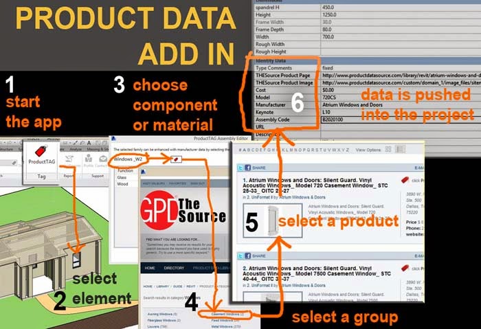
I just want to get something off my chest before I start.  I'm not setting out to make families that we can use in our day jobs.  There may well be some spin-off that we can use in fee-earning work, but what I'm doing here is pure research.  I'm reflecting on forms that Frank Lloyd Wright used, exploring abstract shape-making, reflecting on underlying meanings.

How do I justify this ?  Let me ask one question.  What is the higher priority for our species today: making more stuff (bigger,better,faster) or figuring out where we are coming from (and where we are going) ?  It worries me a little that "the factory" frames everything as a business proposition.  They are making tools for tomorrows visual thinkers.  The old fashioned business paradigm based on growth & profits is not going to solve our problems.  I don't think so.  If my grandson is going to inherit any kind of world at all we need to think outside of the business box.


In my view, tools like Revit should be designed to facilitate visual thinking in its most generalised form.  Young minds in our universities should be using them to understand the buildings and cities of the past, to explore the evolving technologies that have made those buildings possible, to envisage alternative futures.

So let's look at young Frank's frolics through the world of planters.


I travelled to Robie House on Monday.  I was deflected by Rain, which turned out to be a blessing that nudged me into the architecture foundation shop which is definitely worth a visit.  Here I bought a tree of life umbrella which in the event was never needed but became a nice present for my daughter.

Robie House is one of the icons of early modern architecture, the pinnacle of Wright's Prairie Homes period.  There is an interesting parallel with Villa Savoye by Corb.  Both have been hugely influential.  Both are extremely powerful design statements by architects of immense talent.  Both had very brief lifes as dwellings; failed in fundamental ways to deal with climate and fell into disrepair and misuse for an extended period before emerging as protected monuments hosting thousands of visitors each year.


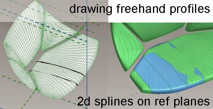
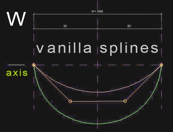
I'm going to use a Straight Line Rig.  A vertical reference line erected at the origin, with a height parameter.  Host a point, change the value of the "Show Reference Plane" parameter to "Always" select this plane to set it as tbe current work plane.  Drag a profile in from the browser and host it on the plane.  Use groups of profiles to create forms.


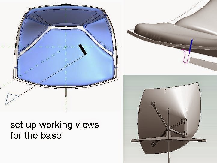
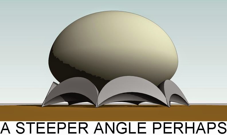
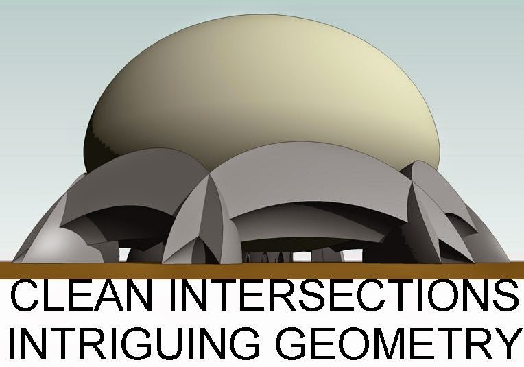
The Robie House planter like the house itself takes horizontality to extremes.  I'm using the two profiles from the previous post, rectangle and ellipse, with the depth factor initially set to 1 so we have a circle and a square. It took 12 points and 14 profiles to create the solid forms (two points host both a square and a circle)  Another 3 profiles for the void cut (all circles)


Something like that anyway.  I may have lost count somewhere along the way.  There are 6 separate pieces of solid geometry: 2 square "extrusions", 2 circular "extrusions", and 2 circular lofts.  The "extrusions" are really blends, but the top & base are identical.


The depth factors are linked up to a matching parameter in the host family.  Ditto the scale.

Here's the thing.  We want the height to be able to scale independantly from the width & depth.  To put it another way we want to vary the proportions in all 3 dimensions.  So in the project we have 3 instance parameters: Height, Slenderness & Depth Factor.  A simple formula does the magic behind the scenes.


The result is a family that flexes nicely in plan & section.


Same thing in axo


So what's the point ?  Why make them parametric ? Why use point world.  Wouldn't plain old vanilla extrusions and revolves do the job?  I'll answer that last one when I get round to making a vanilla version.  I'm using Point World because it still fascinates me and I think it's important for us to keep plugging away at the relative merits of the two ways of making stuff.


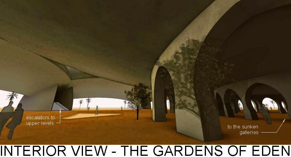
As to "what's the point" ... well drawing is understanding, and it seems to me to be worthwhile to get deep inside Frank's skin.  He may have been an arrogant S.O.B. but he created some remarkable buildings.  And just to prove a point, the process of recreating these planters eventually made me look a little closer at the images I began with.  What do you know, the planter over the entrance has a different size & proportions to the ones on the street front.


Or so it seems to me.  I'm just estimating on the basis of photographs I took 8 or 9 days ago.  If I lived in Chicago I could go back with a tape measure, but this post is being finished off in an old school-friends living room in Reading, England.  Last night we played music in the garden to a small gathering of friends and neighbours. Tomorrow night I will be with my son in London, and a week from now, back home in Dubai.

More planters to follow.


VANILLA PROVE THYSELF

$
0
0
VANILLA PROVE THYSELF

When Robie House was nearing completion, Frank Lloyd Wright had spent the best part of two decades building houses in and around Chicago.  It stands like a ship in dry dock, poised above the street and was for Wright the ultimate expression of his vision of a new type of house, suited to the Prairie, with it's horizontal lines and overhanging roofs.


Having achieved his goal, Wright was ready to move on, abandon wife and family, take up with the wife of one of his clients and head for Europe (via Wisconsin).  What else would you expect from a creative genius, driven by the desire to do things that "never happened before" ?


Although we are beginning to question this notion of the creative superhero it remains central to the world-view of industrial society.  We idolise highly competitive, egotists like Wright, Steve Jobs, Ronaldo, Donald Trump.  We love to believe that they have changed the world forever, invented new ways of being, expanded the art of the possible.  But perhaps it is just a game, part of the never-ending spiral by which our consumer society fritters away the resource capital that our world has accumulated over hundreds of millions of years.


I am exploring two ways of making stuff: Vanilla & Point World.  We have been using mass profiles hosted on a straight-line rig, to make a parametric planting bowl, specifically the one that Wright designed for Robie House.  I want to go on and use this planter as a metaphor for Wright's creative process.  He churned out houses by the dozen, endless variations on a theme.  Most of them featured long low walls, spreading out like the roots of a tree, anchoring the house to it's site.  And to accent these garden walls, two or three strategically placed planting urns.


And just like his houses, these planters re-invent themselves with each new commission.  He couldn't stop fiddling, exploring new combinations of materials, structural gymnastics, different roof pitches.  I never thought much about the planters until I visited some of his Prairie Houses, 2 or 3 weeks ago.  Lately they have become something of a passion.


This one from the Heurtley House features a square base, then a cross, and finally a circular bowl.  These are the three motifs in the logo he used during his Oak Park period.


My third Point-World planter is from his own house & studio.  Built using a loan from Sullivan, this was his base right up to the Robie design: the family home he abandoned when he left Oak Park with Mamma Cheney.  The planters are outside the entrance to the studio, itself an addition to the original house.


Louis Sullivan was his mentor and the source of some of his design ideas, particuarly the obsession with ornamental detail which can be a little embarassing to those who like to claim him as a modernist.  But perhaps the more important skill he acquired from Sullivan was the ability to harness a team of draughtsman and drive them like a maniac towards his goals.


We idolise the creative artist, but in reality most of them ran studios.  From Brunellischi to Gehry, the "great man" produces master-works from an assembly line, often using cheap semi-volunteer labour and almost always claiming the credit (and if you are Steve Jobs, the copyright)  This is not to belittle the skill and vision of such men.  The draughtsman is always free to set up on his own, perhaps by breaking his contract, as Wright did to Sullivan when he designed his "Bootleg Houses" less than a block from his own house, while serving out the 5 years exclusive service he had contracted in return for the building loan.


There are many more Wrightian planters.  Please feel free to send me examples.  Here are a few.


Winslow House was the first of the houses Wright designed after breaking with Sullivan.  The house itself could almost have been by Sullivan, and the planter is conventionally classical.  From here on the urns become more abstracted and geometric.


But what can Vanilla do ? (the challenge in my title)  Can we achieve the same scalability using standard Family Editor geometry ?  I chose the Nathan G Moore house.


The planter may date from the renovation that followed a fire more than 20 years after the original design.  Difficult to be sure. The house itself is rather fussy and steep-pitched, not at all typical of his mature prairie style, whereas the planter is somewhat simpler.

Whereas Point World relies on the Normalised Curve Parameter (NCP) for much of its scalability, Vanilla prefers Reference Planes and equalisation constraints.


The formulae for isolating "Height" and "Slenderness" as the 2 primary user inputs are common to both methods however.


I didn't attempt a "Depth Factor" in Vanilla.  Firstly I don't think it can be done.  Secondly it's questionable how useful it is in this particular case.  To be honest the oval/oblong versions of the planter look a little odd.

So what's the verdict?  I enjoyed pitting the two worlds against each other on a similar task.  I think the Point-World approach to scaling is more elegant, but Vanilla families are more servicable at present for use in real projects.


I had to cheat a little to get the various segments defining my vanilla revolve to snap to grid intersections.  The NCP approach makes small adjustments much easier to achieve.  Equalised dimensions are a little crude in comparison.  I ought to mention that the Vanilla method makes use of the ability of splines to scale proportionately when their two ends are stretched apart.


All in all, I don't think there's a clear winner: just 2 different methods for making stuff that are worth practising and perfecting.  Sometimes one will suit your needs better, sometimes the other.  Point World can make shapes that are impossible with Vanilla.  Point World only exsists (at present) in family templates that are not ideally suited to objects like planters, furniture, or plumbing fixtures.


So "viva la difference" and keep playing with both methods.  Hope you found this useful.  And if you are a Frank Lloyd Wright fan, please don't take offence.  He was a lovable rogue, by all accounts and I prefer to love him "warts and all" rather than worship at the feet of my idol.

7 PHASES OF A BIM ADDICT

$
0
0
This is a talk I gave at the inaugural "BIM Breakfast" (Dubai version) organised by IPC at the Ritz Carlton DIFC on 11th June.  I was speaking on behalf of GAJ, who co-sponsored the event, but I chose to present a personal view in order to reach a mixed audience of experienced users and interested "novices"

The title is something of a mixed metaphor.  You probably picked up on the reference to Shakepeare: his idea of life as a journey, a progression like the acts of a play.  The phrase "BIM addict" is intended to evoke a passion, bordering on compulsion.  BIM generates strong feelings, for and against.  Hence my first slide, based on the standard Alcoholics Anonymous greeting.


So the talk is about BIM as a passion and a journey. Reflections of an architect who first dabbled in "proto-BIM" around 20 years ago & has been using BIM at GAJ on a daily basis for more than 8 years now (full-on Revit).  During that period, and especially the last 8 years, my perception of BIM has evolved, and continues to evolve.  So imagine me as Shakespeare's player, strutting across the stage, changing my costume with each new scene.


When I first got my hands on Revit I saw it as a new and very powerful way of drawing.  By then I had been drawing for 50 years and I was bowled over by the fact that a new drawing tool could empower me so dramatically.  The next image is from the first set of tender drawings I produced using Revit.


You can see that I was Carried away with the ability to visualise and document in a single integrated environment. To place a set of live views from the model onto a page, adjust my design in any of these views, and watch as the drawings update everywhere.  It's easy to forget how powerful this idea is when you first encounter it.  A year or so later and using visibility controls to create a time-lapse effect. Exploring the sequence of trades, detailing in 3d. 


A couple of years further and I was starting to develop a style, but till loving the combination of orthographic and perspective, the holistic approach.  Drawing is a tool for understanding.  How you draw makes a difference: attention to detail, clarity of thought. 


These are intensely personal things that come across as a style. The style of a writer, or a speaker makes all the difference to how you receive their ideas. The same is true of drawing. We used to know this, but sometimes the disruption of technology leads to amnesia, we become drunk with power, and forget the basics of good drawing technique.


 An example of the ability to disect, to get inside, to deconstruct closes my first phase of "BIM as a better way to draw".  The next big thing to hit is the power of data.


One day you suddenly wake up to the fact that your model is packed with information.  BIM objects are intelligent.  A wall knows that it is a wall. You can keep a running count of floor areas as an urban scheme develops, real time feedback to validate design ideas. 


At a more prosaic level you can count doors and windows.  This seems like a trivial thing now, but for someone who has churned out door schedules by hand on large projects it seems like magic. The first encounter with BIM schedules is breathtaking.  A huge weight falls from your shoulders.  Mind numbing tasks fall away and you actually have time to think about what you are doing.


Thinking outside the box a bit, you can study options for apartment buildings or hotels.  Keep track of the balance of room types. 


And the other side of data.  Analytical tools.  This is a wind study we did for a project just a couple of weeks ago.


So far it's been lonely BIM.  I'm sure lots of you know what that feels like.  Trying to persuade the other consultants to jump in.  The water's lovely in here.  Let's hold hands and paddle off together.


Stunned silence, then:  "Yeah we've got a couple of licences, but the guys are not confident yet.  Maybe next time." or "The programme is too tight." or "But we already started in CAD."  Happily things have changed over the past 2 or 3 years and it's much easier now to assemble a BIM team, at least for the main disciplines.


These are images from a project I am currently working on in Oman, just outside Muscat.  Ducts and pipes appearing in your ceiling voids in real time. 


 Coordination meetings when everyone can see straight away where the problems areas are.  Another exciting phase as the addiction takes firm hold.


My catch-phrase for the next leg of our journey is stolen from Autodesk who also helped to sponsor the event. I hope they don't mind.


At some point you realise that all this stuff that has crept into your private life: email and smart phones, facebook & twitter, dropbox ... all this stuff is cut from the same cloth as BIM.  Digital tools that transform the ways that people interact with other people, opening up connections and the accellerating the flow of ideas.  Brainstorming at the speed of light.


I was doing a tender review the other day: contractors in Oman that I had never heard of.  They all have web sites.  Information that would have taken months to compile a few years ago is available in minutes. 

You've all seen the shots of someone pointing their tablet at the ceiling and seeing what is (theoretically) inside. What about compiling snagging lists on a device that knows which room you are in; scanning the barcode on a piece of equipment and checking if it meets the specification. (At this point I hold up my Surface and my Windows smart phone, just to prove that I take my own path through life :-)


CLOUD-MOBILE-SOCIAL is where we are right now.  New cloud collaboration platforms are springing up on a daily basis.  Manufacturers and suppliers are investing in content services, looking at new ways to interact with BIM users.

Which brings us to the next phase of our journey.


The next big realisation is that for BIM to really work (get the full benefit), we need to involve everyone, the entire industry.  That's why the experience of the UK is so exciting, a national initiative.  It's something we really need to encourage here.  Contractors are coming on board in a big way. 


This is a job we are working on right now.  Design & build with a BIM savvy contractor.  I built a parametric crane for them. Type in the height, adjust the radius, off you go.  And suppliers are beginning to wake up to BIM at last.  Some really good content services developing. 


But we need to go beyond lecturing suppliers with "BIM is the next big thing, you need to get on board"  We also need to listen to them.  They have their own digital tools.  How do they envisage the future ?  And it's not just about downloading objects from a web site.  The real value has always been the personal interactions.  Experienced designers and contractors interfacing with experienced specialists.  How can BIM supercharge that process ?  content, suppliers, contractors, get everyone involved  I think this is going to be huge over the next few years.

But meanwhile my mind is racing on.beyond the day job.  Extracurricular BIM.


Pencils are very adaptable tools, you can write a shopping list and if you are Leonardo you can invent fantastic machines or explore the muscles of a dissected corpse.  We shouldn't keep BIM locked inside the business box. 


Beware of dividing the world up into separate compartments.  BIM is the most amazing educational resource.  Study the highlights of classical architecture (one of my favourite weekend hobbies)


or maybe you are into documenting technologies before they disappear from memory.  Sash window. 
And what about art ?   Where exactly is the dividing line between everyday life and a work of art?  Can we do art with BIM?  What would that be like ? 


In the early days people thought photography was too mechanical to become an art form.  How wrong was that?  So that's my current phase.  BIM spreading into all spheres of life.  And here in the Middle East, lift can sometimes feel like a "Rat Race".  What does BIM have to say about that ?   


Most discussions of BIM are locked into an old school business paradigm.  ROI.  Geta competitive edge. bigger better faster.  But that's such an old fashioned business model.  We need to catch up with the cutting edge of business thinking. 


sustainable business concept, Building a long-term brand based on trust and respect. CSR.  So lets take a quick look at  4 pronged model ... starting with


environment - energy modelling, recycled content.  This is not new or controversial.  It's a steadily growing aspect of mainstream BIM, something we all need to embrace.


Marketplace. The images above are from a scheme in London called "considerate contractors".  It's an issue we need to address.  Rightly or wrongly the industry doesn't have a very good reputation for considering the needs of the general public.  Can BIM help us to address that in a typically UAE manner, using cutting-edge technology to communicate with the public and to conscientise contractors about the need to operate responsibly ?  Perhaps Dubai Municipality should require contractors to operate web sites which display virtual models of their projects, warn residents about activities such as all-night concrete pours, and allow them to register comments and complaints.


Workplace.  This is a matter of some concern in the UAE.  The sad fact is that we have gained a reputation for treating our building workers rather carelessly.  Recently at GAJ, we have been working with a BIM-aware contractor that intends to use BIM as a tool for site orientation & planning, fostering awareness that is critical to Site Safety.  This is great & I hope we can continue to build on that.  But what about housing conditions, labour camps.  Can BIM make a contribution here ?  These are open questions.  The kind of questions I am starting to ask about BIM right now in the 7th phase of my addiction.


Community - There are many ways in which BIM could help our industry to contribute to te community.  Lets take a brief look at one: community planning.  This is a well-established idea in many parts of the world: the belief that ordinary people have a right to be involved in decisions about building projects in their neighbourhood.  Here in the UAE we are used to a top-down approach, but it can't go on for ever.  Can BIM help us find a UAE approach to consultation and community engagement ?  Could we soon see virtual models on-line that allow residents in the UAE to envision development proposals before they are finalised and to share their reactions with clients and consultants.

BIM is new, BIM is "happening", everyone can contribute, help to shape the future.  Why not get on board ???


So that's a brief review of my own personal BIM journey, during the past 8 years with GAJ. Yours may be similar in some ways, different in others. But the challenge facing us now as an industry and as a nation (as a species) is can we come together, hold hands and take the BIM journey together.

http://www.constructionweekonline.com/emagazines/mea_676.php


TURNSTILE FAMILIES

$
0
0
Recently I had a project where the kitchen specialist showed some "turnstiles by others".  Whenever you see that little phrase, you know someone has dumped a problem in your lap.  So I hopped onto the internet and searched for a local installer.  These days I make a point of using Bing for most of my searches.  Why should Google have all the fun  ( = information = power )  There is a delicious irony in choosing Microsoft in order to resist a monopoly but that seems to be the situation in certain areas these days.  I digress.

I found a product that looked something like this.


As usual there were questions to be asked.  One day there will be a proper BIM way to do this.  In this case there wasn't even a family to download, but one day it will go much further than that.  I imagine dropping the family into your project, creating a section box around the area concerned and uploading the result (in IFC format perhaps) to a web portal.  Here you can add some comments and questions, bookmark a couple of views and press submit.


This would initiate a 3 way conversation between yourself, the manufacturer and the local installer.  Comments would be tracked and tagged of course, and all parties would be able to create options and new views within the 3d model.  You would be able to synchronise any of these proposals with your project at the click of a button.  But there wasn't even a family.  Has anyone ever come across a turnstile family ?  I decided to make one.


Start with the tripod.  Generic Model, plan view.  Add 2 reference planes at 60 degrees to the vertical.  Go to a left elevation.  Create sweep.  Draw a path on the "centre L/R" workplane.  Guess the length or use information from the product website.  It's around 450mm, maybe a bit more.


Finish path, set the workplane to the "profile plane".  Select profile, edit profile, draw a circle.  I used a radius of 20mm.  Now you have a cylindrical arm.  Go to the plan view and mirror this using one of the angled work planes.

Select the second arm and mirror again using the "centre L/R"


Hey presto, three arms.  I guess we could have used a radial array.  Probably would make the file a little heavier.  I opted for mirror.  I also decided to represent the hub by a hemisphere.  Keep it simple stupid.


That's going to be  a revolve.  I drew my sketch in a front elevation view.Now we are going to load this component into another family, but first we need to make a couple of adjustments.


Uncheck "Always vertical" and check "Work Plane-Based".  Then start a new Generic Model family and load in your tripod component.  I'm starting with Generic Model out of habit really.  We can change the category later.  If you think this should be "Specialist Equipment" then you can start from that template instead.


Set up some reference planes based on dimensions from the catalogue and create an extrusion.  I didn't bother to lock it to any of the planes because I don't intend to make the size parametric.  There is only one size for this product.


Now sketch a void extrusion, flip over to a side view and stretch out the start and end points.  I will probably cut itself out of the solid as soon as you finish the sketch, but if not use the "Cut" tool.  To place the tripod you need to set the workplane, either using pick face, or by naming the angled reference plane to something appropriate (tripod slope?) Once you give a ref plane a name you can set it to be the active work plane by selecting that name. Basic stuff.

You probably need to slide the tripod around a little to get it centred.  You might want to rotate it as well.  Do this in the 3d view, making sure you set the work plane to the one the tripod resides on first.
So that took maybe half an hour.  I loaded it into my project, and tried out 2 different arrangements.  One of them required a centre division.  I won't explain how to make that.  It's just a box. Set up a plan and a camera view on a sheet, added some comments/queries and emailed it to the local installer.


A couple of days later I got a response.  Try another product which has a purpose made end post.  So I made a second version.  This time I have a pdf with orthographic views.  Use the windows snipping tool to make a jpeg of the part I want.  Drag and drop this into the front elevation of the turnstile in family editor.  Scale it up with Revit's wonderful three click resize command.


Edit the extrusion using the front elevation as a guide.  You can delete the void.  Notice that the arms of the tripod appear to he horizontal and vertical in front elevation.
Edit the tripod, left elevation.  Rotate the arm a bit.  Delete the other 2 and restore them by mirroring the first one as before.  Check the side elevation again.  Is that close to a right angle ?  If not rotate a bit more and repeat the mirror routine.  Maybe there is something to be said for a radial array after all, but it only takes a few seconds to do the mirror thing so I stick with that.


I also remade the revolve for the hub.  You could go even further in the search for authenticity, rounding off the edges of the pillar with a void sweep.  I decide to keep it simple.  Then I weakened a little and rounded off the ends of the tripod arms.  Void sweep.  Pick 3d edges.  Pick the circle at the end of the arm.  You will have to pick twice to create to semi-circles.  Finish path.  Draw the profile in side elevation. 


Load it back into the turnstile family.  You may need to adjust the angle of the inclined plane and the rotation of the tripod to get it to read properly in plan and elevation.  Even so it probably won't be perfect.  You might decide to use symbolic lines for the tripod in orthographic views, just to get a cleaner line.


Now for the end post.  Create extrusion.  Draw a circle in plan.  Guess the size.  I made mine from the box I had before, so the height was already set to 990.  The next bit is fun.

Create another extrusion in plan.  Sort of a butterfly shape.  Pure guesswork for the dimensions.  Go into a side elevation.  Create a void extrusion to round off the ends.  This needs to be accurate.  True semi-circles that match the size of the solid extrusion.  Stretch out the ends so that it cuts all the way.


You've made a shape that will act as a rig for a sweep.  Select this shape and uncheck "Visible"  Now the rig will not show up in your project.  You can change it to glass material if that makes you more comfortable, but it really doesn't matter.

Create sweep.  In a 3d view, pick 3d edges.  Go all the way around one "side".  Now you have a path that mimics a 3d polyline.  You can sketch a circle for the profile, or load a circular profile.  I used a sketch.


Repeat for the other side.  Actually I'm not sure that a two-sided product exists, but that's what I needed and I used this family to ask the question.
Shortly after that I decided that 2 turnstiles oriented the same way made more sense, and the pdf I had was showing a recommended spacing for this configuration so why not go for that ? 


Now I'm going to send the manufacturers a link to this post and encourage them to join the global Virtual Design & Construction movement (VDC) call it BIM if you prefer, I usually do.  We are working with a contractor at present who prefers to use the term "Digital Engineering".  Nothing wrong with any of these terms, but I think BIM just slips off the tongue more easily.  That's usually the deciding factor when it comes to language.  Forget the pedantry.  BIM model is easy to say and it gets the idea across.  Get a life.

Sorry about that. 

Dear manufacturer, 
Here is a link to some Revit Families.  At least one of them represents a product that you make.  You are free to take ownership of this family and make it available on your website and via your global network of suppliers.  But make it free.  And even better, consider setting up a web portal that will enhance the flow of intelligent 3d information and ideas between people who are using your products.


Imagine a world where contractors bidding for a job can link to this portal and see the virtual mock-up that you and the architect developed (see above)  Imagine the contractor that wins the job being able to communicate with you and your local trained installer via this same 3d portal.  That world is coming so why not take the initiative and help to create it.  Be a leader and a winner.  Make the world a better place.

http://a360.co/1kbxMQk

by the way, here's a snippet from the actual documentation for the project.  We don't usually describe the product in text right on the sheet like that, but for various reasons we didn't want to reissue the specification ... it's just a workaround to get the job out of the door on time.


P.S.  I have no particular reason to prefer one make of Turnstile over the other, the second version just happened to work on this project and I didn't have time for too much back & forth, so I went with it.  Maybe next time I will use the first one.  Or maybe I will go with whoever puts a Revit family on line.

THE WAY WE BUILD

$
0
0
THE WAY WE BUILD

I have a passion for buildings.  It began when I convinced myself as a teenager that I wanted to become an architect. I was impressed by the way that many architects wrote about their work, how they seemed to believe that they were on a mission to change the world.  And of course, I loved to draw.


Disillusion set in early and by the time I had finished my first degree I had decided that I didn't want to be an architect after all.  I convinced myself that there were more direct ways to change the world than some office job.


Plunging into manual labour on building sites I discovered a fascination for building processes that college courses had failed to ignite.  I decided to train as a bricklayer and spent the rest of my twenties plying this trade in the North of England and scribbling construction details into my sketch books.


At the age of 30 my passion took me to Africa on a wild adventure, teaching building at an experimental school.


I was disappointed by the textbooks and decided to write my own over the course of a long vacation.  It was just a jumble of ideas arranged on a handful of pages, but it was picked up by my employers and eventually got me a job in the Curriculum Development Unit.


We wrote textbooks, ran courses for teachers, devised schemes for distributing tools to schools, wrote a new syllabus, set exam papers ... it was a wonderful period, filled with belief in the future of the newly independent state of Zimbabwe.  Building was a subject on the secondary school curriculum, alongside English, Mathematics, Geography etc.  We felt that a course called "Building Studies" should not be a vocational option for the "less gifted" but rather a proud subject in its own right.  It seemed to be an ideal vehicle for integrating the other subjects and demonstrating their relevance to real life situations.


This period of my life culminated with two years in the Faculty of Education at the University, devising and teaching a new course for Building Teachers.  This was an opportunity to bring together the various strands of my life so far: Drawing, Architecture, Bricklaying, Education ... In my imagination I thought that I had found my vocation, but it was not to be.  It turned out that I was an expendable tool in someone else's grand plan.


And so I found myself forced to reconsider and opted to give architecture another shot, almost 16 years after I had finished my first degree.  This lead to another voyage of discovery, another set of challenges, another perspective on the world of buiidlings.  I worked in an office for 2 years, went back to University for 2 years, joined another office and finally took my professional practice exam.


Another 2 decades have passed.  One in Africa, and one in the Middle East.  All along a project has been brewing at the back of my mind.  I wanted to recapture the excitement of the unfinished series of textbooks I worked on in the early 80s, but also to add insights from my work as an architect and from my travels to different regions of the world with their different building traditions.


At some point I fixed upon a working title: "The Way We Build".  It is a ridiculously ambitious concept.  Take history of architecture, construction technology and theory of design: mix them all up together with a survey of vernacular building forms and reflect upon ten thousand years of urban settlement along the way.


For almost 20 years I have been assembling a database and creating my own analytical drawings whenever time permits.  Six or seven years ago, I realised that BIM software (Revit in my case) is an ideal vehicle for this kind of research.  My database is littered with half-finished Revit models, many of which have found their way on to the pages of this blog.


Two buildings have emerged from my recent tour of US/UK.  First is Robie House: the apogee of Frank Lincoln Wright's prairie houses phase.


Second is the De La Warr Pavilion: Erich Mendelsohn's contribution to the sudden flowering of Modernism in 1930s Britain.


Both are works in progress.  As always there is an element of guesswork when it comes to reconstructing the dimensions, but that's part of the fascination.


There remain many small anomalies to be resolved, structural puzzles to be agonized over.


There are always details that you notice in passing, but only assume significance as the model develops:  places where Frank opens up a balcony or a roof to let a shaft of light pass through for example.  Are these really justified in practical terms, or are they just architect's games ?  Borderline perhaps.


I decided to use feet and inches for Robie.  Takes me back to my school days, before England went metric.  That in itself has been an interesting challenge.  Frank definitely used a 4' module in the planning, so it seemed more faithful to bite this particular bullet.


I find myself reacting to the gushing use of "masterpiece" and "genius" in what has turned into a FLW tourist industry.  Certainly he was a remarkable and most prolific designer, but what does Robie House really mean to us today ?  It's a huge house with servants quarters, expensive to heat and maintain.  What does this tell us about the social divisions, even in America, just before the First World War ?  It's just a 3 bedroomed house for a successful young businessman, but it's built like an ocean liner.


In amongst the drawings I found on the internet were some from a 1960s "Historic American Buildings Survey".  One in particular stood out as going beyond a dry record of dimensions and attempting to add some analysis under a series of headings: sun control, ventilation, heating, lighting, insects.  Date: 1967, Drawn by: Mary Reyner Banham.


2 years later, I enrolled at the Bartlett (then called the School of Environmental Studies) and sat in awe during lectures by her husband, Peter Reyner Banham, a big man with a big beard and big ideas about the history of the Modern Movement in Architecture.


There are fascinating environmental systems in Robie house.  Wright worked very hard to integrate the heating and lighting into the architectural form.  One example is the way that radiators are tucked under window sills behind slatted timber grilles.  I didn't study these carefully enough as the tour guide whisked us around the interior, but it seems clear that there is an outer frame with an inner screen that either hinges or lifts out to give access.


Wright's timber detailing is generally lauded for being simple and direct, a brave departure from the heavy ornamentalism of the time.  Maybe so, but it still seems rather fussy and overhearing to a modern eye, quite different from the stripped minimalism of the De La Warr Pavilion.


The pavilion is named after "Buck" de la Warr, the 9th Earl, who was the first hereditary peer to join the parliamentary Labour Party.  He was descended from the 3rd Baron, Thomas West, who put down an indian "rebellion" in Virginia in 1610 and after whom the Delaware River is named.  Presumably the spelling was changed to match the pronunciation.


Buck was Mayor of Bexhill in 1933 and instrumental in promoting the architectural competition that was won by the recently formed partnership of Mendelsohn & Chermayeff.  Chermayeff was Russian by descent, but grew up in England.  Mendelsohn was on of many emigre intellectuals who arrived in England during the 1930s.

Fascinating history, and much more could be said, but not today.  The pavilion comprised large multi-purpose auditorium and a long strip of secondary functions.  Today this houses gallery spaces and a restaurant.  Originally there was a restaurant, bar, library and conference room.


The pavilion has been through ups and downs over the years but with remarkable continuity of function.  Today it has been splendidly restored, and hosts a continuous stream of exhibitions and performances.  Look it up on the web.

So that's a peek into my latest explorations for The Way We Build project.  I'm looking at a couple of possibilities for collaboration.  Hope that pans out.  It would be great if more universities caught on to this kind of approach, using BIM to research our Heritage, in the spirit of Peter & Mary Banham ... now wouldn't that be wonderful ?


CURTAINS THAT FLEX

$
0
0
In my second presentation in Chicago last month I proposed a heirarchy of 3 major types of rig for use in point world: straight line, rectangle & box. 


The series of planters by Frank Lloyd Wright that featured in recent posts were all based on the Straight Line Rig, hosting a series of profiles.  In this post I will use the Box Rig to make families that represent curtains.  The aim is to achieve something approaching the softness and irregularity of real-life drapes.


We start with a rectangle, drawn in plan, using reference lines.  Add equalisation plus parameters for Width and Depth.  Select the rectangle and creat form.  Convert the offset into a Height parameter.  Sometimes it is useful to add formulae that make Height and Depth dependant on the Width, as in the image above.  For the curtains we will keep things simple and type the 3 dimensions in directly.


Make your box 3m high, 1200 wide, and 200 deep.  That will be a reasonable starting point for a curtain that is partly open.  For my RTC presentation, I simply drew 2 splines using Spline through Points with 3d snapping on: one spline along the top face, another along the bottom face.  The points will snap to the edges and acquire NCP parameters (values between 0 & 1 which control their position as the family flexes)  Select both splines and create form.  Add a material parameter.   The result is an undulating surface: moderately successful, but a bit too stiff.


So I decided to add a reference line along the top face, and another along the bottom.  This allows me to vary the depth of the troughs and valleys in a somewhat random manner and create curtains that look more natural, with irregular folds.


Flushed with success, I explored the possibility of even more dramatic ripples with 2 points for each fold in the cloth.  This seemed to work OK but for some reason when you go to a camera view, random lines show up, criss-crossing the scene.  They look worse on screen than in an exported image, but still rather disconcerting.


No worries, I can live with my second version.  Copy this and change the width and depth (wider and more shallow)  Create a new type and apply a new material.  Mine is based on the Bamboo that comes with Revit, but enlarging the scale and fading the image so that it simulates a sun filter material.  Now we have 2 layers of drapes. 


Check out a plan view.  You get some very interesting shapes, but not what you would want in a set of drawings. 


Building plans are stylised.  Sometimes we forget that, but it's the main reason for the "symbolic" capabilities of Family Editor.  Hide the solid geometry of your door panel, and add symbolic representation of a "door swing".  Sadly this feature is missing from Point World.


We had some very interesting discussions in one of Paul Aubin's sessions at RTC, effectively a dialogue with Autodesk at a fairly senior level.  One of the ideas that came up was to have a new family template, possibly called "Generic Model CME", which behaves like a standard Generic Model family, but uses Point World techniques for making geometry.  It would have the visibility controls shown above, plus Symbolic Lines, Masking Regions & Detail Items. 


You would be able to go to family categories and swap to just about any category you wanted, including plumbing fixtures.  It would not be based on adpative points, so the family would respond to the "Level" and "Offset" instance parameters just like a normal Generic Model and you could schedule the components by level.  Even better, you would be able to nest this type of family within a hosted template.  So you could have a wall mounted light fitting based on Point World geometry.  We don't know yet whether this is a realistic request.  Perhaps the coding would just get too messy.  But it would be a wonderful thing if the factory discovered that it was able to grant us this wish.


In the meantime we will resort to work arounds.  Here is one.  New family, Generic Model.  In the plan view, set up reference planes, parameters and symbolic lines as shown below.  Nest this family into another Generic Model.  Create an array, link parameters and "hey presto" we have symbolic representation of a curtain inside a Generic Model family (not a detail item) 


This is good news because we can nest a GM into Point World.  So load it into your curtain, place it ina plan view, lock the bottom left corner to the same corner of the box.  Now you can link up the parameters.  You'll need to set up a formula in the curtain family to generate an "X" value based on Width and No of folds.  If you do this correctly, you will have a symbolic representation of a curtain that flexes correctly and only shows up in plan views.


How do we hide the 3d geometry in plan ?  I made a new sub-category called "adaptive 3d"  (my curtain family was made from the Generic Model Adaptive template.  In many ways it would have been better to start from "Conceptual Mass")  So assign the curtain geometry to that new sub-category, and in the project you can turn the sub-category off in plan views.  If you use a view template, it's not too painful.


Why do I say that the "Mass" template would be better than "Adaptive" for this kind of family ?  Well Adaptive Components don't respond to Levels & Offsets the way that other families do.  They're not meant to.  Adaptives are supposed to attach themselves to points within the project and adapt their size and shape accordingly.  They don't have an origin in the same way as normal families.  They are Shape Shifters.  They don't belong to any particular level.  They define themselves in relation to other objects, not to some absolute datum.  So if you want to control the position of your family by selecting a level and typing in an offset, Adpative Components will disappoint you. They also have a disconcerting tendency to flip upside down when mirrored.

So my freebie is slightly different from the above story.  It's a mass family, the symbolic "worm" is centred about the origin (which usually is a more stable way to make families) and the subcategory for turning things off is called "_Hide in Plan"

Check it out for yourself at this link.

Mass Curtains.rfa

OUTER SPACE

$
0
0
When I was looking for everyday objects to model in point world (for my RTC presentation in Chicago) one of the first pieces of furniture that sprang to mind was the Space chair.  A Fritz Hansen original, much copied, classic use of moulded plastic sheet.


For the longest time I couldn't figure out how to make it.  I kept trying to see the form as a series of profiles hosted on a spline, but that turned out to be really clumsy.


Then one day the penny dropped.  Actually you don't need Point World.  The underlying form is a blend.  It's like one of those thached roofs that are round at both ends with a straight ridge in the middle.


Flip that upside down, at an angle.  Make a similar void, slightler smaller, cut away and you've got it.


Well it needs to be trimmed around the edges of course, but that shouldn't be too hard.  So I started with a profile.


The swept blend was a wonderful thing when it was first released, then a year later it got overshadowed by Point World and I've been neglecting it ever since.  First insight.  You can do a swept blend with a straight line.  Why bother ?  Because it allows you to use loaded profiles, something that ordinary blends don't accommodate (perhaps they should)


Using a straight line as the path for a swept blend gives me lots of control, easy to adjust the length and angle.  The profiles are parametric, easy to adjust their sizes and proportions.  I was using a CAD download from Fritz Hansen as a guide to get the size & shape right.


My first attempt to trim the edges was awful.  Second go was much better, but you can still see sharp edges when you zoom in close.


I decided that I needed a void blend.  Now you can make a void extrusion with a hole in the middle, but that won't work with a blend.  You can only have one closed loop at each end.  No donuts allowed  ... unless you leave a little sliver of a gap somewhere so that actually it's just one loop.


That's what I opted to do.  Not very elegant, but it works.  I leaves you with a spike of plastic sticking out sideways as if the shape had been injection moulded rather than pressed from sheet, but with care you can clip this off so that it's barely noticeable.


Now for the cushions.  I had a quick go at making these in Vanilla also, but it was never going to work, so I'm back in point world after all.  I isolated the cad object for the cushions.  It's a mesh.  Maybe some of you know how to convert this into a solid that will come into Revit and explode nicely.  That would save time, but I've never figured that one out, so I'm going to make if from a series of profiles ... in Point World.


I decided to set up a series of reference planes that slice through a cushion.  They don't actually cut it of course, but I can host splines on these planes and adjust them until they are pretty much sitting on the surface.  A bit tedious, but it was an interesting exercise.


I'm using conventional 2d splines here, the kind that stay resolutely on the reference plane you put them on.  So the only ref points belong to the straight lines that are used to close the loops using 3d snapping.


Use create form on the first 2 or 3 loops. Then progressively add more to create a reasonably convincing replicat of the CAD cushion.


You can easily see where your surface is proud of the original and where it dips below.  Select the nearest spline, look for a node, adjust to your heart's content.


There's always going to be a flat end where your last profile sits, but you can make this very small, or you can just decide that it's not going to show up, especially if the cushions are black, which they often are.


When exporting to cad from a family, your temporary hide/isolate settings are respected, so it's easy to push this out as an SAT solid.  Open this in autocad and you get a chance to round off the sharp edges.


Import SAT back into Revit and explode.  Now it's free-form native geometry and you can apply a material parameter.

The base is pretty straightforward to make so I won't go into much detail.  It helps to set up a ref plane with a parallel section plane when creating the extrusions for the legs and the revolves at the end where they attach to the plastic.


You might think that this results in a heavyweight family, but it's just over 1mb.  I'm not going to spray hundreds of these around anyway. There are a masking regions and symbolic lines to represent the object in plan views.  Interesting to note that the "free form element" for the cushions doesn't trigger a "visibility settings" button on the ribbon.  Fortunately you can turn it off in plan views via the "Visibility/Graphics Overrides" in the properties dialogue.  Another case of inconsistent terminology for Steve Stafford's record book.


I've turned all the 3d geometry off in orthographic views and at coarse detail level.  That should handle most performance issues


For the front & side elevations I used the CAD objects kindly provided by Fritz Hansen.  Just added a masking region.


Hope you found that interesting.  Download the family here


.Space Chair Download


I'm going to finish with a gag reel that illustrates the follies of cleverness.  More failed attempts to create the space chair using Point World gymnastics.


Along the way I developed the most complex trigonometric formula I have ever devised for Revit. (not saying much)  But none of the results lived up to expectations.  What a waste of effort.


Or maybe not.  Sometimes the simple solution will only come to mind after a long & difficult search.


THE UNIVERSAL LOLLIPOP TREE

$
0
0
This is something that I developed for my Urban Design explorations talk at RTC Chicago.  The idea was to take the basic "blob on a stick" tree that is often used at an Urban scale, and make it more parametric.  Hence the universal lollipop tree.


It wasn't too hard to set up.  A revolve made from quarter ellipses.  You can vary the shape by moving the "waist" up and down, also by changing the proportion of width to height.


The family I used in my presentation looked fine in the images, but in reality was less than perfect.  The way I had hooked up the parameters led to somewhat counter-intuitive behaviour.  For example, increasing the trunk height factor would actually decrease the proportion of trunk to canopy.


So this weekend I decided to fix that family, make it more user friendly, and offer it up to the general public.  Version 2 was much better.


There are subtle changes to the formulae that make them work more as you would expect from the given names.  I set up 15 types, with names that I thought would be easier to follow.


That's all good, but the names really refer to shapes.  At one point I was actually adding the height to the type name, but this just seemed to make things more complicated.


I decided to go for a version 3 where height would become an instance parameter.  You probably know that the different family templates have slightly different behaviours baked into them.  The Planting Template has a "Height" parameter that you can't delete and you can't change to "Instance" So I had to resort to creating a new parameter named "_Height"


Because all the "driven" values are ultimately dependent on "_Height" these also have to be instance parameters.  Revit won't let you have two instances of the same type with different Type Parameters (which is what could happen if you allow a Type Parameter to be dependent on an Instance Parameter)

Because of the way the parameters are all interconnected, I had to delete all the formulae (copy-paste them into a text document) change the parameters to instance, then copy all the formulae back in.


The end result is a tree whose shape is determined by four type parameters, and whose height is controlled by a single instance parameter.  There are a bunch of greyed out "formula driven" parameters that appear in the "other" section of instance parameters.  These record the actual dimensions of any given family instance.


So that what I decided to do with my lollipop.  You can probably get by with the 15 types built into the family, but it's quite easy to tweak them, if so desired.

Hope you like it.  Download from here.

LOLLIPOP TREE DOWNLOAD


GONE TO POT

$
0
0
This is another one from RTC Chicago.  It's based on a picture of a chinese pot that I decided would be an interesting shape to model in Point World.

Once again we are lofting with loaded profile families, and the rig is a combination of "straight line"& "rectangle".


So we start with an octagon profile. There are different ways to set about this.  You can base it on points, 8 of them all spaced out equally from the centre with a parameter to control that distance.  Or you can dispense with the points and dimension directly to the lines.


Turn this into a scalable profile with a simple formula.  R = input * Scale. ( I use R for consistency, because the simplest profile of all is a circle, radius R)


So we have a mass profile.  Load this into another mass family.  Draw a vertical reference line at the origin point. Host points on that line.  Reveal the normal reference planes.  Host instances of the profile on each of these, then play around with the input values so as to build up the shape of the chinese pot.


You need to select the profiles in groups and create form.  First 4 profiles, then 2, then 2 again, then 4 again.  Sometimes two forms share the same profile.  By the way I forgot to mention the height parameter.  And of course the profiles and the height are all linked to the same global scale factor.


At the top of the pot, there is a little pointed knob for lifting the lid off.  This is a revolve.  We could use a series of circular profiles, but I'm opting to illustrate a different technique.  Typically, the rectangular rig takes the form of a ladder.  So I'm building one of these off the top portion of the vertical line.  It involves hosting points on points and giving them an offset.


Create a loop using splines with 3d snapping.  Select this and the vertical line to create form.  Revit should interpret this as a revolve.


You can see that the 3 instances shown above vary in both height and slenderness.  Quite easy to set up. The scale parameter (used to control the nested profiles) is calculated from height & slenderness via a simple formula.


That's as far as I went for RTC, just a quick example in passing.  But of course we can take this further by loading different profiles.  The possibilities are endless, but here are a few.


One way to achieve this is via type-based profiles. This involves a bit of heavy lifting, with 9 different types needed for each profile.  The amount of work can be reduced somewhat if you base the new profile on a copy of the old one.  That way you don't have to set up all the named types again.


I followed this through to create a family with three types (octagon, circle & square) plus instance parameters to vary height and slenderness.

To get more value from my effort, I "saved as" 3 times and played around with the positions of the profiles and the relative size of the knob.  The result is a systematic exploration of variations in shape.  I'm not sure why anyone would want to have so many different pots to choose from, but just in case you do, this is one way to achieve that end.


Another approach, would be to use instance based profiles.  That's how my original pot was built because it's much faster to set up that way.  But when you swap out the profiles with a parameter all those instance values get lost and you end up with a shapeless extrusion.


Not to worry, you can just create another family for each shape.  Even better, rename the profile in the new family to match the name of the profile you want to load.

I followed this approach to create families based on profiles incorporating my famous "bulge factor" parameter.  This dates back to my Doric Pumpkin experiments and uses a points-based profile.


The "bulge factor" will take you all the way from very concave to very convex.  I didn't do "very concave" in this example because it doesn't look right in a pot.


The nice thing about this kind of exercise is the way it reverses the diminishing returns principle.  Once you've done the initial work, adding a new profile takes very little effort.  Also varying the relative heights of the different sections is easy and before you know it you have dozens, if not hundreds of variations.


So just remember, these families belong to the mass category.  Other than that, they behave nicely.  If you want to play with them, follow the download link.

GET YOUR POT HERE


FREEHAND CHAIRS

$
0
0
Continuing with the theme of Rigs for lofting profiles in Point World, this is what I call the "Freehand Spline" rig.  It's freehand in the sense that not everything is subject to dialogue box control.  To make some kinds of changes you have to open up the family and manipulate it directly.


I grew up with freehand drawing, so I have no problem with that.  Parametric dialogues are great in their place, but there is still a lot to be said for the direct, intuitive approach.  Witness the success of finger poking devices in recent years.

I wanted to represent a type of chair that is very common.  It might be bent plywood, or it might be moulded plastic, or it might be something softer.


You could make a reasonable go at it in Vanilla using a sweep tapered off at the ends with void cuts.  I've chosen to do it in Point World which offers a slightly more elegant solution and allows more subtle variation to the shape.  The profile I used for my first example can be varied in both width & curvature.


So the chair is more curved in the middle where you sit, and rather flatter at the ends.  This is most evident in a side-on close-up.


I experimented with a few different profiles.  Most of the complex profiles refused to "create form" but eventually I found one that gives an upholstered cushion effect, based on a 3d spline and a straight line.


This varies quite nicely based on a single width parameter.


The irony is, that the most elegant form to acrue from these experiments is based on a rectangular profile and could surely be made quite convincingly in vanilla.
The base is lifted straight from the space chair that I featured a couple of weeks back.


So what are the advantages of Point World in this particular case ?

First of all there is the ability to modify the spline directly and get immediate feedback on the resulting shape.  In Vanilla you would have to "edit sweep", "sketch path" make the changes, "finish path"& "finish sweep"

Secondly you avoid the need for at least one void cut to taper the back of the chair (two if you want to taper the seat slightly also)  Apart from appearing rather clumsy when selected in family editor, these cuts inevitably leave small seams on the edge of the seat.


So for the sake of experimental completeness I decided to make 3 versions of this chair.  The first is based on the adaptive template. It's the first one I showed.  The second is pure vanilla, with void cuts, as above.  The third is vanilla, but the seat is taken from point world version, exported to SAT, reimported and exploded.


The adaptive version can be opened up in family editor and the shape adjusted using Point World techniques. On the down side it behaves strangely.  It will not respond to the level & offset parameters in the properties dialogue.  When you press space-bar, instead of rotating 90 it jumps several metres to one side.  On subsequent presses it swings around in a cirle, returning to base on the fourth press.  You can avoid this be making it as a mass family, then you just have the "wrong category" problem.

The pure vanilla version works fine, but I find it hard to love those orange voids that jump into life whenever you touch any geometry.  "Crude but effective" seems apt.


I thought it might be fun to round the edges off using "pick-edges" mode for a void sweep.  Would have been exciting if it worked, but it didn't.  You can round off one side at a time, but this leaves an awkward little gap at the end.  Also attempting to add the next side yields one of those "circular chaing of references" errors.


It is possible to add a bullnose edging using "pick-edges" but no use trying to "join geometry" to hide the joint line. Destined to fail.


My next brainwave was a thicker rectangle with an edging that mimics upholstery. This worked fine.


So why not make the seat less flat, thinks I.  Turns out that a double hump refused to loft itself along a spline.  One node too many.


The lop-sided nature of the "4 node" curve is a little odd perhaps, but beggars can't be choosers.

It turns out that you can delete the seat and the edging remains intact, which is just as well because the new geometry won't take a "pick=edge" sweep.  You can copy-paste between families to drop a curvy seat into a straight edging.


The difference is extremely subtle, even when you exaggerate the curve. The eye is fooled by the straightness of the edge I think.  Using a patterned material makes the curvature more obvious, but is it really worth it ?  I'm not sure, but I'm determined to keep trying to generate furniture families with a softer look.


It seems that the edging is the most expensive piece in this family. File size more than doubles.  So I tried ditching the edging and cutting off the ends with a curved void.


I went on to experiment with 2 solids hosted on the same spline. Also attempted to reduce the "flat end" effect by grading the profile size down in a series of countours.


And that's the end of my freehand wanderings.  Nothing very dramatic in terms of end results, but an interesting technique all the same.


IT'S THE INFORMATION STUPID !!

$
0
0
This is a talk I gave this morning at the second Dubai "BIM Breakfast"


Why have I chosen to paraphrase Bill Clinton's election slogan for my title ?  BIM is a propaganda war.  We are fighting for the hearts & minds of the construction industry.  Trying to drag it out of the stone age.

Most of us have heard the phrase "it's all about the I in BIM".  But stuffing your model full of data doesn't guarantee a well designed building.  So for me "It's all about the DM in BIM" ... and I don't mean Dubai Municipality ... I'm talking about Decision Making.  That's the focus of this presentation.  How can better BIM support Decision Making processes ... with a special emphasis on the role of manufacturers, suppliers & specialist sub-contractors.


When I was a young boy, sometimes I would go shopping with my mum.  We'd walk down to the butcher's & buy some meat; across the road to Uncle Sandy, the baker & buy a fresh white loaf; then back along the street to the greengrocer ... Each of these shopkeepers knew us by name. "Hello Mrs Milburn, what will it be today ?" Everything would be placed carefully in brown paper bags and there would be a hand written receipt, added up the old-fashioned way.


Today I drive to Spinneys, Lulu or Carrefour & rush up and down the aisles with my trolley, grabbing pre-packaged merchandise as I pass.  At the checkout, someone I never saw before scans the bar codes.

At this point, information ripples outwards across the universe at the speed of light, updating databases in real time.  Every day, that branch knows exactly what has been purchased. They can pull up graphs of purchasing trends over the past month, or the past year.  Down the supply chain, the guys who make baked beans or breakfast cereals can aggregate data from thousands of outlets.  In board rooms around the world this information is converted into glossy reports that inform decisions about where and when the next mega-mall or factory will be built.

In my lifetime a digital revolution has completely transformed the retail industry.
But it seems that the construction industry has not changed to the same extent.  Why is this ?  Part of the answer is volume, rapid turnover.  Every day, thousands of cans of Baked Beans are sold, millions perhaps. Retailing is a repetitive process that is relatively easy to mechanize, digitize, optimize.

At Godwin Austen Johnson we design a lot of hotels and resorts.  Our projects are well known and our reputation is high.  But when I say a lot of hotels, I'm actually talking about a handful each year, and every one of them is substantially different.  Some are city-centre business hotels, some are coastal resorts, some are inland desert villages.  The repetition factor is negligible.


The role of information in construction & retail is very different.  Take for example the ratio of DATA to DECISION MAKING.  In retail you have a lot of highly organised data, and relatively few decisions.  You might adjust your shelving arrangements twice a year for example.  In design and construction our data is all over the place and we are making dozens of critical decisions every day.

MARKETING   V    DESIGN

This is where BIM comes in.  A BIM authoring tool like Revit is actually database software.  Retailing has transformed itself by linking all the points of sale to databases and then connecting these databases together.  We need to connect our BIM databases to the rest of the supply chain.  But first let's take a closer look at BIM authoring, for the benefit of those who may not be hands-on modellers, which is to say, the majority of the people in the construction industry.

05 Rural House video (maybe I'll get around to uploading this later- it's a very simple introduction to BIM authoring)

This short video click illustrates in a very simple way how a BIM authoring programme like Revit is a database application.  All the information about this small Rural African House is stored in a highly systematic manner.  The definitions of all the components are stored in a list organised by category: wall, roof, window, door etc.  Each of these components is made from materials which are cross-referenced from another list. 

Every piece of information required to define the building has its own place in the database. Change any one of these parameters and the effects will ripple through the entire model.  Furthermore we can sort and filter this information in many different ways to help us analyse the current status of the design and to identify areas where decisions need to be made.
So where do the suppliers and manufacturers figure in all this ?


You can download manufacturer content (BIM objects) from a variety of web sites. Quality varies and there are big gaps in some areas, but the message is spreading and huge strides have been made over the last 2 years or so.

The question remains though: is this really what BIM is about?  Do we really design buildings by dragging and dropping objects into our projects ? 

Isn't the essence of design teamwork, brainstorming, sharing ideas and knowledge, sitting around a table and solving problems.  Shouldn't we be looking for software that supports interactive processes ?  Actually quite a few manufacturers have been thinking along these lines for some time, just not in the context of BIM.


German sanitaryware manufacturers Duravit have an on-line application that works almost like BIM.  You can create a bathroom of more-or-less any size and shape, add doors and windows from a visual menu and then choose Duravit fittings to complete the bathroom design.


UK company Ideal Standard have a similar system which goes even further.  The images feature photo-real textures and once you are done the app will generate a schedule with product images, part numbers, quantities etc.  They also offer specification tools for architects and CAD downloads, but no BIM objects.


There is a huge "disconnect" between the user-friendly, interactive design apps and the cumbersome download packages that many manufacturers provide.  Hit the download button for one of the Ideal Standard ranges and you get a zip file with dozens of folders.  Inside each folder is a huge list of CAD files with indigestible names. 


Rubber flooring specialists Nora have a nice app on their web site that allows you to choose from a number of typical context images (schools, hospitals, factories etc)  Choose any product from their range and you get a convincing image of how a finished project will look.  They also offer BIM downloads: pre-formated material swatches that include embedded data and images that allow rendering from within the BIM application.


Sadly there is no connection between the material selection app and the BIM downloads.  In fact the BIM materials are far from user friendly: huge download sizes and difficult to follow instructions that actually don't work.  What would be really cool would be if you could select materials via the app, add them to a shopping basket, then download a zip file with just those materials (high res context images, data sheets & BIM data, all in one package plus a web link that you could email to a QS or a contractor so that they could access the same data and hold their own conversations with Nora)
None of this should be taken as a criticism of the companies concerned.  I chose these 3 because they make good products and they are making a real effort to create interactive digital tools.  I give them top marks for pushing the envelope.  What remains is to make their tools talk to our tools.  And that is a task for all of us.


Part of the answer may be an app developed by a web site called "The Source" who offer a portal to "Global Product Data"  (Global is of course a well known euphemism for American)  Actually the app is really neat, I just wish it would link to manufacturers we use in the UAE.  Give it time, give it time.


At this point I'm going to invent a new acronym "Cloco Zones".  It stands for Cloud Collaboration: Web Portals where Building Designers can meet up with Manufacturers and Suppliers within a BIM environment.  Imagine a hybrid between BIM 360, the Ideal Standard bathroom design app and GPD ProductTAG.

Cloud Services like BIM 360 Glue are already offering interactive zones where Consultants, Contractors & Clients can engage in digitally informed problem solving.  Wouldn't it be great if we could extend this into the world of technical advice and support that we have been receiving from specialist suppliers and subcontractors for decades via more traditionally means ?


Take ironmongery for example (door hardware).  The traditional method is to send an email out to a friendly supplier, give them floor plans (with door tags) and a schedule of door types, then wait for a couple of weeks while they set to work on analysing this data, feeding it into excel perhaps, & creating hardware sets.  Eventually they send us a pdf, or maybe even a word document or excel file, with little pictures, product descriptions and quantities. 
Checking this through and pushing the data back into our model consumes more time and by then there have probably been one or two design changes, so we end up sending comments on the first submission along with revised drawings so that they can update their schedules.  The whole process can easily take a month or more.
But what if we sent a subset of the BIM data through to a web portal, which they could populate with their proposals. 


Firstly this would give them a much better 3 dimensional grasp of the project, and being a database they could sort and filter the information in any number of ways.  Built-in markup and messaging capabilities would allow rapid exchange of queries and suggestions.  Surely this would result in better decisions and faster turnaround times.


Better still, the same web portal could be used at tender stage to inform the price negotiations between suppliers and contractors.  A lot of manual cross-checking and duplication of effort could be avoided, and of course once the project is awarded, the data can be passed seamlessly through to the procurement process.  I know that standards and software compatibility are going to be big issues, but surely this has to be the future.
So to conclude, here is my definition of BIM.  Two definitions actually


In other words, BIM is much more than Revit, or any other authoring software.  It is the use of digital tools to inform our decision making processes so that we can design and construct buildings more effectively.

Consultants have digital tools, Contractors have digital tools, Suppliers have digital tools.  Better decision making requires that we teach these tools how to talk to each other.  This in turn will allow the human beings involved to have better-informed discussions, and put their skill and experience to use


That's my message for today.  I will be posting this presentation on my blog later in the week. Lots of other stuff there if you are interested.  Also GAJ web-site is well worth a look.  We've been using BIM for more than 8 years now.  Good design, good processes, always learning new stuff, not afraid of the future.
 

QUARTER PAST EIGHT

$
0
0
A half finished (half-baked?) post has been sitting here since early May.  Those were the days of dejection, when hardcore Reviteers were giving up on "the Factory".  Since then, Autodesk has reached out to RTC; Anthony Hauck has initiated a new "age of open-ness" and now ... 2015 R2 ... a special subscriptions only upgrade.

Feature no 1.  Additional editing capabilities in camera views.  You can move, align & pin objects after selection.  Subtle but nice.  I have immediately found use for this while working this weekend on my secret pumpkin project.  Select an entourage or planting object and use the nudge keys to adjust your composition.  This used to be a painful exercise, involving jumping back and forth between plan and perspective views and trying to judge the likely effects.  Nudging directly in the view is much more intuitive and efficient.


Feature no 2. Reset target button for perspective views where the camera is pointing way over to one side.  I already beat myself into the habit of always typing in width and height, never stretching the crop region of a camera view.  But for those who haven't kicked the habit or when you are cleaning up after someone who can't keep their mice off the shape handles, this is a splendid addition.


But let's get back to my proto-post from 4 months ago.  Here it is ...

I pride myself on my cryptic titles.  It's funny the way our brains work.  We seem to be constantly making connections in the background, mostly below the conscious level.  Raw material which we categorise and interpret extremely rapidly when we interact with our environment.  From time to time a lightbulb pops up: "wow" or "something odd here".  It's like an evolution thing: non-random selection of random associations.


Artists use this all the time.  Free associate then sift through the results looking for a fertile starting point.  Humour is also heavily reliant on associations that creep up on you in a surprising way.  Hence the pun.  There is a reason that newspaper headlines and advertising copy makes such liberal use of puns.  They tap into a fundamental feature of our brains that we use to sift out items for conscious attention from the morass of random associations that bombard us every waking moment.


Quarter past eight is a hinge point in the evening.  The day is behind us, younger kids have gone to bed, sit back with a glass of brandy and an after eight mint.  Not my life style, but you get the idea.  In today's mechanistic digital world that moment is also called 20.15  The associations are subtly different.  Time to board your plane, set the alarm clock, unload the washing machine, make a phone call to a distant time zone.


I get to use BDS premium.  That's what GAJ has signed up for, and thus about 5 weeks ago I installed the trial version of the new release: 2015.  Random associations, knee-jerk reactions, emotional responses.  There was a lot of that in the first few days.  I guess there is a spectrum, from measured disappointment to apoplexy. You can put me in the first category.


Sketchy lines took me by surprise.  I had given up on that one.  It's good news for those of us who are trying to push for more use of BIM in the early stages of design.  How about the sarcastic comments that Revit finally introduces something that other programs have had for years?  Well it depends what type of programme you are talking about.  It doesn't surprise me that the factory has held this back until the average processing power out there is up to the challenge.  There is a lot of number crunching to do in a BIM application and we can sure that some users will have a dozen windows open, all with sketchy line mode enabled, and still expect a snappy response when they modify a family with 200 instances.


But let's not duck the main issue.  We used to get much more.  Perhaps we have been spoilt, but it's hard not to feel cheated.  Some will jump straight for the conspiracy theory.  Large corporations are alien monsters determined to enslave us.  You can tell from my tone that I take a different view.  Past experience tells me that the parent company has a strategy and a long term vision.  I am unlikely to agree with them on every issue, but it often turns out that they had spotted something that I had missed.


So what do I think the strategy is ?  I suspect that the medium to long term success of the global BIM project is paramount in their thinking.  Majority market share of a failed project is not worth a great deal.  If I was in their position, I would be feeling that architects & engineers are doing pretty well at the moment.  They are ahead of the curve and they have the bit between their teeth.  Keep them engaged, but focus more of your attention on the other nine tenths of the industry.

We feel slighted.  We feel that we are "THE end users" who feed in all the money.  But actually, if I stand back an reflect, it might be a good idea to use the revenue from Revit licences to kick start other aspects of the BIM project.  After all we got all those wonderful features in earlier releases from the proceeds of 2D CAD.  That was quite widely accepted as a fact five or six years ago, and I for one thought that it was an excellent piece of strategy.  Revit pioneers got their software almost for free, (on the back of Autocad licences) for several years.


So we pay subscriptions, and this gives the holding company a predictable revenue stream that they can use to plan 5 to 10 years ahead.  That will never convince the rabid dogs out there, but it's an intriguing possibility.  Can we participate ?  Can those of us who are ahead of the curve imagine what it would be like to have the stragglers catching up.  If we were rowing a Roman war galley across the channel to invade Britain, we would be well advised to work as a team, to row at a pace that everyone can maintain, even that scabby slave from north africa on oar number 97.

Putting aside the far-fetched metaphors for a moment, we have BIM 360.  Clearly this initiative is being prioritised and clearly it aims to bring contractors and project managers into the BIM fold (field & glue).  Who else needs a leg up?  Cost consultants perhaps.  Our local BIM users group had an interesting presentation recently from a company called Causeway.  They have been selling software to Quantity Surveyors for more than 20 years and have an impressive user base, mostly in countries that do things the "British way" What struck me afterwards was that the "Bean Counters" have been doing BIM for many years now, but where we have always been focused on Geometry, they have always been focused on Cost.  For architects and engineers, BIM means geometric models, based on a central database, fully integrated, with crosslinked data.  Fine.  For a QS, BIM means financial models, based on a central database, integrated and cross-linked.  To a large extent they can do all that with Excel, but they have come up with dedicated software packages to do the job even better.


So maybe they aren't behind the curve.  Maybe they are just on a different curve.  Our task then is to start linking these curves together, and that is what Causeway (and others) are trying to do.  They may seem to be taking baby steps at first, but what steps are we taking ?  When I meet people from the construction industry, it isn't long before I'm asking them what BIM means to them.  Quite often you will get a blank stare, but then they hear the word "Revit" and suddenly, "oh yes I've heard of that." Should I be thrilled ?  My favourite software is better known than BIM.  Trouble is that if you are a supplier, or a cost-consultant, Revit is a product that other people use.  I want them to know about BIM, a process that they can embrace and help to shape.


But perhaps I should be asking them about the software processes that they are using and imagine ways in which we can link our digital worlds together.  Because, let's face it, every branch of our industry has developed digital tools.  Many of them have web-based interfaces that aim to engage architects and engineers interactively.  You can create your own little work space and visualise their building products in a rich 3d environment.  There are hot-links to datasheets and model specifications.  What gives us the arrogance to claim that they are way behind us on the gartner hype curve ?


So how would I use "our subscription money" to facilitate the "global BIM project".  Let's give an example, I'll call it "Project Pandora" In my imagination, Autodesk signs an agreement with a manufacturer's association, lets say the Alumium Manufacturers of Planet Earth (AMPE)  These guys make windows.  The deal is to develop software tools together: an integrated, web-based collaboration system that will ultimately connect together all those bits and pieces from Revit models sitting on the architect's servers, to QS estimating packages, to contractors' procurement and project management tools, to the window manufacturers' manufacturing & sales management systems (PLM).

Imagine a web portal.  It belongs to AMPE and you can use it to make generic window families.  You set up a project page and make some windows via a nifty, user-friendly interface.  You can view your work in a variety of ways, you can download the families, but more importantly you can maintain a link to your Revit model.  Push a button to synchronise.  The window types will update in your model and the quantities etc will update on the web portal.

Further down the line, you can set up a link to a particular manufacturer, give them controlled access to information on your project page, and invite them to make product recommendations and give specialist advice.  If you prefer you can work with 3 proprietary systems in parallel and compare their systems and their cost estimates.  This is not meant to replace direct contact with technical reps.  It's complementary.  It helps to grease the wheels, inform the conversation, blahdy blah.

At the other end, the manufacturers have all their PLM systems and design software, let's say Inventor.  This would all hook up to the various project pages to which they have been given links.  Over time they would be able to estimate how many of these potential jobs will come their way.  They system would generate all kinds of graphs and pie charts to help management to plan ahead.  The design software would be ready to generate shop drawings in a matter of hours rather than days, and it would also be primed to communicate with the production line and configure the manufacturing process.

For me it would be great.  Project architects could make the window families for themselves with zero knowledge of Revit. (not that I want them to have zero knowledge of Revit, but expecting them all to be fluent Family Editor experts is not very realistic either) It would be much easier to get specialist advice and feedback.  As well as helping to create window families, manufacturers could provide links to more detailed representations from their design software.  I could access this with ease, directly from a window type on my project page.  Just click the button and see what the friction hinges and catches look like, drag down a section cut and see how the profiles fit together.  And of course it would spit out detail items and illustrate typical sill & jamb conditions for different wall types.

I'm suggesting that this is done via AMPE because I want it to be inclusive.  A new startup company can get basic access to the system as part of their subscription to the global association and there would be established protocols to follow when they were ready to customise there own portal and create functional links to their internal software systems (stock control, invoicing, CAD/CAM, R&D, whatever)  As market leaders, Autodesk could take the initiative, but later on you would want other players to join in so that designers would choose a file format at some stage in the process.  It might be that an architect tells the portal when they first sign up that they always want Revit content, so that choice would be made under global settings.  Or it could be that you want to choose different formats for different projects.

Moving on to tender stage and post-contract, the bidding documents would include links to a special version of the project page.  The contractors estimating department can hook this up to their own software systems, talk to manufacturers, who would already be linked in, negotiate their own preferential terms, and populate their bid with a few clicks of the mouse.  Firming up orders would then be a formality, even if the design has changed.  Everyone would just have to refresh their links, review the implications and press "go.

Project Pandora might take 2 or 3 years to set up, followed by another 2 or 3 years of live testing.  But once you have a success story for aluminium windows,  others can follow: ironmongery, sanitary ware, kitchen units, acoustic partitions ... I don't know how it would all pan out.  How do generic materials like concrete masonry units or floor screeds fit into this picture.  Obviously the family creation element is missing, but designers still need to interact with suppliers, and contractors would still benefit from a digitally linked system.  As the information ripples through your network, your own internal systems can predict effects on cash flow, labour movements, storage, crane hire.

This is just a daydream.  It's my idea for a software/process initiative that could have a much deeper impact than a better text editor for Revit.  Given the choice, I would rather have Autodesk do Project Pandora than restrict theselves to new features for Revit.  Of course I would like a better text editor, navigating freely in perspective view, railings that rock.  I want everything and I want it tomorrow (by quarter past eight) but I also know that the BIM project has a long way to go.  Bringing designers, contractors and manufacturers onto the same page surely has to be one of our top priorities.

In the absence of Project Pandora, I am faced with making stuff in Family Editor.  Actually it's lots of fun, depending on what else you have to get finished by quarter past eight.  The ability to re-order parameters and add tool tips is going to make a big difference to the useability of my families in the office environment.  That's a big plus, and one of the reasons I will consider rolling out 2015.  (in fact we are rolling it out right now, around 5 months after it was released and just in time for the R2 goodies.)


IFC linking will be great, once we start receiving stuff in IFC format.  Hasn't happened yet.  I can see images in schedules being really useful for our Interior Designers ... if only they could make the transition to using Revit.  There are times when they just do product selection and we do all the documentation, so that could work.  I heard someone complaining that images are "not the BIM way" but I think that misses the point.  When you are specifying a particular type of chair or washbasin, the family is likely to be a lighweight placeholder object that looks OK in plan & elevation.   For the ID cut sheets you need a photographic image supplied by the manufacturer.  That's what the clients expect.  So for my money, images in schedules is a great new feature.


That was the end of the original draft post.

Since I wrote this, Anthony's presentations at RTC confirmed that I was partially correct.  Yes, Autodesk believe that BIM authoring is in fairly good shape and that their highest priority is to bring other parts of the BIM process up to speed: i.e. downstream uses for the models that come out of the BIM authoring process. (it would have been so much easier to say "BIM models")  I think they are spot on.  We have to be more inclusive, stop showing off about how progressive we "BIM geeks" are and open up to the rest of the construction industry.

Last week I found myself doing some IFC linking.  I received a precast model exported from Tekla. Revit 2015 did a pretty good job of converting this into a Revit link with most objects in sensible categories that respond to filters and custom over-rides.  I was able to do a pretty good job of setting up coordination views and marking up plans and sections with comments on discrepancies between their model and ours, all nicely colour coded.

Returning to 2015 R2, their are lots of other goodies.  Dynamo is built into this install/upgrade package.  I have failed to find the time to become dynamo literate, (the 3rd image in this post was produced more than a year ago. That's the last time I had a serious sit down with Dynamo) but it's clear that the community is growing, and the potential is immense.  Kudos to Zach, Matt & the entire team.


Another add-in which is harder to discover is Site Designer (you have to to to the Xchange apps store).  This is the Eagle Point tool, bought out by Autodesk and offered to us subscription guys for free.  Thankyou.  I shall give this a proper trial run later, but finally we can make roads & footpaths (sidewalks to you)


There's lots more of course.  Project Solon to help you customise your energy analysis reports, significant performance gains, multiple wall-join edits, type selector search, several subtle tweaks like naming of duplicated views, double-click deactivate, multiple trim with crossing box, more consistent tag leaders.

Hidden away in Family Editor is a new button that allows you go "load into project and close" How many times have I ended up with half a dozen or more families open because I forgot to go back and close them after doing a little tweak ?  And absolutely priceless when the need arises, R2 brings us a "Reveal Hidden Elements" mode to find those deleted constraints, and locked alignments that some overenthusiastic modeller has sprayed all over the project.


TO PUMP OR NOT ?

$
0
0
It's not an easy question.  Last year I went so far off into the left field that I think I almost gave Zack a hernia, or perhaps just a moral dilemma.  Anyway, I don't think I have either the time or the energy to hurtle even further off topic, which is probably just as well.


So IF I am going to make a pumpkin this year, I have to find a way of getting back to basics.  But at the same time it would be nice to keep the connections going, to maintain some of the themes that I have developed over the past 3 years: scalability, metamorphosis, visual illusion ,.. BIM as an art form?


So I need an artist.  I've done Archimboldo and I've done Escher.  They have beem my muses, providing inspiration and direction, something to refer back to when I lose my way, find myself going around in circles.  Perhaps it's time I chose an architect.  But who would that be ?  Has to be someone who deals in dreams and illusions.


I decided to go for the eighteenth century, French enlightenment, the grand schemes of Nicholas Ledoux and especially of Etienne Boullee.  The seminal image is his breathtaking project for a cenotaph to Isaac Newton, which he conjured up around 1785 just as the industrial revolution was taking off ... the beginnings of a transformation the scale of which even Boullee with his grandiose imagination could not possibly have foreseen at the time.


The connections to pumpkinland are obvious.  Huge spherical object.  Punctured by holes, eyes to the stars. The distorted sense of scale could almost be Escher.

So the challenge I am setting myself is to keep it simple.  Just design a building.  Try to work in the spirit of Boullee: something monumental.  Monumentality is after all one of architecture's enduring themes.  Also, I should be demonstrating the potential of BIM as a design tool. That has been a sub-text of my pumpkin work all along.  Why not bring it more into centre stage ?


I started by exploring the notions of scalability and scale.  Scalability has, of course been a major theme in all my pumpkin explorations.  If you are planning a gigantic architectural creation, you might want to start with a form that scales parametrically.  After all, it is difficult to be sure.   How big is big enough?

To begin to answer that question I thought it might be useful to model other examples of architectural giantism.  And so we have simplified, full-scale versions of the great pyramid, the Burj Khalifa, the Gherkin (not so huge, but I alread had it to hand)


And I made my "circle in a square" version of Boullee's big sphere.  I was thinking in terms of some collossal edutainment project in a desert setting, here in the UAE.  A "Tribute to the Fertile Crescent" the cradle of civilisation, where domesticated staple crops first emerged.  So this could be a place to celebrate the whole cornucopia of domesticated plants and animals, (continuing my previous themes)

I envisaged the square as a huge shading device as well as a deck on which pomegranite orchards and stands of emmer wheat could flourish.


So this is a little exercise in early design explorations.  Testing the scale of an abstracted form agains the human form, and against previous precedents.

But what would the sphere itself be?  It has to be an auditorium, I guess.  A place where magnificent spectacles take place.  And talking of grand spectacles, perhaps I should test the scale against the Zeppelin field outside Nuremberg where events took place that shook our faith in civilisation.


And while I am making abstractions of event spaces on a grand scale, how about the millennium dome.  Then again if we are dealing with grandiose landscape statements there is always Angkor Wat, and of course Versailles.


After a while, I thought it best to mass up the Empire State Building, just to keep my American friends happy.  And then from my detour into ancient Rome early this year I was able to toss the Collosseum, Circus Maximus and Piazza of St Peter's into the ring.  They are all dwarfed by the bold scale & simplicity of Angkor Wat, product of a civilization that barely gets a mention in most western history books.

But is it a fair comparison ?  Should we rather be thinking in terms of the King George Docks to the East of London ?  Or even the Suez Canal ?


It's interesting to see these huge engineering/industrial creations at the same scale as the pyramids & Burj Khalifa, but Angkor is particularly interesting for my purposes.  It bears comparison with Boullee's grand conceptions: breathtakingly simple and largely symbolic in purpose.  From a birdseye perspective Angkor has a dominating presence.

But if we view our collection in Elevation, the impression is entirely different, a reminder of the importance of viewing your design in different ways (one of BIM's strengths of course, the ability to maintain multiple viewpoints as the project develops)


So reviewing the elevation: Burj Khalifa is certainly the tallest, but there is something about the simplicity of the great pyramid that puts it "out there" in a class of its own.  As for my collections of "square ringed saturn" objects.  The scale of the largest certainly makes an impression when viewed in elevation. But the form is not yet doing anything special for me.

It's a start though, and I will attempt to build on this idea of a parametric scalable family that represents a monumental building in the spirit of Boullee.


Not much of a design at this point however.  Need to do better there.

TEN YEAR ITCH

$
0
0
I first arrived in Dubai at the end of February 2004, but for various reasons, my official start date at GAJ is in June, and I was in Chicago then.  Then other stuff intervened, but eventually my 10th anniversary got celebrated in the office about a month ago.  That's me on the big screen, and my boss Brian charming the audience with a tale or two as only he can.


As a follow up to that I was given a voucher to take a small group of BIM enthusiasts from the office out to lunch and we did that last weekend.  My apologies to those who did not get included in the event.  It doesn't mean you are less important or less valued in any way.  I tried to pick a mixed group to represent different roles and levels of experience.  It was all organised by the inimitable Rajani who can be seen here lighting candles.


So here we are, sitting in a famous Indian restaurant at the Dubai Convention Centre and eating ourselves silly.  Time flies so fast, and it will soon be 10 years since we first got our hands on Revit 7.0 and began our BIM journey.  I think only Kannan in this group was with us then, but Liza, Raina and Cirilo can also be classed as veterans.  Anshuman & Nandish represent the crop of young creative design architects who have started to buy into the BIM concept after some years of coaxing by myself.  Finally Daniel represents the experienced BIM guys that we have been able to hire more recently to take a little load off my shoulders.


ARE YOU DOMESTICATED ?

$
0
0
This post records my first fumbling attempts to design a monumental building that is recognisably both a pumpkin and a homage to Etienne Boullee. I started with a circle in a square, somewhat reminiscent of Wright's Prairie Planters (although this work was done in late March, long before I visited Chicago.)  The building purports to be a "Museum of Domesticated Species and Urban Settlement" aka MUDSUS or more popularly, "The Desert Pumpkin"

The square is clearly too high, so I looked for ways to drop it while keeping the whole family parametric & scalable.  At this stage we are trying to avoid jumping into Point World, so it's a bog-standard Generic Model family.  I'm using simple formulae and equalisation constraints to tie everything back to a module.   The module is the width of the square, "W".  It's an instance parameter with a default value of 3m.  So the unscaled version would pretty much fill your living room.


The thickness of the square "table top" is controlled by parameter "T", so why not make repeated use of that value.  I'm going to need some stout legs at the corners.  These can contain lifts to take people to the top of the table (Alice in Wonderland once more, "drink me") There will be gardens up there, and also down below.  Species that like the sun and species that prefer the shade.


I see this building as some kind of museum/research institute/theme park that celebrates the domestication of plants and animals and the role of the Middle East as cradle of civilisation.  I need some kind of functional programme to guide my efforts and that seems as good as any.  Links back to my previous submissions too, all that exploration of the vegetable and animal kingdoms.

My first camera view suggested I needed to drop the table even further down and maybe run a sweep around the edge.  It's a monstrous span between the corners so I need some intermediate support.  The neoclassical answer would be an array of giant columns, so let's give that a try.  Shades of Schinkel's Altes Museum in Berlin.  Seems a reasonable precedent.  The neoclassicists were not averse to an occasional Egyptian flourish, so I decided that would be more appropriate to the region than Doric or Tuscan.


To support the sphere at it's base I used a cross.  Even closer to Wright, how wierd is that ?  I only just noticed that now.  Then I had the idea of bringing a monorail into the desert, and extension of Dubai's Metro system perhaps.  That would be a tremendous tourist experience, flying over the dunes in a high speed train and finally docking at the giant pumpkin museum in the middle of the desert.


So I have this hollow cylinder to represent a station, and a gap in the array of columns to let the trains pass through.  So far so good, and I'm starting to think about the shaded interior also. 


Maybe we need some reflecting pools at ground level.


I'm feeling pretty chuffed at this point,  The whole family still scales nicely and I'm getting some promising images.  The original family is based on a 3 metre module


Scales up to 15m or even 150m without a problem.  And it's all done in vanilla so far.


But there's one nagging doubt.  Is a sphere acceptable ?  First of all it's a bit too close to the original Cenotaph to Newton.  Secondly, this is supposed to be pumpkin carving.  So what if I bring in a parametric pumpkin ?


There's no way I'm going to be able to do this in vanilla, so I have to rebuild from scratch in Point World.  I decide to use a box rig.  Don't need so many formulae and equalisation constraints now.  Normalise Curve Parameters will handle most of that.


The pumpkin itself is adapted from last year's submission.  Despite going way off the rails, I did in fact make a highly parameteric pumpkin, which featured in the background of my images in various guises.


Actually it's 2 half-pumpkins, or "Pump-Domes". Each Pump-Dome is made of segments in a circular repeater.  You can control the angle of the segments and this is linked back to the repeater.  Basically the angle is 360/no of segments.


The segment family is based on a box rig.  The angle is calculated from the width and length using basic Trig.  Tangent of Angle = Opposite / Adjacent.  I might revisit this whole set-up later, but for the moment I'm reusing existing knowledge to test an idea for a building form.


The columns go back in as repeaters, also the trees.  Everything is wonderfully parameteric and scalable.  I work up different versions of rendered images again. 


But in the cold light of day it all seems very forced, and to be perfectly honest rather silly.  No matter how I play with the "number of segments" and the "bulge factor" the basic composition doesn't hang together, and at this point I put the whole pumpkin idea on one side and focussed on my presentations for RTC Chicago, thinking "maybe I'll come back to this, and maybe I won't"


SECOND WIND

$
0
0
This work was done in August, four months after my initial efforts ran aground and conscious that I needed to either give it up or find a new angle.  One weekend I happened upon the idea of an octagon.  Suitably islamic, could match up with an 8 lobed pumpkin dome, let's see where this leads.

I'm going to jump straight into point world this time.  But of course we can nest vanilla families into Point World, so it's going to be mix and match.  Let's start with an egg shape to represent the pumpkin/auditorium and an octagonal extrusion to act as the rig for a table top hosting gardens above and below plus exhibition galleries suspended around the perimeter.


The rig will be hosted off a Vanilla GM family.  Just 8 model lines and a single parameter which pushes each line out from the centre.  Actually we will be using and "input * scale" system to make the profile scalable.


The egg is also a Vanilla object.  Three parameters this time, controlling two partial ellipses that help to defint a revolve.  Simple formulae will give me a "width factor" and an "eccentricity" to vary the shape, and a single parameter to determine size.  I chose height, but it probably should have been width (to make the linking of octagon to egg more logical).


Not to worry though because I am not emphasizing total parametric control at present. We can do some manual tweaking, in fact it will be essential.  Get in there and massage things around based on an intuitive sense of proportions.  Don't let technicalities dominate.  Think design.


I decide to place conical towers at the 8 corners.  These are GMA families with a single adpative point.  Size controlled by "Height", shape by "Slenderness" and "Taper". Stick them on the corners.  Add a sweep around the top edge of the octagon. A simple rectangle will do for starters.  Now we can "load into project" and get a feel for the relative size of the elements.


I'm not going to go for columns this time.  Perhaps arches will be more appropriate to the regional context.  I start with an elaborate contraption derived from the Neimeyer arch I created for RTC Chicago.  I thought this might be a nice blend of islamic and modern.


But what about the interior space.  How do we give this some character ?  And what about the link from the galleries to the auditorium ?  I don't think a full scale table top is going to cut it.


And how about the galleries themselves?  I decided to use a Vanilla Generic Model family as the profile for this sweep.  Something about drafting in vanilla seems a little simpler, more direct.  Maybe it's just an illusion.  By saving out alternative versions with different names I can swap between them.


Formally I want to keep this very simple, but functionally we need some well shaded daylight: indirect lighting for the galleries.  We used to say that "form follows function" but it's more like a tennis match: swatting the ball back and forth until something starts to make sense.


The window openings allow me to maintain the profile as a continuous loop while using it to define internal spaces.  Starting to think in terms of external terraces also, and spaces that overlook other spaces.


And the spaces below the galleries.  There is potential there.


I came up with a form to link the galleries to the dome.  Three levels of corridors giving access at performance times, and stout legs providing support to the great bowl of the ampitheatre.  I also developed the idea of a corridor/buttress linking each of the corner turrets to the auditorium.  This will have a dual function, structural support and circulation.  It will also help to shade the internal courtyards.  I'm not going to have a continuous table top this time.  Need to get some light into the interior.  Maybe will have a lattice-like shade structure


But zooming in on the facade, I get the feeling that the arch form isn't working.  Somehow the transition from arch to galleries above rings false.  This arch was not meant to carry anything above.  That's how Niemeyer used it, holding up nothing but the sky.


So I ditched the arch.


What about a horseshoe arch.  Keep it simple and abstract, grand in scale and it might work. .


The family itself is vanilla.  Lots of equalisation with all the parameters linked to a global scale factor so it can be resized along with the master Point World family.


It's always important to view your work from a variety of angles.  That's a classic BIM thing.  Jump between plan, section & 3d as you work.


The rows of arches are repeaters.  This means nesting the vanilla GM inside an adaptive family which gives me the ability to easily rotate the orientation.  In the end I came up with a rotation parameter because their always seemed to be one segment of the octagon that behaved differenly from the rest.


Each of the 3 rows of arches needed a slightly different combination of "number of elements" and "end/beginning indent".  There is clear advantage to be had by linking these back to parameters in the master family.  Keep all 8 segments in sync.


I'm starting to enjoy the "forest of columns" feel around the perimeter.  I'm adding a few "flat people" to better judge the scale.  Is it monumental enough ?


The linking corridor spokes add definition to the interior space.  Time to put in a little image-editor time.  If we are going to use BIM for concept design, it's important to integrate image-making into the process.  This might involve some 2d drafting within Revit, or it might involve exporting different versions of the same scene (rendered & shaded views perhaps) and combining these with a filter or two in the image editing software of your choice.


So, what have we got?  That was a productive weekend's effort and a much better result than the original "squared circle" concept.  But it's still not quite right if I am to be brutally honest.  It remains a collection of different ideas that don't quite hang together.  There are some nice touches and the internal spaces are quite compelling, but is the octagon sufficiently pumpkin-like ?  Don't we have too many straight lines ?


A work of art needs to hang together as a whole.  The central concept needs to be sufficiently strong to weld the entirety together.  Let's say we've learnt a lot, but it's time to start over once more.

SLICE AND DICE

$
0
0
This is my fourth post, and represents the fourth iteration of a design process.  Stage one was just an exploration of scale, done the Revit way.  Second came the first design concept, "pumpkin in a square".  Learned a bit about using a parametric family as a design tool, but ultimately a failure.  Stage 3 was the octagon with spokes.  Much better, but is it good enough ?

What we need is unity, integration, pumpkinicity through & through, plus middle eastern to the core, not to mention fundamentally monumental.

I'm going to persevere with a smooth egg shape for a while longer.  It has a certain purity, and I don't want to get too distracted playing with pumpkin segmentation and bulge factors until I am confident about the supporting/surrounding elements.


A flash of insight early one morning while still in bed.  A pumpkin segment disembodied and laid down flat is a crescent.  How about arraying the dismembered parts of a pumpkin around in a circle?


I'm still steering clear of Point World.  Let's not get sucked into too much technical stuff.  Focus on design issues.

First of all, the crescent.  It's just a revolve with a start angle and an end angle.  Make it with splines and it will scale up with a single width parameter.  Each spline has 4 nodes.  One at each end and 2 in between to define the curve.  We can open it up and play with these to vary the curvature. At first I wamted to make it fully parametric, but decided not to get bogged down.  Easy enough to make manual adjustments and it reminds me to think like a designer.


This is all vanilla remember, so now repeaters, just a raidal array.    There's something odd about a circular array like this when viewed from ground level.


I started out with 5 segments appeared to be more than enough when viewed from above in parallel projection. But when seen from ground level in perspective the reverse is true.  After a bit of trial and error, I settled on 9


The next issue is about angles and keeping the egg suspended high enough.  Initially the crossing over of the end points was accidental as I played with the width of a single segment and the diameter of the whole array.


But realising that we needed to create a wide zone of structural support but eager to keep the full crescent shape visible, I decided that a crossover could work to my advantage.  In it's earliest incarnations, this idea involved placing an extra curved extrusion "behind" the points.  A clumsy solution.


A bit more trial and error led to the next breakthrough.  Take a segment that starts flat on the ground and cut away the middle with a wedge.


If we get the distances right, the overlapping ends will create satisfactory forms both front and back.  I am left with V shaped cuts that make natural entrance points and an interior space big enough to house lifts and perhaps escalators.


At this stage the family is not fully parametric.  I can't type in different numbers of segments and expect them to all adjust themselves convincingly.  But I can scale the whole thing up, so I did just that.


We have made some slight concessions to the law of gravity, but the pumpkin slices are not going to hold up the egg on their own.  How about some extra support in the middle ?  I imagined this as a thick circular wall punctuated by arches.  In family editor terms this means an extrusion cut by an array of void sweeps.


Later this developed into a double ring, and the void sweeps became blends so that we could have narrower arches cutting the smaller inner ring.  This was around the time when I completed my "Quarter Past Eight" post ... the time when 2015 R2 was bestowed upon us ... and I was able to take fully advantage of nudging in perspective view.


Let's treat this a bit like a real project.  Time is short and we need to get some images across to the client.  So let's take a break from family editor and all that parametric stuff.  For the exterior view, all we need is people and trees plus a bit of creative layering using image editing software.


The interior view also responds well to layering, and I've hinted at escalators with some 2d drafting.  A bit crude perhaps but it will do for now.


The section view is where drafting really comes into its own.  Masking regions give the impression of floor levels within the segments.  These will be exhibition galleries, a whole series of themed spaces looking over each other via triple volume edge spaces.  Levels linked by escalators and at least one of them continuing right around in a full circle.  The egg itself is an immense event space.  Lasers conjour up holographic representations of past civilisations: ancient sumer, egypt, catal huyuk and jerico.  This is the signature show, playing several times a week, but there are also seasonal events, concerts, plays, circuses, opera.


Underground there are more galleries, and extensive research facilities, specialising in the ancient middle east and the genetics of domesticated plants and animals.

Those images were created on 19 sept and that's the point at which I decided I had something worth sharing, and wrote the following.

So what is the verdict on pumpkin-land version 3 ?  Could be a goer.  With the time available I have to run with it.  I think it is strong enough.  Remains to be seen what I can make of it.  What happens if we introduce seams ... ie convert the egg into a pumpkin.  Will it remain a strong concept ?  I think it has a much better chance than the previous 2, but the only way to find out is to do it.

Actually it might help to unify the base and superstructure.  We have seams where the crescent/segments cross over, so why not echo these in the dome?

I am also thinking about materials and construction now.  The bowl of the auditorium has to be concrete. What about the dome?  I am thinking steel truss ribs supporting a lightweight shell.  In Dubai, domes are commonly made using GRP sandwich construction with a lighweight foam core.  For the moment let's just imagine an array of lightweight shells, perhaps a metre thick with a really stupendous U value.

There is going to be a seam between bowl and dome.  Let's not try to hide it.  Think of a jack-o-lantern.  You slice off the top to scoop everything out, then put it back on again.  It has a seam, express it.  In this case it will be much lower down, no matter, same principle.

Other organic references spring to mind.  Peeling back a banana skin perhaps, or the outer leaves of some exotic vegetable. What about an acorn ?  That has an upper dome and a lower bowl.  There must be a clue here somewhere to handling the transition.

Fenestration will be another big issue.  How to treat the inclined crescent shaped surfaces so that they can let some daylight into the interior ?  I think perhaps a continuous horizontal texture will be best.  Think louvres.  Or maybe a musharabiya pattern of some kind.

SCHEME DESIGN

$
0
0

The clock is ticking, and as with any design project we have to stop buggering about at some point and make some firm decisions.  This is my design concept.  Pumpkin wedges, facing outwards, arrayed around the base of an elevated pumpkin.  Let's move on from concept to scheme design.

I think the next step will be to firm up on the scale and on the number of wedges.  Scale has two parts: overall scale, and relative scale of pumpkin to wedges.  This may be a fantasy, but there has to be a whisper of truth.  All good dictatorships know this.  Mask your lies with with the thinnest of veils of righteousness.  What am I talking about ?  The design must be informed to some extent by functional and structural considerations.  We need not be too strict, but without this element, it is not design at all, just wishy-washy day-dreaming.

3 things at the back of my mind.  I would like to bring more light into the bowels of the earth (the space under the bowl).  That bowl needs more convincing structural support.  We need a more convincing circulation plan.

But first let's rebuild the pumpkin wedges in point world.  They need to be masses if we are to play with floor plates and areas (ie test the scale) and the repeater concept will probably be a more robust way of making a scalable base.


So I'm going to use a box rig, but the wedge itself will essentially be built off a rectangular rig (the bottom surface of the box).  The rest of the box will be hosting the void cut.


I just need one formula, which expresses the height in terms of an angle.  (Tangent = Opposite over Hypoternuse ... ie Height over Width)  The length of the box (D because it was originally conceived as Depth) controls the length of the pumpkin wedge, which is a revolve.


The profile of the revolve is hosted on ladder rungs in the time honoured manner of my rectangular rigs.  Like any respectable revolve it has a start angle and an end angle.  Start angle is zero, end angle is a parameter.  I'm sure you can figure out what's going on from the pictures.


I made this as a mass family, then hosted it into a Generic Model Adaptive (GMA).  The GMA can act as a repeater component, also by nesting I can play around with the orientation of the pumpkin slice.  This is important because I have yet to find a foolproof way of ensuring that components will orient themselves in a repeater exactly as I would like.  Nesting allows me to go back and host my slice on a different reference plane.  It this case it needed to stand up on end, which is after all the orientation it had before it was sliced out of the pumkin and tossed to the ground.


In the master base family, I create a circle with a radius parameter.  Turn this into a repeater (actually the original model-line circle will also be retained as a separate object)  Host a slice, fiddle around till I get the orientation right, and repeat.

Now I can vary the length of the slices and the number of components to very easily play with different base configurations.  I chose to load this into a project and separately insert my egg family (the auditorium).


That way the base can be selected separately when creating mass floors.  Immediate feedback on the kind of useable area I can expect.


For the moment let's keep the number of slices constant at 9.  That number seemed to work well last time and it makes for an unsual geometry.  To create a gap between egg and slices, I will need alternative support for the egg (it no longer touches the slices)  I also need vertical circulation so let's start very simply with a series of rectangular lift cores. This is the second time I have come across wierd behaviour when takin a section through the exact centre of a revolve.


I was surprised by how quickly reducing the egg size spoils the overall composition. I don't want the slices to be too dominant.  Everything else should appear to be subsidiary and supportive to the egg/pumpkin.  Of course part of the problem has to do with placing the camera too close.  The nearer you approach, the more dominant will be the base, and the more the auditorium dome will recede as you look up at it, ever more steeply.

So I used a more distant camera to judge the relative sizes of the elements.  2 or 3 iterations produced an acceptable result.  Also this exercise justified my decision to keep the elements separate rather than try to do everything via on monstrous parametric family.  Keep it simple.  Focus on design.  Get the job done.


Looking at the section I decided to bring back the spokes idea from the octagon scheme, but make them more organic: a huge lunging arch.


Once again some drafting in section view helped me to think things through and quickly generated an image that could be used in design meetings.  We have accepted the idea of drafting for construction details.  Totally counter-productive to model screws in 3d.  Doesn't the same principle apply to early design.  Why try to model every detail of a concept that may get the chop next week ?


A similar approach applies to further comparisons of scale.  In my first post I looked at monumental scale via simplified massing models.  This was an appropriate approach at the time, but right now I want to put my auditorium in context and think about banks of seating.

So I dragged jpegs into my section, duplicated the view, dragged in some more.  How about Garnier's Paris Opera or Adler & Sullivan's Chicago Auditorium. The point is that Revit contains an embryonic Desk Top Publishing capability.  Personally I would like to see this side of the programme enhanced.  It would certainly appeal to designers.  Don't we want designers to be more involved in BIM ?


By doing the 2d, touchy-feely stuff within the BIM software it's easy to switch back to 3d.  So I created an in-place revolve, just 40 degrees with some embedded void extrusions.  Then I arrayed these around in a circle.  Quick and dirty, generate some images, stand back and reflect.


Want some plans ?  Now the automation of BIM comes into play.  And what do you know ...  the results are reminiscent of Boullee & Ledoux.  That same monochrome, figure/ground feel seems to have found its way into my pumpkin by osmosis.

This gave me a real kick and drove me on to work up some image-processed renders.


Do I have to justify these ?  Is there something un-BIM-like in spending an afternoon overlaying layers and applying artistic filters to what is essentially a static image, divorced from the intelligent model ?

Well I would love to see these kind of capabilities integrated into BIM authoring software.  But I don't see that happening any time soon.  In any case it sometimes help to take a break and do something different.  I've compared this before to playing a guitar song on piano.  Always throws up fresh ideas, new interpretations.


Notice the Albert Speer spotlights in my night shot.  Cathedral of light in the desert.

The Mirage version began as an attempt to reveal the inner workings using transparency and layering, get a feel for the relationship of the crypt to the dome above.


Sometimes it's good to spend the time layering up people and trees to flesh out an image.  Sometimes it's OK to keep things raw.  Just add some textural effects and express the drama of the space.  There are no fixed rules in the world of design.  Are BIM managers so fond of their rules that they can't get along with designers ?  I really hope not.  It's all about team work and we need to pull down the existing barriers, not erect new ones.


The final image is very, very simple, and almost monochrome, but I love it to death.  Somehow it evokes the cool grandeur of one of Boullee's magnificent etchings.  I'm starting to enjoy this.


BATTLE OF THE BULGE

$
0
0
It's time we got the pumpkin bulges going.  I had a pumpkin dome last year, but I want to try rebuilding it from scratch with a slightly different approach.

I call this my "pumpkin slice rig".  Basically we build the wedge again, but this time as a rig.  It's a point world revolve from plus 20 to minus 20.  Make it glass and untick "visible".  Now it's a rig.


I made a new subcategory of mass called "construction lines" and set them to red.  I can use model lines for construction because we aren't going to use them directly in any "create form" operations.


Create radiating lines in sets of 3.  These will host profiles, each based on 6 points.  Effectively cross sections through the outer shell of the dome/egg.


Two points define the middle of the curve, hosted on the middle red line.  One at the end, the other set in a fixed distance.  The NCP for this second parameter is reset to "segment length". And controlled by a parameter called "thickness".


I don't know why I started to build a bowl, when it's supposed to be a dome. No big deal, just had to rehost the end points onto the upper curve.  To create the bulge, the points on the two side spokes have to be pushed further in.  So I have another length parameter called "curve".  Add "curve" and "thickness" together to set the position of the inner side points (CT).

When you are happy with everything, set the red lines to not be visible.  Leave it to the end because they will grey out.


At this point I just loaded the family directly into the project and made a circular array.  Wanted to check it out before attempting the furter complications of nesting and repeaters.


Set up a view from the indside.  Looks a bit bare perhaps, not sure what I can do about that.  I decided to make the dome white. Going for something of a tent effect.


Something tricky was going on with the array.  Not sure why.  I identified a reference point that had not picked up its NCP parameter correctly, but that didn't fix the issue entirely.


I decided to move right along to the next stage: a nested repeater dome ...  using the double nesting trick again.  Mass into GMA into mass repeater.  There's probably a better way, but for now this did the job.

All the funny alignments went away.  Maybe mass families just work better with repeaters than with vanilla style manipulations within the project environment.  I'll keep an open mind on that one.

I added a rib down one edge of the dome segment family, with a radius parameter that bounces down all the way to the project.


I also decided to try rotating the dome so the seams line up with the lift towers.  That seemed to work and set me off on adding a bit of articulation to the cores.  A vertical groove and an egg-shaped finial.

I'm happy now.  The concept is hanging together.  The connection to Boullee is there, but we have a genuine pumpking, complete with bulge factors.  There is a definite middle eastern feel, but also modern.  Perhaps a hint of sci-fi even.


I wanted to try an lattice texture on the cresent-shaped faces of the base, but this proved a little difficult.  You can get curtain panels to cut nicely at the edges in the nested families,


but by the time they come through to the project they are spilling over the edges.


The compromise for the moment is to set the edges to "empty".  Which it is for my final render for this post.  The variation in texture is definitely worth having.


PLAYING TO THE GALLERIES

$
0
0
So first of all, I'm in the competition.  I have a concept that is strong enough, it's definitely a pumpkin, it conjours up the spirit of Etienne Boullee, it's parametric, and I'm having fun.
At the time of writing this, I have one long weekend plus 2 or 3 normal ones to flesh it out.  So what's the plan?  Where should I focus my energies.

The central theme is use of BIM for concept design.   So don't get sidetracked into resolving minor details or showing off Revit trickery.  We have been striking a balance between highly parametric massing families and quick "manual" adjustments, using whatever is most appropriate to current design concerns.  Let's continue along that road.

Goals ? 

1  I want some compelling images of the gallery spaces within the pumpkin slices that form the base. All we have at present is a schematic section through the lift cores. Need to develop the gallery spaces themselves.


2   We should probably develop the ground plane.  Are we going to have crops growing down here, domesticated species on display ?  How do I make that not boring ?  How do we represent it in a BIM way ?  Should we be developing the idea of a basement as hinted at in the octagonal iteration?


3  The interior of the dome/auditorium.  How can we make this more convincing, more dramatic ?  At the moment it's just a ridiculousy huge volume.  What can we do develop this, beyond just adding frills?

4  The question of scale remains.  Have we settled on a final size?  How do we justify the height of the dome ?(effectively dead space)  Isn't there an exercise to be done, creating a fully parametric family that will generate a full range of design alternatives for the client to review ?

I've shown off a couple of my final images from this session.  How did I get there ?  I like to do drafting in Revit.  There is this strange myth that BIM has to be 3d.  Sometimes 2d is the fastest way to explore an idea.  Hence my exploration of 9-sided geometry at ground & basment levels.  Circular corridors can be very disorienting, so I'm thinking in terms of colours that tell you which segment you are in.


To develop the gallery spaces I decided to bring in a single segment an place real walls & floors.  Better perhaps to try this out as a side study first.  By chance my single segment came in with a rather small width in relation to its height and depth.  An interesting (if unintended) demonstration of the parametric capabilities of this family.


Next problem.  Walls steadfastly refused to be placed "by face".  I know from experience that walls will successfully attach to much more complex surfaces.  Perhaps the problem lies in the sharp points at the ends.  I added small voids into the rig to clip these off and hey-presto, walls work.  Maybe I will


I had this idea of curving the front edges of the floors so that the gap between floor & sloped glazing varies.  I'm forgetting about the musharabiya for the moment.  Just treat is as a plane of glass.  You don't want to start editing the boundaries of floors generated from mass faces, so I borrowed an idea from my Gherkin studies: shaft openings.


I also had it in mind to use escalators to connect the different levels together.  My mental picture of this was flawed.  Escalators turned out to be rather large in relation to the segments themselves.


So I made a new copy of the base family and increased the radius.  Turns out that I am back to roughly the same size as the largest version of the "circle in a square" from my first post.  Why didn't I just stick with that size all along ?  I'm not sure, but there has been no harm in moving up and down the size spectrum, exploring the impact on different aspects of the project.


I have a problem at the intersections.  The walls cross over and create boxed in spaces.  How to cut away the unwanted portions ?  It can be done with a face-based void family.  Not very elegant.  You have to keep adjusting the shape, reloading, adjust again ... kind of like flying blind. 


Then it struck me.  I don't want to cut away huge sections of this curved wall.  That would compromise the structural integridy of the concrete shell, which has a log of work to do.  I just need punched holes at each floor level to take people through the crossover zone and on to the next gallery.


For a while I did try putting the elevators into the crossover sections between galleries, but this seemed to lack the drama of riding an escalator next to a huge inclined plane of glass. 


So I came up with a scheme for up escalators on one side of the crossover and down escalators on the other side.  I quite like the way that the sequence of 4 escalators step back in 2 directions as you proceed from level to level. Kind of a cascading effect.


I also came up with a scheme for scooping light down the back edges of the galleries.  Once again it's a cascading sequence of curved voids that twist their way up the inside skin of the pumpkin segment.  Could be rather nice.


For this set of studies I am treating the inclined plane as a curtain wall.  The musharabiya screen will be revisited later (hopefully)  For sure we want to have heavily filtered light entering the galleries, otherwise there will be huge glare problems.

At this point I got the idea of having a double-skin dome.  This is after all a very ancient idea that is utilised in many of the most famous domes, from Wren's St Paul's to Brunellechi's Duomo in Florence.  Part of the idea is to create an appropriate scale inside and out, but also there could be climatic benefits in a desert setting, and perhaps we can use the space between in some way.


I set about rendering this larger project and in comparing images discovered that the proportions had changed, subtly perhaps, but definitely for the worse.  Remember that the various bits and pieces are not yet connected together into one humungous parametric super-family.  This is for speed and agility in the first place, but it also means that these little differences in relationships keep cropping up.  I regard this as a positive, because it makes me think harder about the proportions of each element.


So this has been a good exercise.  We're not going to get a fully resolved design in the time avaliable, but it's been very rewarding to take a first bite at some practical issues.  There are service floors assigned to the lower levels of the segment.  Triangular volumes with orange floors.  Also a couple of whacking great beams to handle the considerable span.  A grid of columns can rise from these beams to support the gallery floors.  You can also see the light scoop at the back in the next image.


This study has focussed on one segment out of nine, so I set up part plans for that corner and dragged them into a 3x3 matrix on a sheet.  For extra drama I exported this as a jpeg and inverted the colours.  I like the way that the geometries shift as you move up through the space.


I also set up a part section where the galleries meet the lift core and fleshed this out with some 2d drafting and graphics.  You can just see the beginnings of the great auditorium bowl in the top right of the image.  This view also begins to capture the drama of walking under the flat arch of one of the gallery segments and heading for the undercroft beneath the bowl.


You can see that I've populated portions of 2 floors with people and display cases.  This was in order to do my interior shots: the one at the beginning of this post, and the other coming up now, capturing the cascading curved edges next to the inclined plane of glass.


So what about that space sandwiched between the domes ?  That's going to be really useful for structure methinks.  But also we might be able to devise some kind of funicular or cable-car system to take people up to a viewing platform.  Dramatic views across endless desert.  That could work.


One last image to close the post.  I decided to bring in the great pyramid as a test of scale.  Turns out that we are in the same ball park, just slightly bigger.  Also this made me realise that the you could read pyramidal construction lines into the whole composition.  I think that's a decent weekend's work.  


Actually it was rather a long weekend.  This was all done over Eid, basically the first few days of October.

Two weeks later and I have one weekend left for the final touches.  By Monday I will have enough material for 3 or 4 posts, but barely time to write up one.  So the plan is to have one more post describing the process and focus more of my attention on the final product, which will take the form of a "Design Report".

It's been a lot of work, but immensely rewarding. 

One last push.
 
Viewing all 551 articles
Browse latest View live