Counting down to submission and as always there is not enough time to do pursue all the ideas that jostle for my attention. It's been another roller coaster ride and immensely rewarding for me. Thanks again to Zach for hosting this competition.
I must also thank Arezoo who has been helping me to assemble a design report, to package up my adventure in the form of a book which will form the main part of my submission. For this post I will be taking snapshots from that report. I don't have time to continue recording my process step-by-step. Something had to give. So let's cut to the chase.
![]()
Our brief calls for a Museum of Urbanisation & Domesticated Species (MUDS), to be built deep amongst the virgin desert dunes of the UAE. Here we will celebrate, contemplate, cogitate the solemn mystery of how we gave up our wanderings and settled in mud brick boxes, packed together beneath the sun.
![]()
The pumpkin is a domesticated vegetable species, belonging to a family that ranges from tiny "patty-pans" to sagging giants, transported to competitive events by tractor & trailer. It provides a suitable symbol for the way we have made ourselves dependent upon agriculture, co-evolving with plant and animal species to the extent that neither we nor they can survive without the agri-business conglomerate which holds the world's ecosystems in its vice-like grip.
![]()
![]()
![]()
![]()
![]()
![]()
![]()
![]()
![]()
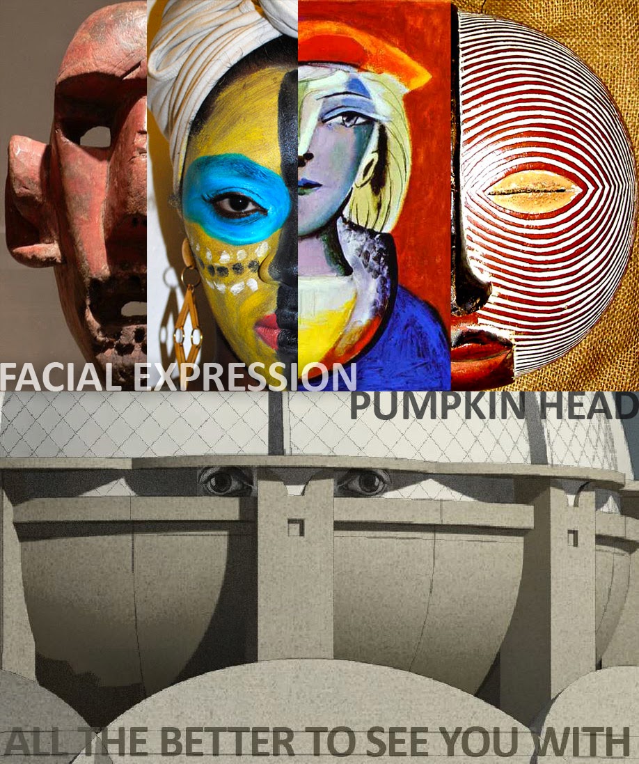
If we want that face, it will have to be highly abstracted. Think African masks. These made a major impact on modern artists like Picasso. Perhaps we can kill two birds with one stone. (Modernity & Facial Recognition)
![]()
![]()
![]()
![]()
I must also thank Arezoo who has been helping me to assemble a design report, to package up my adventure in the form of a book which will form the main part of my submission. For this post I will be taking snapshots from that report. I don't have time to continue recording my process step-by-step. Something had to give. So let's cut to the chase.

Our brief calls for a Museum of Urbanisation & Domesticated Species (MUDS), to be built deep amongst the virgin desert dunes of the UAE. Here we will celebrate, contemplate, cogitate the solemn mystery of how we gave up our wanderings and settled in mud brick boxes, packed together beneath the sun.
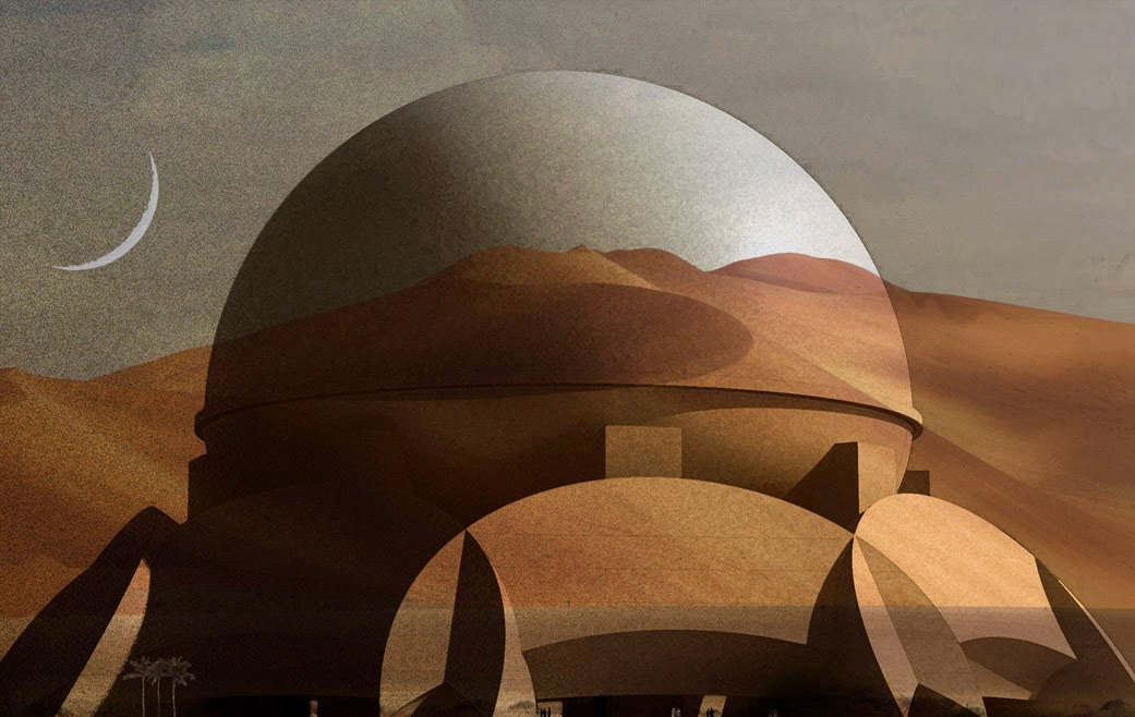
The pumpkin is a domesticated vegetable species, belonging to a family that ranges from tiny "patty-pans" to sagging giants, transported to competitive events by tractor & trailer. It provides a suitable symbol for the way we have made ourselves dependent upon agriculture, co-evolving with plant and animal species to the extent that neither we nor they can survive without the agri-business conglomerate which holds the world's ecosystems in its vice-like grip.
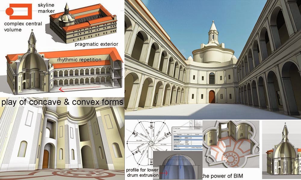
And so, in the tradition of Boullee and Ledoux, our building is built around a set of representational symbols: firstly the bulging lobes of a giant pumpkin, bursting with fertility, pregnant with the seeds of uncontrolled growth; secondly the crescent, a slice of forbidden fruit cut out to satisfy our bottomless appetites by the mother-goddess eve. (Environment Virtually Engulfed)

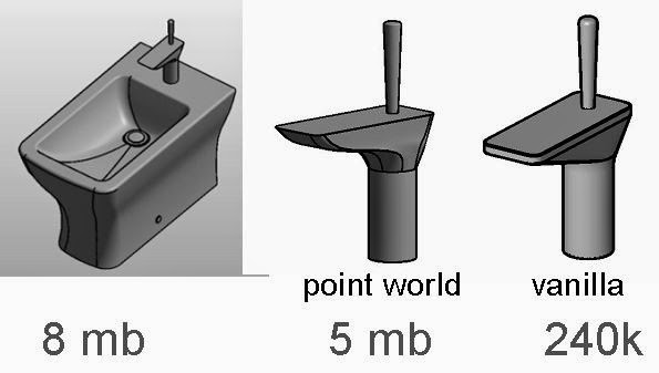
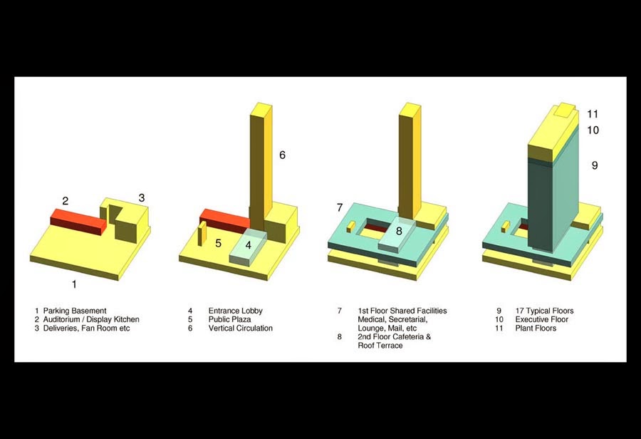
The importance of the inbuilt layout capabilities of BIM software is often overlooked. Two dimensional “design spaces” have enormous potential that is constantly exploited in every architect or engineers’ office around the world. It is hard to imagine design professionals holding a conversation without pencil and paper to hand.
Combining images with orthographic views. Rapidly scaling to life size and drafting over with notes and construction lines. These collage techniques, reminiscent of the early work of Picasso and Braque, can be immensely informative and save a good deal of abortive work if conducted at an early stage. 2d BIM. All good.

The gallery floors form a cascading sequence of curves sliding down next to an inclined plane of glass. (Solar treatment to be considered later but probably inspired by the musharabiya concept) A staggered array of escalators links the floors together in a continuous sequence

The appendices normally contain the latest set of drawing sheets, a coordinated set of plans, elevations and sections as required by the contract for the stage in question. In this case the drawing sheets date from the time when the massing family was fully parametric, just before the pumpkin eyebrows and other “modernizing” elements were added.
Primarily they record a staged exercise in comparative design options. Nine versions of the design are laid out and systematically analysed in a 3x3 matrix.
On one axis: Number of segments 8, 9 & 10
On the other: Overall size Small, Medium & Large

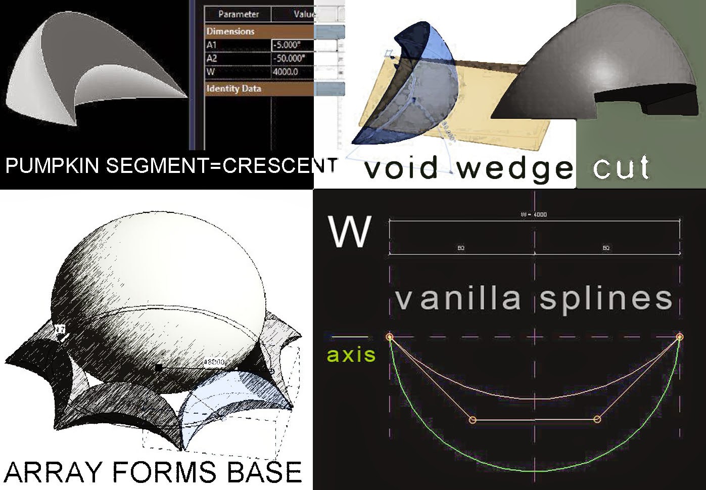
Time to turn the dome into a pumpkin. We will consider the parametrics involved in this exercise during the next section. Here we focus on the double dome strategy. There are multiple justifications for this. It is in fact a time honoured way of resolving the conflict between internal and external requirements that occurs in almost all domed buildings.
Structurally this approach is very beneficial creating adequate depth for a well triangulated supporting framework. Thermal performance will be enhanced, and voids always come in handy wherever mechanical services are involved as they surely will be here.
Our software tools can generate camera views quite effortlessly. For someone who has been through the process of laboriously constructing perspectives by hand it is embarrassingly easy. But blending digital outputs and processes to create an evocative image requires the human touch: experience, skill and a fair sprinkling of intuition.
Technical wizardry is only as good as the creative thinking that it enables.
This perspective image is helping us to think about the spatial relationship between the research facilities in the basement, and the display and event space above, between the ground plane and the underside of the bowl.

Moving on. How does the building feel at closer quarters, a visitors approach? What is the drama of the welcome experience ? We envisage planting: crop research beds, fruit trees, date palms; perhaps a series of long slow ramps leading down to the basement (not modelled) Parking and transport facilities have yet to be considered.
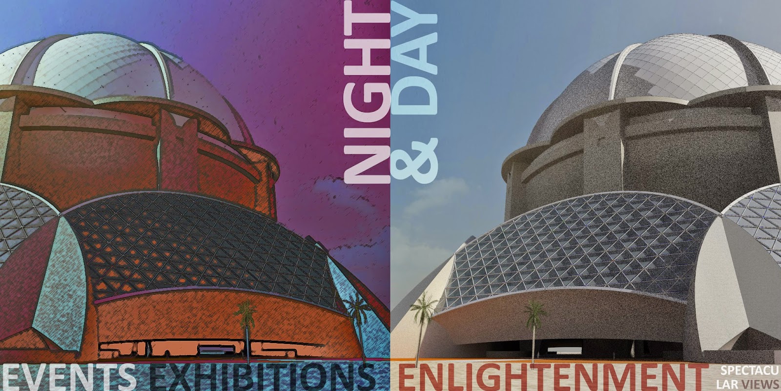

On reflection though we decided that our building was developing a case of schizophrenia. The lower levels have a decidedly modern feel. Dressing up the dome with traditional frills just isn’t going to work.
Also, we don’t have a face
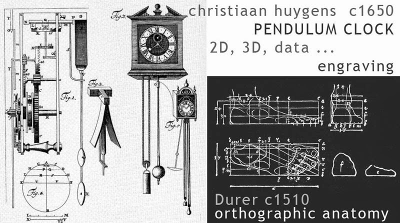
In the hands of renaissance men like Durer and Leonardo the pencil was a potent tool of discovery that allowed them to range freely between domains that we now call science, art and technology. The ability to construct virtual worlds using lines that converge at points on the horizon line must have been as game-changing in its day as the advent of BIM has been for us.
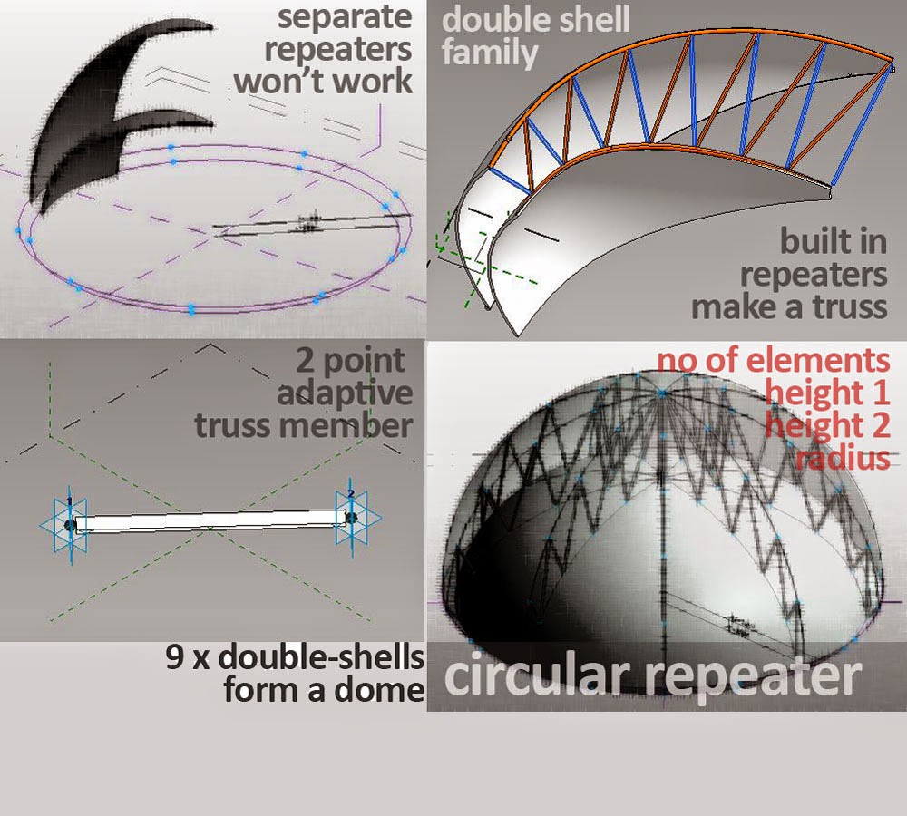
On this page we display some of the parametric gubbins working behind the scenes to create alternate versions of the auditorium bowl, plus a larger image of the world beneath that bowl. This is not a final presentation image, but rather a tool for thinking. In that sense it is no different from the dialogue boxes next to it.

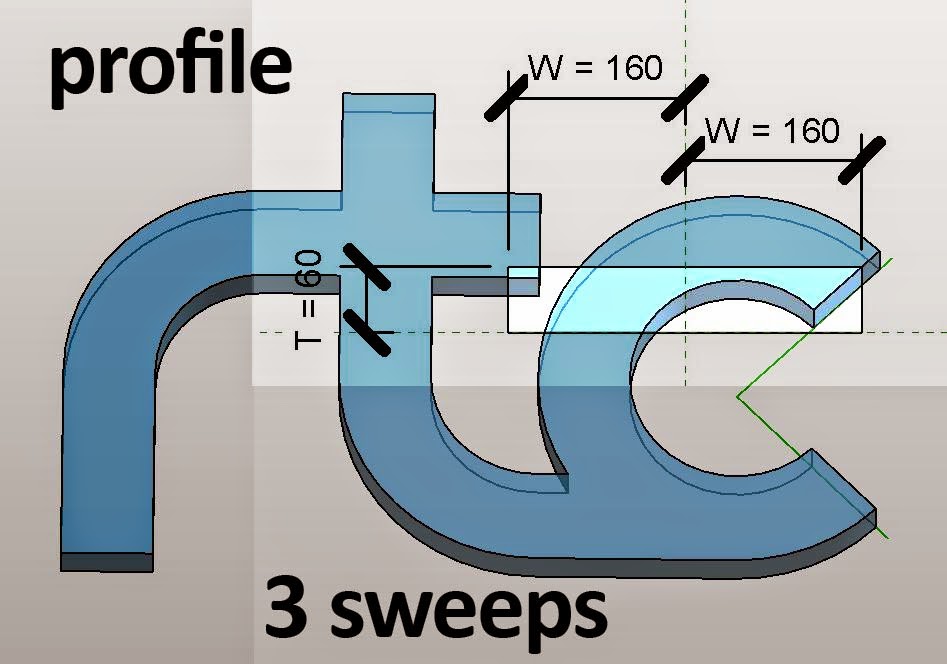
The cable cars that take our visitors from the rim of the bowl to the syringe-like viewing capsule have not been modelled. They remain in the flat world of 2d drafting and paste-up: “sketched in outline”. But the capsule itself is lofted from doric-pumpkin profiles, a throw-back to the original 2011 submission. Welcome back old friend, appearing for the first time as a 9-pointed star and gratifyingly easy to recreate from scratch.

So much for the report extracts. If you want more you'll have to buy the book ... or maybe just download it for free in a couple of days :-)
I'm going to sign off now with a rather strange image. I think I have been pushing the boundaries of what conceptual massing can handle. For example I started to get messages about "too many edges". Even more strange, in some of my camera views strange artefacts appear. The repeater components for my double-dome truss loom like apparaitions, displaced from their proper location in 3 dimensional space. You can see several of these skeletal ghosts in the image below. Interestingly enought, it only happens in realistic mode.

So that's it. I will be submitting later today. Hope you enjoyed the ride half as much as I did. Downloads of the final product will become available some time soon.
Cheers guys.