Quantcast
Channel: Shades of Grey
Viewing all 552 articles
Browse latest View live

BACK TO SCHOOL

$
0
0
This is a talk I gave in February at the 4th Dubai BIM Breakfast.  It's a subject very close to my heart: education, and the active role that BIM should be playing in teaching and learning processes for all students of architecture, engineering, quantity surveying, construction management etc.  You have to pretend that I'm talking.  Here we go with the opening slide.


Those who have seen me speak before may have noticed that I am significantly smaller than last time you saw me.  At the first BIM breakfast I invented the term "BIM addict" to convey my passion for all things BIM.  It was a light-hearted metaphor, but by then I had already realised that I had a more serious addiction, one that has become very common in the "developed world"  I have a psychological addiction to food.


This was my last ever serious session of substance abuse.  An "all you can eat" brunch.  What is that ?  These things ought to come with a health warning.  This is a representative cross-section of BIM users from GAJ, gathered to celebrate my 10 years with the firm.  A bit late, I'm about to reach 11, and it's almost 10 years now since we started our BIM journey.


I mentioned the "developed world" but perhaps we should call it the "overdeveloped world".  I think there's an interesting parallel here between personal addiction to food and global addiction to fossil fuels.

For sugar levels, bad chloresterol and hyperglycemia; read pollution levels, global warming and hyper inflation.  I have managed to turn my body clock back 10 years in the last 4 or 5 months, but I'm afraid it will be much harder for us to untangle the global issues.


 Turning back the clock a bit further, I went to an old fashioned English grammar school and 50 years ago I was a quiet, studious boy ...  But truth be told I much preferred subjects like Maths & Physics to say History & Geography.  Memorising facts bored me.  I liked the challenge of understanding principles and trying to apply them to novel situations. 


But best of all I liked Art, a subject where you had a blank sheet on which to create your own version of reality.  I especially liked learning by discovery, self-directed learning, active learning (as opposed to the old "transmission" model where the students are passive recipients of knowledge)  But there was one occasion when History came to life for me as a subject.  For some reason, our teacher ("Spot" Avery) decided to throw us the challenge of representing social processes in diagrammatic form.


Actually this diagram is a model, in the sense of a mathematical or scientific model.  It's an attempt to isolate the critical aspects of a real life phenomenon and represent them in a way that deepens our understanding.  Thats what BIM models should be.  Simplified representations that allow us to solve problems and make decisions.


I was good at Art and Maths so I decided to become an architect.  Left behind the coal-mining town I grew up in and headed for "swinging London".  And of course I was easy pickings for the spirit of youthful rebellion that filled the air in the late 60s and early 70s.  The diagram here is my take on education systems at the time.  A square box designed to turn diverse individuals into compliant little boxes ready for deployment in factories and offices.


Architecture schools are interesting places.  You are supposed to spend about half your time on taught courses (transmission) and half on "Design Studio" (discovery)  By second year I just stopped going to the lecture courses and spent all my time "discovering".  There was an interesting woman based at the Bartlett in those days, a psychologist called Jane Abercrombie.  You can find her in Wikipedia, but it doesn't mention the aspect of her work that is most relevant here.  She discovered that architecture students were remarkably adept at switching careers.  Compared to people who study medicine or education, they are much more likely to end up doing something completely different than what they were "trained for". 


That's exactly what many of us did.  We wanted to change the world.  We had been taught to analyse and solve problems.  So we went out looking for problems.  I took an interest in adventure playgrounds and drew cartoons for various fringe publications and I got tangled up in a building cooperative.  Suddenly the subjects I had found so boring in lecture halls started to get interesting.  Construction technology, theory of structures, environmental science all came to life in the activity and challenge of real building work.

So I spent most of my 20s learning to lay bricks, plastering, making wooden window frames, becoming fascinated by the way the old brick terraces of northern England had been constructed at the height of the industrial revolution.  I was still drawing, thinking in visual terms, but this became integrated with the practicalities of getting stuff done.


At the end of that period I was invited by some friends from my London days to illustrate a book about the squatting movement of the late sixties and early seventies.  This drawing is another model, a representation of a social process where a group of people took over a row of terraced houses and converted them into some kind of living, breathing experiment in communal living: knocking holes through walls, inserting new uses into spaces, arguing, negotiating, learning.


Then another sudden change.  I went to Zimbabwe to teach building at an experimental school and ended up staying there and spending my 30s working in education.  I taught building, wrote text books, trained teachers.  It was a very exciting period for me, pulling together my drawing abilities, my building skills, my interest in new approaches to education.


While working in the Curriculum Development Unit I took a part time course to train as a teacher.  The university couldn't handle the idea of a building teacher at the time, so I registered as a maths and science teacher.


One of the things that came up early on was this saying which is attributed to Confucius.  Of course this served to reinforce my own ideas about active learning, group work, and problem solving.  One of our maths education assignments called for us to make a teaching aid that encouraged problem-solving abilities. 

I chose orthographic projection, which just about makes it into the maths curriculum as part of geometry.  My teaching aid was made from matchboxes which I stuck together in groups of 3 and painted white.  This gave me a set of shapes which students could handle, discuss and draw.  There was a set of worksheets to accompany these shapes, designed to gradually draw them into the process of drawing elevations and plans in true orthographic.


We're not actually going to have an intermission yet.  This is just a reminder to me to get back to the topic before my time runs out.


How are we going to fit BIM into the curriculum ?  I will focus on architecture courses, but the principle applies to building management, engineering, quantity surveying etc etc. 

I did a quick web search and architecture courses describe themselves in very different ways, but beneath the surface the fundamentals remain the same.  About half the time is spent on generalised problem solving (Design Studio) and about half on taught courses (Content)  The content part includes building materials and processes, history of architecture, social context, theory of structures, environmental physics (heat, light & sound)


It's a packed schedule so fitting in another course on BIM is going to be hard.  But I think that's a bad idea anyway.  BIM shouldn't be a taught course, it should be a thinking tool to be used everywhere.  Take out your BIM pencils and get to work on this problem.

 
Just for fun I decided to convert my matchbox exercise into BIM.  I see this as a supplement to the original concept, not a replacement.  Students would still have the physical models and they would still be challenged to draw shapes on graph paper as solutions to puzzles.  But they would also be able to access the shapes on computer screens or tables or mobile phones even. 


So what does BIM add.  First of all it makes the teacher's life much easier.  Typically with BIM there is a bit more effort involved in setting up the first 2 or 3 views.  After that your productivity starts to catch up with hand drawing and ultimately you can generate new sheets in a fraction of a time that hand drafting or CAD could manage.

That's what happens with my worksheets.  Setting up the first one took a couple of hours, but after that, new permutations become child's play to generate.  (Child's play is doubly apt here)
The other interesting point is that if you click or tap on an individual matchbox, it highlights in all the relevant views.  This is a really useful visual cue for students who are struggling to make sense of orthographic and isometric projects. 

So let's look at BIM as a hands on teaching aid in the context of typical Architecture courses.  There is a myth that authoring tools like Revit are "no good for design".   Well it all depends how you use them.  If you treat Revit like a 4H pencil slavishly running along a straightedge, then your design work might be a bit stilted, but if you think in terms of 6B and freehand sketching you might just find that Revit has some useful features for exploring sculptural form.


It's all about fluidity, following ideas wherever they may lead.  By the way that's a genuine mistake in the image above.  Should be Oscar, not Felix, but they were both pretty fluid when it came to form finding, and they both used strong geometric generators to drive their ideas forward.  Which brings me to the courses that explore the ideas behind the designs.  "Form Follows Function" , "Less is More" all that kind of stuff.


Le Corbusier was a great one for elaborating the theoretical underpinnings of his work, and if you want to get beneath the skin of a building like his chapel at Ronchamp, there is no better way than modelling it using BIM.  It's a fascinating building on many levels, well suited for a design theory course.


The hand drawings were created for Bachelor of Education course for Building Teachers that I designed and operated for two years before changing direction again and returning to architecure.  On the right are my BIM versions of the same kid of thing: visual aids to help people learn about building materials and processes.  Some of these can be made by the teacher, but then I would challenge the students themselves to go out and observe building processes, sketch what they see and model some aspect of this using BIM software.

It's called learning by discovery.


I've shown this slide before.  I harks back to my love affair with the old brick terraces.  We don't aim to fill students heads with facts about how buildings are constructed today.  Rather we want them to understand why and how buildings have been built at different times and in different places.  That we they will have the skills to adapt to a changing industry, or a world facing a serious resource and endergy crisis.  What was good about timber sash windows ?  Why were they such a successful technology for two centuries and why did they so suddenly go out of fashion ?


I've shown this before as well.  Vernacular housing is always a fascinating subject for students to grapple with.  Is it sad to see rich and complex ways of life disappearing before our eyes ?  Why to people abandon thermally appropriate roofing technologies and substitute corrugated iron sheets that turn rooms into ovens ?


I would invite students to study a rich building tradition from a variety of angles and using all the tools at their disposal, including BIM.  My cousin lived in Kathmandu some years ago and I took the opportunity to pay a visit.  This was early on in my personal BIM journey and the models I started to make when I got back have been sitting around half-completed for several years now. 


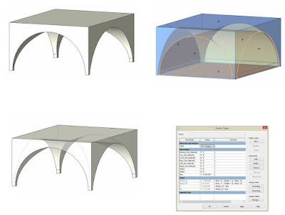
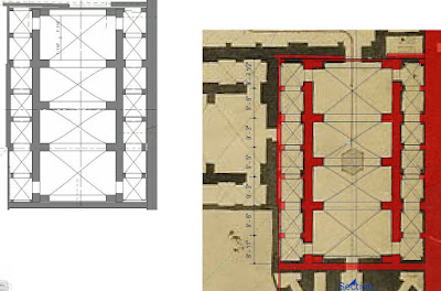
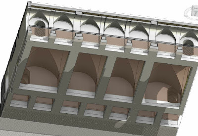
Urban design crops up in most architecture courses.  Cities are the context for most of our work and we need to think deeply about how they work, and why they sometimes don't work.  I have never been to Rome, but my BIM pencil has helped me to explore its rich and varied history in ways that no other learning aid could possibly rival.  You could make a physical model, but that would take 10 times as long, and where would you put it ?   You could use a generic modelling programme, and miss out on all the embedded data and true orthographics that BIM has to offer. 

 
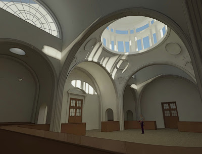
I'll finish with this shot from my own recent design work.  The Desert Pumpkin.  It's an imaginary project and an attempt to showcase the potential of parametric processes to generate and develop design concepts.  It's the kind of thing that architecture students could be doing for their thesis projects. 


So please, don't make BIM into a course.  Don't make a long list of topics and then subject your students to a series of lectures.  Bad idea people.  We need an integrated approach. 
Create opportunities, set challenges, encourage your students to make the BIM pencil a regular feature of their problem-solving tool kit.  Let them use BIM for research, for design, for theoretical studies, for analysis.

Seriously.  Don't use aversion therapy.  We need all the BIM addicts we can get.


FORMIT FASCIO

$
0
0
One of the last sessions I attended at RTC Chicago was about Formit, and I came away full of enthusiasm to sign up for the beta testing now that the web-hosted version was up and running.  But then I saw some really interesting buildings on the long way home.  Robie House, De la Warr Pavilion, Hawksmoor's Limehouse Church ... then the next thing you know it was the Desert Pumpkin, couple of BIM Breakfasts, AUX Dubai, family xmas ... and come January we started on serious overtime at work.

So I didn't get very far with Formit until last Thursday evening when I decided to attempt a quick massing model of Casa del Fascio, a fascinating building that I got to know by means of Revit explorations.

Sneaky Fascist Peek

Driven to Abstraction

A Tale of 3 Buildings

Playing Chess With Terragni


Of course I had to go down a few blind alleys.  Made the mistake of starting in Internet Explorer.  It seems to work, but after a while you realise that lots of bits and pieces are missing.  Then I messed up with one of my arrays and picked up an extra bay along the front facade.


None of this is very accurate.  I was trying to do it half from memory ... simplified and abstracted ... improvising on a theme rather than replicating the original.  Mostly it was a vehicle for getting to grips with Formit.  So I started again in Chrome, and then in Firefox.  Works much better :)


Everything is very different from Revit and it's many years since I worked with the dreaded Sketchup, but after a while I started to remember the logic of push-pull cardboard modelling.  Groups were frustrating at first, but after a while I got the hang of it.


You can save a Formit sketch locally, which is fine, but when you save to A360, the heavy lifters up in the clouds do their stuff and create an RVT for good measure.  In the background of the next image you can see a monster lurking.  That's an import ... basically merging two Formit files (I think)   A couple of years back I did some posts where I was trying to find a way of doing spiky buildings in Revit.  Forms that are easy to make in Sketchup, but then steadfastly refuse to come into Revit as solids.

Drawing the Curtain

Curtain Call

More Bermuda Triangles

SpikeyStuff


Well it seems to be child's play for Formit.   I made an irregular extrusion,  then triangulated it up by drawing lines and push-pulling end points like a madman.  Save to the cloud, download the RVT and Bingo!  You have a mass family containing an import instance.  You can go ahead and explode this and apply a material parameter if you want.  It takes mass floors without a complaint.  What's more you can do some more adjustments in Formit, save, download, open family, reload into project ... mass floors update to the new shape.


So that's my first serious attempt to do something useful in Formit and I'm feeling pretty positive.  I'm sure there is much more to come from the developers and certainly I have more to discover and skills to hone.  Also it's going to be important to figure out what to do with it.  Where are its strengths ... when to stop and switch over to "proper BIM", how to optimize the interaction between the two rather different worlds (aka "concept design" and "detailed development")

QUICK & DIRTY

$
0
0

This blog is suffering from serious neglect.  My usual style of posting takes so long.  Let's try to do something fast.

It's Ramadan (in case you didn't notice) Got home early last night and consequently up with the lark and into the office before 7.  Decided to do a quick blast on Formit.  (Bit by bit, build up my fluency)


Fired up the map and headed for Great Zimbabwe (feeling homesick)  Hit Import Satellite Image, adjust the location slightly to centre on the Great Enclosure, down in the valley, and off we go.  Better set units to metric, and since I need to draw very loose splines, better switch "snap to grid" off.


Draw two splines, roughly sort of parallel.  Important to note that you get one chance to draw it right.  No adjustable nodes to fiddle with the line afterwards (like in Revit)  This is a different world.  Forget parametrics, think quick and dirty (like this post)  The minute you close the loop it becomes a surface.


Flip to 3d (we were in plan ... the only other choice) select the surface and drag it up.  You can type in a height if you like but I'm just guessing it anyway, so proceed to repeat the procedure for more curvy walls.  It would be nice to make them slope in, but I couldn't figure that one out.  With regular shapes it's easy, (just grab an edge and move it) but these walls are actually made of lots of little facets (you can see them as little orange dots when you hover over a surface)  Let's move on.


The famous conical tower is hidden in the trees, so I decided to try loading another image. 


This turns out to be pretty easy, just need to use a bit of trial and error to adjust the size.  Then you can also play with the transparency.  As far as I can see it just comes in centred.  Can't push it around afterwards.  I'd probably have to recrop the image to get it's position closer to the satellite image.  Let's work with what we have.


I made a material with an image I had on file.  Not really seamless and it maps rather strangely to irregular shapes.  The cone is really wierd.  Probably looks OK from a disgance though.  I tried out jetpack mode for the first time.  Despite its name this is primarily the "look around" tool I was ... looking around for, last week.  Just move your mouse and swivel your head around 360 degrees.  Space bar does the actual jetpack thing.  Sort of playing kangaroos.


So I ended up with a tolerable representation of my favourite National Monument (actually a really amazing place) and it took less than an hour, even as a stumbling novice.  It's great as a quick first look at a project in a specific location.  Eventually I will come back and model this in Revit.  Maybe I will have a second go in Formit first, just to help me strategise my Revit work.


Then came the write-up (at lunch time)  Here comes one of my other favourite "quick & dirties" : the snipping tool.  I used this for the screen captures as I was building the model.  Now I just reframe the ones I want to use and add some quick doodles to direct your attention.  Thick red pen is favourite.  Type up some text in notepad and I'm finished.  Back to work guys.

----

It's time to go home now.  Done my statutory overtime.  Can't resist one last image.  This is my son Joe, at Great Zimbabwe in 1994 wearing his famous Chicago Bulls outfit.  Those were the days.  He's a dad himself now.  How time flies.


CLOUD NINE

$
0
0
Sometimes odd little things just crop up.  I'm sure I knew about this before but it had slipped way below the radar.  "Measure along an element" combined with Tab returns the length of a chain of elements.  And into the bargain you get this quite impressive display of temporary dimensions.  Not sure what I would do with it, but more data is better (apparently) so lap it up.


Then I read this post about copy-pasting revision cloud sketches into detail lines.  SCRATCH PAD

I stumbled on this myself about a year ago, but haven't used it much.  Just occasionally you want to cloud something that isn't actually a revision.  Maybe it's a problem with the linked structural file, maybe it's just "we showed this feature two issues back but you seem to be ignoring it".
I was a bit surprised by the statement that you can use the cloud in a filled region.  Doesn't work like that for me.  You can paste the lines in alright, but all you get is the underlying polygon, no curvy segments.


But that led me to thinking, "what about a detail item".  This was quite exciting, I thought I'd discovered a hidden gem.  The curves came in perfectly and I even managed to get parametric scaling working. 


Sadly though, despite the curves being fully intact in family editor, they don't transfer back to the project environment.  It's just a rectangle.


Still, my mind was racing away by now.  Isn't this really a lot like a line-based detail item ?  So I quickly knocked one of those up and turned out to be surprisingly easy to get it working.  Put this back into my rectangular rig and reloaded.  It works, but something doesn't look right. 


That's when I realised that the in the revision cloud segments, the meeting point between the two arcs doesn't lie on the straight line.  No problem, this is also easy to set up.


Still, my little cloud was a bit too regular, so I threw in one of my false starts to mix it up a bit.  Also set up a parameter for varying the proportions of the underlying rectangle.


All very good, and the journey was fun, but when I stopped to reflect, I decided that just drawing directly in the project with the line-based family was going to be the most effective strategy.

 But by now my mind was wandering all over the place.  What about a two-pick family that defines a rectangle ?  So I set up a rather elaborate rig with angles to define the proportions of said rectangle and tried locking lots of my little "2_arc_detail items" in place.


Of course that was asking a bit too much.  Everything worked fine until I tried to change the angle, then it broke.  Probably locking families to families I thought (by mistake)  Easy to test, use the rig to drive a simple rectangular filled region.


That worked like a treat, so the principle is OK, but trying to lock 6 detail items each with 3 planes to be constrained was somewhat daunting.  How many retries would I have the patience for?  Wait a minute though.  Locking a rectangle is easy enough and I already made a rectangular cloud.  Just need to adapt that one.


This did the trick.  Changed the rectangle family from 4 segments to six.  Flexed it thoroughly.  Nested into the diagonal-rectangle rig.  Align and lock.  And it works.


None of this is particularly earth-shattering, but it was an interesting exercise in squeezing unusual behaviours out of family editor.  And along the way I came to realise what a neat idea the two-pick pair of unequal arcs was when someone on the original Revit team thought it up.  If only we could recapture the freshness of those early insights.  Wouldn't that be something ?

Oh yeah & I had fun with the snipping tool too. 

FACE OFF

$
0
0
I had the great pleasure to meet Stefan Larsson from BIM Object earlier this year at a meeting of our local BIM user group.

I want to start by saying that nothing here should be taken as a criticism of the splendid work that they are doing in pushing forward the BIM content agenda and raising the bar on an almost daily basis.  It's feedback: straightforward honest feedback from an experienced Revit user with a long-standing interest in promoting better sanitary ware families that are freely available to all.
I have commented on downloads from BIM object before, and there are other links which deal with related issues.  I will place these here in case you want to have a look.

how-big-is-your-toilet
duravit-in-point-world

I'm going to discuss the recently released Roca content.  It's a very exciting development, firstly because they are the first really big European brand to make serious BIM content available (I think) and secondly because these really are usable objects.  They stand up quite well against families I have made myself.

Let's get down to it.

First thing I noticed is that there is widespread use of CAD implants.  This is usually a bad thing of course, but there's something intriguing about the way this has been done.  Somehow the edges of the polygons have been hidden.  I think this has been deliberately done because some important edges have been left visible, and a few random edges have also slipped through the net.  The result is a surprisingly crisp 3d representation. 


I really don't know how this was done.  I suspect it was some tinkering within the CAD file itself.  It's interesting to note that one or two unwanted edges have slipped through the net. The effect is a similar in some ways to what you get when you explode an "sat" format solid.  But that's not what they did.  The CAD imports are still intact.

One of the big objections to imported geometry is the accumulation of layers that result within object styles, and sure enough this starts to happen.  I think I would have preferred to have just one layer per material, rather than one per object. (called say "Vitreous China - Roca")  Actually my own standard is to have a subcategory called "_Porcelain" which I use for all sanitary ware.  These days it's all white so you can control the render material easily via that one subcategory.


Coarse, Medium and Fine have been diligently applied in a consistent manner.  You only see the imports in Fine views.  Coarse gives you boxes, as you would expect, and medium displays typical clunky looking revit blends and extrusions that approximate the actual shape and size. 
Do I want medium ?  Does it actually help with performance ?  Does the extra geometry have a negative effect, bloating file size for no good reason ?  My jury is out on this.  I don't understand the performance issues well enough.  I can only say that it seems like a lot of effort for very little advantage.  More on this shortly.


I often find with bulk downloads that there is some inconsistency in the way families have been set up.  Perhaps more than one person was involved.  I don't know whether these were made by the BIM object team or whether Roca got someone else to do the modelling.  I'm not a fan of outsourcing generally and I shudder a little at the prospect of hundreds of manufacturers bashing out there content via the BIM sweat-shops that are springing up in some parts of the world.  It's going to be inconsistent and somewhat shoddy. 

The Roca offering does have some minor inconsistencies.  For example the plan views are sometimes masked, sometimes not.  Notice tiles showing through in the close-coupled WC. 


Actually this one is rather carelessly drafted.  The cistern is placed off-centre.  Also the two bidets are treated differently.  One has circles to represent the tap and the waste outlet, but the other does not.  Similarly with the two WCs: one has the seat down, the other doesn't seem to have a seat in plan view.


These are hardly deal-breakers, but if I was the BIM man at Roca I would be aiming to achieve a slightly crisper and more consistent set with the next release.
If you are going to include a detailed and faithful representation of curved sanitary ware geometry in your families, surely you want to allow some basic rendering and perhaps game-engine based viewing.  These families do have a good built-in porcelain material that renders well, but there is no way to apply chrome to the fittings.  Rather than having a separate layer/subcategory for each and every object surely it would be better to have one consistently named container for each material.  You can get a long way with just three (porcelain, acrylic and chrome) 


Another minor inconsistency is in the vertical origin placement and height offsets.  Most families have been made so that they automatically come in at the right height, but the corner basin for some reason has to be given a vertical offset.  The zero origin is actually the underside of the basin.  This doesn't make any sense at all.  The origin should be either FFL or the rim of the basin.  In other words, either you should give it an offset of zero to get the standard height, or you should type that standard height into the offset parameter.


While we are looking at elevations, I'm going to note that these use symbolic representation.  I agree with this approach for sanitary ware, but many do not.  It's amusing to see that the close-coupled WC is off-centre in elevation as well.  I don't think they make them like this.  If you are going to do symbolics, I would have included a masking region so that you can do proper internal elevations of your bathrooms.  We do those all the time.  If you prefer to see the tiles through the fittings (unlikely) you can always make them transparent.  You can even over-ride them to show as dashed lines if you like.  So include masking regions and let the end user choose.
The wall-mounted shower fitting is an interesting case in point.  The masking region in plan is shaped as if to hide the 3d geometry, which makes little sense since this is all turned off in plan views.  The result is a little messy.  Too many lines, all slightly misaligned to each other.


One small quibble.  Why not include placeholder taps in the families?  Having gone to so much trouble to provide accurate forms that render well, a glint of chrome would really help.  If it doesn't look like the tap I want, I can always swop it out, but most of the time a generic tap shape will do fine.

There are some taps, but supplied as separate families.  They are provided in the same way as the sanitary ware, with 3 separate versions of the geometry for coarse, medium and fine.  Does this make sense for such small objects?  The next little segment is just me thinking aloud with my BIM pencil, exploring some ideas about modelling taps. 

As supplied, the medium scale version is a little weird.  I felt that it could be handled more elegantly, so I replaced the sideways-on extrusion with a blend.  Somewhat better methinks.


The standard coarse scale "box" approach has always troubled me.  Seems just a little TOO crude.  So I experimented with something that actually resembles a tap slightly but is still just one simple extrusion.  That gives me a sequence from fine to coarse that looks much more sensible and useable to my eyes.  But is it really necessary ?  I think a strong case could be made for just having the fine version.  Most of the time we don't need 3d taps, and for those occasions when we do, why not use the real one ?


By the way there is a rather odd displacement of the various elements in this particular tap.  The coarse & medium scale versions, masking regions and 3d geometry ... don't match up when viewed in side elevation.  No big deal, just the modelling equivalent of a typo, but it does highlight the underlying problem that we all face in trying to manage all this "stuff" created by different people at different times which ends up in our models and has to be interpreted somewhere down the line by people tasked with procuring components at competitive prices and with assembling them on site.


Inevitably I got a bit carried away, imagining what I would like to have "out of the box" from Roca.  It turns out that my "medium" version of the bidet tap doesn't look too bad in a rendered view.  But what about the toilet seat.  Typically I keep these simple and closed.  There might be hundreds of them in the project, after all.  But what if it was just a one-off villa, or a detailed mock-up of a typical hotel room.  Maybe I want to show the seat down and the lid up.  Or maybe I even want an angle parameter that opens and closes the lid on an instance basis.  That was a fun challenge and turned out to be fairly straightforward.


Would be great to have an app that built these families for us at the click of a few buttons.  You choose the accessories you want and the level of complexity/detail that is appropriate to the project.  The supplier's software check's that everything is compatible, assembles a family and adds it to your project bundle read for download.  Perhaps the bundle is stored in a 3d environment that you can view on-line to check out how the towel rails go with the tiles and the bidet taps.  You wouldn't need any Revit skills to do this.  You might be a "designer" or a "client representative" who just wants to hand the complete bundle over to the BIM team.


One more image to show the quality of orthographic representation I would like to see.  I'm not sure who drew the 2d representations for Roca, but they weren't paying very close attention to the actual objects and they don't have the same eye for crisp drafting style that I was taught to admire.  Of course it's easy to criticise with hindsight and I have no wish to paint a negative picture.  Just take this as someone who "likes to draw" ... exploring the art of the possible.


Along the way I took a closer look at polygon edges.  Are these Roca objects doing something clever ? Or is it just a happy accident?  I wish I knew. But looking closely at various CAD imports I noticed that the edges that don't show up in Revit are also suppressed when opened in AutoCAD.  Furthermore, some of the objects that I took to be totally smothered in nasty visible edges were not quite so straightforward on closer inspection.  Take the swan chair that I downloaded from Fritz Hansen.  The edges that you see are quadrilaterals.  But these cannot possibly be planar.  Sure enough when you zoom in they are all broken down into two triangles, but all the diagonal edges are hidden.


One final thought.  Revit knows how to soften the edges of topography, which is actually just a set of triangulated points.  If only we could harness that capability and apply it to CAD imports within families, things like soft furniture and sanitary ware would suddenly become so much easier to do well.

I'm going to shift gears now.  That was a basic review from a Revit user; kind of a QC check to give some pointers on how to improve next time around.  Now I want to look a bit further forward and build on the ideas in my "it's the information stupid" presentation.

its-information-stupid

As the supply chain becomes more engaged in the BIM process, I would expect all sorts of new ideas to emerge.  These guys are developing new products all the time, updating product codes, tweaking fixing details, offering different accessories etc.  They have software that they use to handle various aspects of this process: keeping their inventory up to date, processing orders, whatever.  My belief is that step-by-step connections will be made between these internal processes and BIM workflows.  Manufacturers will find ways to push product information through more efficiently. 

Commissioning some guys to make a set of families manually is just step one of the process.  Putting them on a web site and letting people download them one by one is also just a first step.  It's not really the seamless flow of information we all hope for in "level 3 BIM" or whatever the ultimate workflow comes to be called.  I see the GPD plug-in (for example) as a first tentative step in this direction.


BIM is all about collaboration, teamwork, an integrated approach.  Sticking BIM objects on a web-site is not an integrated, collaborative workflow.  Don't we rather need digital enhancements to the kinds of support services that so many manufacturers and specialist suppliers already provide to consultants.
 
I see the current drive to persuade manufacturers to digitise their content as just a first step, a way to grab their attention, to get them thinking about what BIM could mean.  I would love to see more interactive, cloud-based environments where we could meet half way and set up a dialogue.  Places that some aspects of my design model could be linked to.  Places where I could hold digitally informed discussions with ironmongery specialists, for example.  Visually rich and responsive environments where my understanding of the needs and history of a particular project, and a trusted specialists wealth of knowledge about door hardware come together and explore various "what if" scenarios.  I call them CLOCO ZONES  (cloud collaboration)


Why am I still sending flat drawings to a lift specialist, or an ironmongery supplier.  They are dying to input their experience into my design process.  Why can't we do that in real time in the cloud ?  Is it so hard to filter out those parts of my model that are relevant to them ?  Are the Intellectual Property issues so much greater than the ones we already accept by sending them CAD files by email ?

I want to have an environment that I can link my project to and press the update button once a week or once a fortnight.  I want to engage specialist suppliers as early as possible in the design process and receive regular feedback and guidance from them as the design develops.  I want this to be at the level of linked databases that can talk to each other and display feedback in rich, visual formats.  "Here are all the fire doors in highlighted in red, the door closers are represented by green dots, notice that we have a problem in these two areas". 


Or let's say I have this guy who is really experienced at waterproofing landscaped decks.  Instead of just downloading a dozen material swatches, plus separate specification clauses and a bunch of 2d CAD details, to stick on my hard drive and have a look at later ... why don't we meet in the cloud.  I could link the relevant parts of my model to a space where he can put his specialist software tools to work to develop a proposal: hyperlinks to typical details and specs, preliminary quantities and costings ... all set up so it will be easy to update when my design inevitably changes in response to input from the client, the operator, the engineers, the landscape consultant.


It has to become dynamic and interactive.  That's starting to happen with the inner core of the design team, but out on the periphery we are still thinking in terms of "send me your catalogue".  All we are doing is breaking that catalogue up into a thousand separate BIM object downloads.  Which brings me to another point.  There are a few suppliers who aggregate their BIM objects into collections.  Very occasionally these collections include sheets which arrange the products into logical groups and use tags to display some of their properties.  There may even be one or two who use schedules to summarise this data in an organised way. 

It's not rocket science.  It's the way we are presenting information about building projects.  Why aren't we presenting product ranges in the same, integrated, intelligent manner?
So to conclude, let me repeat.  I'm not trashing anyone here.  I'm not even saying "I could do better", because I don't think I could.  All I'm saying is "I've got some ideas, we're all in this together, maybe you will find them useful, this is just the beginning, we could take it so much further, don't you think ?"

So to Stefan Larsson, Stephen Hamil, Daniel Hughes and thousands of other guys out there:  you're doing a great job, forgive my impetuosity, and keep up the good work.


THE WRONG QUESTION

$
0
0
I'm chilling out in New Jersey, spending time with my daughter and generally being lazy after a hectic RTC schedule in Washington.  I made a really good decision by deciding to attend the Building Content Summit which preceded the main event.  I've posted about the content issue many times on this blog and in the process my own views have evolved considerably ... to the point where I think "content" may be the wrong heading for a discussion of supply chain BIM.


The mix of attendees was really good and even though it came under the auspices of the Revit Technology Conference, Bentley and Graphisoft were given equal billing and made excellent contributions.  Hats off to the organisers for facilitating this and coming up with a great format for the day's proceedings.  Manufacturers, content providers and designers were all well represented, but perhaps we were a little light on contractors and owners/facilities managers.  I think this was probably good though.  Better to keep things relatively simple for the first version of this event than to attempt to be all embracing and end up lacking focus.  One neat feature was the live "recorder" who sketched out a visual record of the discussions blow-by-blow on a large white board.


My contribution was a short "rebuttal" on behalf of designers which was great.  I'm likely to present a somewhat contrary viewpoint in any case so I enjoyed being asked to do just that.  I think we have the horse befor the cart.  It's not about getting the manufacturers to supply better BIM content.  It's about using BIM processes to extend collaboration beyond the design team.  We all know that BIM is about collaboration, so why to we insist on using the metaphor of a "Content Supermarket"  Why have we decided to line canned "BIM objects" up in rows on virtual shelves up in the cloud ?


We already have well-established collaboration procedures.  Many manufacturers employ full-time support staff around the world to help the design team with product selection and to provide in-depth knowledge and experience in specialist areas.  In reality, manufacturers, suppliers and specialist installers were part of the design team long before we started using computers.  We already exchange drawings and schedules, hold brainstorming sessions, engage in collective decision making.  But sadly it tends to be a different "we".  While project architects and specifications advisors are collaborating the "old-fashioned" way,  BIM managers and head-office technicians are focused on the supermarket metaphor.   In other words we are engaging the wrong people using the wrong model.


The split between design and documentation pre-dates BIM.  It's been around for generations, centuries perhaps.  But as the technology becomes ever more complex, the rift deepens.  I think it's very dangerous and have tried to remain in the middle ground, somewhere between a designer and a BIM manager.  Sometimes it feels like there is no ground, out there in the middle: that I'm suspended above the grand canyon.  We need to build bridges, which is why I like to talk about this stuff.


Previously I've called them Cloco Zones: user-friendly spaces where designers and manufacturers can collaborate using intelligent 3d models.  There was a sharp intake of breath when I suggested this at the summit.  No way am I letting a manufacturer into my model.  But that's not what I'm proposing.  Middle ground is what we need, somewhere that's connected to the digital worlds on both sides, but with the control to push and pull only what you choose to exchange.


All along I've been using door hardware as an example of how this could work, and it turns out that Assa Abloy have already developed something along these lines.  I'd heard of this before, but not seen it in action.  They had a booth at the main RTC event (I'm pretty sure they weren't at the BCS) and gave me a demo.  I need to try it out myself, but my first impression is that it's a very positive step in the right direction.  This is not a trip to the supermarket.  Perhaps it's more like an afternoon spent at an old fashioned department store when you take your child down to get kitted out for school and are guided through the process by a helpful and knowledgable assistant.


In the afternoon we had rotating discussion groups: a chance for everyone to interact and let off a bit of steam.  Inevitably we have more questions than answers.  Too may standards?  Could ANZRS be a useful starting point?  What about mapping tools to allow easy translation?  Could we have a happy medium: standardise where we can and back this up with a robust set of tools for automating conversion.


The reality is that many people are working on the content issues, coming from different angles, using different paradigms, and with different motivations.  In the short term it's going to be pretty messy.  Content modellers and aggregators will continue to pursue the supermarket metaphor.  Manufacturers and designers will explore new tools to enhance collaboration.  Some eyes will light up with dollar signs.  Others will pursue "open-source" solutions.  Hopefully we will remain light on our feet, open to new ideas, ready to adapt to a changing ecosystem.

One closing thought.  Perhaps there is a role here for manufacturers associations.  Do we really need a separate app for every supplier of sanitary fittings?  Wouldn't it be nice to have a neutral collaboration space where we can compare alternative submissions, assess different proprietary solutions?  Wouldn't it be great if these spaces persisted into the construction phase and beyond?

BIM is all about digital support for decision making.  But decision making is a social process.  Collaboration is the key.  Better digital collaboration will lead to better digital content.  Let's not but the cart before the horse.


Download a version of my short presentation from the link below.

Rebuttal


PROJECT SOANE - A SENSE OF SCALE

$
0
0
Four weeks ago I dragged my son Tom around a bunch of John Soane buildings in London, taking photos like a nutter.  There are 3 churches, his tomb, the Dulwich Picture Gallery, his house in Lincolns Inn, and of course the Bank of England (what's left of it)  I didn't get around to Pitzhanger Manor or the Chelsea Hospital Stables, but I did pick up some books which reference these and other project that are either outside London, have been demolished, or were never built.


All this, inspired by Project Soane.  Look it up if you don't know.  I'm very excited to be contributing to this initiative which brings into the public realm ideas I have been banging on about for some time now.  In particular the belief that the BIM pencil is an amazing tool with applications way beyond what we do in our day jobs: education, research, publications, history of architecture, history of civilisation, lots of stuff that we have been doing with ordinary pencils since before John Soane was born in a village near Reading, son of a bricklayer, destined to rise to dizzy heights in an age of revolutions.


The next weekend was spent in Somerset, with my old schoolboy mates Ian & Al, plus other friends picked up over the ensuing 50 years or so in various parts of the world.  The 3 of us went to Barnsley Grammar School back in the ice age, or rather the "swinging sixties" and have had a passion for music ever since.  We have a band, affectionately known as the Barnsley Vista Social Club, which meets occasionally and gigs about once a year, basically when I'm in the same hemisphere as the others.


Down in Somerset we stayed at a place with definite sixties connections, pictures of Lulu and Engelbert Humperdink who stayed there when it belonged to a musician of the era.  The gig itself was in the village hall just across the road from where Al lives.  We had a brilliant audience, many with definite 1960s credentials, who got up and danced when I broke into my Howling Wolf impression.  It was a night to remember and we raised a surprising amount of money for Nepal in the process.  What a privilege to have shared my youth which such remarkable people.


For the last 2 weekends I have been busy with my BIM pencil, exploring the Bank of England as it was around 1830, when Soane retired, Napoleon was a fading memory and railways were about to burst upon an unsuspecting world.

I decided to start (as I usually do) by getting a sense of scale and an overview of the whole building.  Screen grabs from Google Earth and Bing Maps both give similar results.  Google Earth has a long scale bar that resizes dynamically as you zoom. Very clever, but perhaps misleading.  I don't think we can be so sure about the accuracy of the scaling of imagery that is assembled "automatically" from various aerial sources.  Perhaps Bing is a little wiser in just giving us a short bar with a rounded off value.


Fortunately we have a couple of plans that were drawn up by architects that followed Soane. (Cockerell was one) There are also dimensioned drawings for rooms like the Stock Office that has now been lovingly restored as the Bank Museum.  So I was able to do a cross-check on the overall scaling.  The result is my best guess at a filled region to represent the bank perimeter and the positions of the couryards and light wells that existed when Soane had finished weaving his magic.


I have deliberately set the two main corners at right angles.  Almost certainly this is not quite correct.  Life never quite lives up to these abstract ideals.  I'm sure Plato would have agreed with me.  We have no choice but to simplify.  There would be no point in trying to record every millimetre of deviation from an ideal plane.  The question at hand is "how much to simplify".  I have chosen to use right angles wherever possible.  Deviating by fractions of a degree is not something Revit likes to do.  We would be mad to attempt it.


Taking this discussion a step further, I felt the need for a grid.  This helps us to orient ourselves when jumping from plan to section to elevation.  I find grids invaluable in helping to minimise human error.  Revit has wonderful grid and level tools (best in class springs to mind)  Let's make use of them.  Feel free to argue otherwise.  Now is the time to hammer this out.

I have also chosen to space my grids at round-figure intervals.  The position of walls in relation to these grids will be subject to revision as we go along, but let's keep things simple if we can.  Perhaps we will decide to rotate one or two walls by a degree or two relative to the grid later on.  This may be the only way to make sense of window spacings for example in some of the internal courtyards.  But I propose to start by setting all walls parallel to the three sets of grids that I have prefixed with A/B, C/D & E/F (A being at right angles to B, etc)


I would have liked the angle between Princes Street and Lothbury to be 60 degrees (wouldn't we all).  Sadly it is not so.  I started with 61 but later adjusted this to 61.5 in order to make Tivoli Corner work.  It's a mission to rotate whole sections of the grid, so I hope we don't have to do this again, but you never know.

I am also assuming that certain sections of the facades are perfectly symmetrical with well defined mirroring axes.  We will get in an awful muddle if we don't do this I think.  Clearly that was Soane's intention which is more than good enough for me.


Similary the walls are at present defined in multiples of six inches.  Which brings me to the topic of units.  Most of the world works in Napoleans units.  Despite claiming to be the world's greatest democracy, the US cannot get past the Imperial System that it inherited from its former colonial masters who invented the Bank of England way back in 1694.  Soane of course also used this system, despite a certain admiration for Napoleon implied by items in the unbelievable collection of artefacts, paintings and historical relics that he assembled in his house, now the Soane Museum in Lincoln's Inn Fields.  Take a visit if you ever get the chance.  To say he was obsessed with the classical period and a man of the most remarkable energy and dedication would be a huge understatement.  Also his fascination with effects of space and light is brought to life here in a way that words or even pictures could never convey. 


At primary school with my mate Ian, I used feet and inches.  The metric system came upon us after we joined Alan at BGS if I remember rightly.  In my bricklaying days there was an overlap.  We measured brickwork in millimetres, but timber sizes still tended to be thought of in terms of 2 by 1, and 6x2.  Strangely in the UAE we still measure floor areas in square feet, even though everything else is metres and millimetres.  I am struggling a bit with my memory box, but it's fun to work in unfamiliar territory, kind of like playing the blues in A flat perhaps.  Unexpected insights.


There is a splendid drawing that was provided on the Project Soane site which has the perimeter wall in plan and elevations arrayed around.  Many of these are in pairs showing Soane's "before and after" vision for transforming the work he had inherited from the two previous architects of the Bank.  I cut and pasted sections of this as backgrounds for my 4 principal elevations and scaled them up as best as I could.  This gave me a basis for deciding on the vertical scaling.  After some experimentation I have settled on a figure of 25 feet for the height of the Corinthian Columns and Pilasters that feature all around the perimeter at various points.  This may well be wrong, but we have to start somewhere.


The stonework is set in horizontal bands with recessed horizontal joints and flush verticals.  Many architects have used this device, Wright for example was very fond of it, witness Robey House.  Using my 25 foot guesstimate, these bands would be spaced at 1' 4".  This can be easily checked (I'm embarassed that I didn't think of it when I was there)  Maybe I will ask my son Tom to nip down with a tape measure some time. 


I've done a few of these kinds of studies before. (Ronchamp, Casa del Fascio, Lever House, the Gherkin, Robey House, De la Warr Pavilion ...)  You can never nail things down 100%.  There are always little anomalies and discrepancies that I fail to resolve completely.  Photos say one thing, plans another, elevations and sections something slightly different.  The St Bartholomew's Lane elevation in Soanes drawing does not match the plan drawn directly above it.  He gives two elevations (before and after) but neither of them match the plan.  Clearly he changed his mind about how to modify the frontage he had inherited from Taylor.  I am following the plan, which tallies well with a historical photograph taken in the 1920s. 


Actually I am giving preference to the plan drawn by Cockerell. This is the one supplied on A360 and used as an underlay in most of the uploaded Revit files.  It's not perfect, but it seems to be the best we have.  The BIM pencil allows us to coordinate plans, sections and elevations with a precision that was unavailable to Cockerell, so I've made minor adjustments here and there.  Bear in mind also that even if he did become aware of discrepancies half way through the drawing process he would most likely have faked some of the dimensions rather than start the drawing again from scratch.  That was the reality we faced when we worked entirely by hand.  You took more care to get things right first time, but at some point in the process you were forced to accept the small errors that had crept into a set of drawings that might represent hundreds of person hours.


In the spirit of crowd-sauce I wasn't going to make the blind windows from scratch.  I had been using a simple rectangular recess, good for starters, maybe I will go back to that later on and represent the bank as a very simplified abstraction to show what we have learnt about the composition.  Some good work in the family I downloaded, but I needed to adjust the proportions to suit my assumptions.  Don't know for sure who's right on this, but I need to follow through consistently with the line I've taken.  Also the head and sill were not quite right on closer inspection.  So I gave them a bit more depth.  I'll come back to this again later perhaps (or someone else will grab the baton) but for now it does the job.


Another week has gone by since I started this post, so I need to wind it up.  My last image will be based on two photos I took at the Dulwich Picture Gallery on a beautiful sunny day at the beginning of August.

I think it's not too far-fetched to say that the red telephone box is a precursor to wi-fi spots, which is not to say that John Soane invented the internet, but there is a connection and it has to do with style.  Style matters to humans.  It mattered to our ancestors a million years ago when they made symmetrical flint axes and it matters to those who purchase apple's exquisite digital toys. 

Monuments use style to convey respect for past events and personalities. Soane had a thing about shallow domes with segmental pediments.  Giles Gilbert Scott re-purposed this stylistic motif to add dignity to the democratisation of telephony, which brings us back to the public telephone box: access to global communications for the man in the street, just like today's smart phones.


Important questions.  What was Soanes "style" all about?  How do we capture the essence of that style in a BIM model?  Why are we doing this in BIM (as opposed to visualisation software)?  What is the most appropriate level of abstraction/simplification?  Can we find a flexible approach to LOD ? (strategies for switching between levels of abstraction, swapping out components etc)  What is the balance between product and process? Showing off v learning?  Visualisation v Historical Analysis? Recording the past v exploring interpretations.

More to come, day job permitting.

For those who don't have access to Project Soane, and/or Revit 2016 here's a link to a PDF of my work so far.

Bank of England.pdf

JOHN SOANE & CANOPY DOMES

$
0
0
There's a half-finished post about my work on Project Soane from a couple of weeks ago that I may come back to, but for now let me skip ahead to what I've been working on this weekend.

I've been getting to grips with the interior layout of the Bank of England.  Just broad brush stuff: what was there when Soane was first appointed and how he renovated and expanded it over a period of 40 years or so. 


Then I started to home in on the series of banking halls around the Rotunda that he renovated in two major phases.  This work is partly informed by some old photos taken by Frank Yerbury shortly before most of the bank was demolished to make way for the current version.  These were on a DVD that I bought at the Bank Museum in early August.  Some of these spaces go by different names based on evolving usage.  I am using the names on these old photos which I find relatively easy to remember.


The photos are very useful because the drawings from Soane's office show the design in development and sometimes present conflicting information. I have been exploring this series of spaces as variations on a common theme.  All of them have central domes buttressed by 4 vaulted bays and 4 smaller spaces in the corners.  Like Soane I started with the Stock Office, which has been renovated to house the current museum. This was fitted into an existing rectangular space to replace a dilapidated existing hall.  He chose masonry vaults and domes to avoid the problems associated with the previous timber roof structures.


These halls were built, one by one, within existing shells, so I decided to model them first as Generic Model families: simple, quick massing studies to act as a guide to later work.  I wanted to resolve the major issues of scale and alignment before investing too much effort in detail. There are connections between the rooms that need to be lined up and interesting relationships between the various roof levels as they fit together like a jigsaw puzzle with interlocking light wells


I haven't done pendentives before in Revit.  Turns out they are quite straightforward.  Basically we are looking at a device for making the transition from square to circle: taking a dome and bringing it down onto 4 supporting columns.  There always has to be buttressing to deal with the lateral thrust, but the main wait is coming down on the corner columns.  It's clear from the drawings that the roofs are flat, so I made my pendentives from a box cut by a revolve.


In Soane's domes the centre of the dome is often well below the springing point leading to his characteristic shallow arches meeting the columns at an angle. That's how the Stock Office works.


But sometimes he has sufficient height to allow a full semicircle with the dome flowing down smoothly into the columns.  The colonial office is a good example.


So let's take a closer look at pendentive geometry.  I made a basic parametric family to illustrate this.  We start off with a revolve that creates a hemispherical shell.  Parameters for inside radius and shell thickness. Formula to add these together for the outer radius.


Now set up a reference planes to define a square.  We're going to use these to control a void in the form of a square donut.  This will cut away the sides of the dome creating 4 arches and 4 point supports.


To complete the picture we need upper and lower cutting planes that can also be varied parametrically.  I've set this whole thing up so that the cutting planes are controlled as fractions of the dome radius.  That way, when you type in a new radius the whole thing scales up while maintaining its basic shape.


The end result is a family with 5 instance parameters that can change its size, an vary between a full hemisphere and one of Soane's relatively flat "canopy domes".  So much for basic dome theory.
A set of pendentives can be used to support a simple dome, or a dome on a drum, or lightweight lantern which is what we see at the Bank of England. In the stock office he uses decorative steel brackets to support the lantern roof, shallow arches at the sides, and groin vaults at the ends which allow for steel framed clerestory windows above the corner bays.  These corner bay receive additional daylight from circular holes cut through the ceiling.


To the left you can see a doorway that leads through to the Old Shutting Room which was the next space that Soane rebuilt, once again fitted within and existing shell of perimeter walls.  You can see from the way that Soane places 4 columns around each of the corner bays that he is not relying on these older walls to carry any load.  Everything can be taken down to new foundations within the interior.


The same strategy is used in the Shutting Room.  The door in front of us is the one we saw before coming from the Stock Office, while the one on the left leads to the Consols Transfer Office which is part of the extensive North-East extension that Soane built over the next few years.  This has already been modelled in some detail by Russell Fuller Hill, an excellent contribution which helped me to build a simpler massing model.


You can see my take on the CTO on the left in orange.  This is again a Generic Model Family, but nested within a link so it can be easily swapped out with Russell's version.  That's the strategy I'm aiming towards here, a series of modules with different versions that can be loaded and unloaded depending on where your focus is and the processing power that you have available.


I haven't gone into as much detail as Russel.  No need to duplicate his efforts, but by standing on his shoulders and with the benefit of the old photographs I think I have been able to progress our understanding of what was actually built.  For example the arches that connect the side bays to the corner spaces are lower in my version.  Russel had followed the majority of the drawings, but the photos suggest that Soane made a late change and one drawing (which I think is a record of progress on site) seems to confirm this.


The photos suggest that the design for the casing to the columns was also changed, simplified down to a single recess with a Greek key moulding for the capital.  These are all subtle changes, but show an ever thoughtful architect reflecting on his design and making late adjustments.  The lower arch in particular has practical implications in that it keeps the crown below the springing point of the arches to the corner bays so that these can have a simple arched ceiling rather than the groin vault originally envisaged.


With some reluctance I have rotated the Consols Transfer Office and the Shutting Room by 1 degree.  This is to line up an axis from the rotunda, through these two spaces to the apse at the end of Lothbury Court.  This also brings the CTO closer into line with Cockerell's plan which we have chosen as our common base and from which I developed my guide grid.  For the moment I end up with double walls with wedge shaped cavities in some locations. 


I think it's important to make the connections between the rooms fall in more or less the right places, and to maintain the most obvious axial alignments.  I am intrigued by this aspect of Soane's work: how he adapted to the difficult angles he inherited and created spaces that may look slightly awkward in plan, but would have flowed quite naturally and regularly as a walked experience.

It also strikes me that the CTO does not have full columns up against the perimeter walls, like the previous two banking halls.  This suggests that the walls themselves are loadbearing, which is logical enough given that this is a completely new extension.  These are the kinds of insights that I believe justify the use of BIM on a historical research project of this nature.  Revit makes you think like a builder.


And as an ex-bricklayer, I do hope I can find time to model the construction of part of one of the roofs over these vaults and pendentives.  The drawings show "crop walls" which I would have called "dwarf walls" and spanning over them "York Paving" slabs, which is basically the same material that I saw used for the floors in the reconstructed Stock Office.

 Was that the final finish?  What about waterproofing ?  A roofscape photo shows sheet metal on a portion of flat roof around the lantern, but this could have been added later. 


Oh and the three black holes at the end of the CTO in the drawing ?  I'm quite sure these are skylights in the ceiling of the passage leading towards the Consols Library, which is directly behind the exterior screen wall and therefore has no windows.  It was accessed via half a dozen steps at the end of the CTO. 


They would have been very similar to the ones in the Stock Office, probably covered with a small octagonal lantern like the one you can see in this photo that I took from inside the museum.  It's a bit washed out, but clearly visible.


UP ON THE ROOF WITH MR SOANE

$
0
0
This is a bit of detective work that I did while modelling the lanterns of Soane's banking halls at the Bank of England.  There is an old photo that claims to be the lantern to the Old Shutting Room and I thought it might be interesting to recreate it with a camera shot in Revit.


I was interested to know what the other lantern was, behind and to the left.  The church spire is clearly St Margaret Lothbury, which I photographed on my recent visit.  One of Wren's many City churches I believe. 


I tried to line this up with a candidate space for a dome/lantern, but the nearest fit I could find is the Power of Attorney Office, represented here by an orange pole.  The problem is that this is a semi-circular space.  Doesn't look right to me.


Even worse, when I slotted in Russell's CTO as a link, its lantern popped up into view to the right.  Definitely not matching the photograph.


So then I followed a hunch and took a shot from behind the Stock Office, looking past the CTO towards the spire.  Near perfect match.  What is more if you peer through the dirty glass in the photo you can see the arched window of the CTO, and even more telling, the steel brackets of the Stock Office lantern. That's clear enough for me.  Wrongly labelled photograph, it happens.


If I am right then we have a photo of the exterior of the CTO lantern.  From the interior shot of the same age this appears to be glazed.  Is that dirty glass that we can see?  I think it must be.  The Stock Office on the other hand is clearly covered in sheet metal.  And we know that it had a plastered ceiling, from the photographs and from the reconstructed version.

 
By the way, the pitched roof in the background is the Consols Library, which is the orange roof in the foreground of the next picture.
 

This really is a fascinating roofscape.  I definitely haven't unlocked  all its secrets yet, but the pieces are starting to fall into place and it's much more interesting than I had imagined.  You can see why he was keen to impose order to the whole complex with his exterior screen wall.  It really is quite a hodge-podge, and I haven't even started adding the chimneys which you can see in the photograph and deduce from the many fireplaces in the drawings and interior shots.  Of course they had coal fires, all the buildings did, hence the famous London Smog.

I'll leave you with this thought.  The Bank of England is starting to remind me of a box of toys.  When my kids were young we had these large drawers on wheels that went under their beds.  Just gather all the toys up from the floor and wheel them away for the night.  Soane created this cool, suave, exterior screen, a neat and tidy box to contain the chaotic collection of toys that the bank had generated to house its activities over a century or so of piecemeal growth. 

Weekend beckons, let's see what I can come up with :)
 

ASK NOT WHAT PROJECT SOANE CAN DO FOR YOU

$
0
0
This post is directed at all those who have registered for Project Soane but not yet contributed anything (except maybe a like or two).  Perhaps you are having trouble deciding what to make.  Maybe you feel intimidated by some of the "advanced" contributions that have been uploaded so far.  You shouldn't be.  This is "crowd sourcing".  It means we need a whole bunch of people to get actively involved. 

My goal is to suggest a number of relatively small, self-contained tasks suitable for an "average" Revit user, which would also be valuable contributions to the project.  I am hoping that I will then be able to incorporate these elements into the larger assemblies that I have started to rough out.


For example over the weekend I spent some time improving the external screen wall that I had mapped out in outline 3 or 4 weeks ago.  There are a number of decorative elements that need to be made as families, such as the urn that features at Tivoli Corner.  4 feet high, one revolve & one extrusion.  Maybe include a material parameter. 

Download the image below, bring it into family editor, scale it up & trace over. Upload the results to Project Soane.  Half an hour max.


There are other elements that have already been made, but at present are very crudely represented using placeholder families.  It would be great if a few of you would volunteer to create versions of these at a higher level of detail.  Doesn't have to be perfect, just a little bit better than what we have at present.  Baby steps will get us there if everyone pitches in.  For example there are  two entrance gateways along Lothbury.


Three families here that need work, ranging from very simple to intermediate.  There is a parapet element that is used repeatedly, right around the building.  It may be two curves, crossing to form a kind of groin vault, or it may be more like one of Soane's canopy domes.  It was drawn both ways and maybe both types were used.  Old photos aren't a sure guide either because the parapet was raised some time after Soane's departure.  I think we should make both versions.


If you have a little more time to spare, there are parapet elements based on scrolls and shells.  There is a variant on this that wraps around the curved corners also. 


Then there are the gates and doors: at least one in each of the 4 elevations.  Along Lothbury we have two, almost identical gateways: the bullion entrance and what amounts to a tradesmen's entrance.  Sometimes these are shown as solid doors, sometimes as wrought iron gates.  The bullion entrance has both an inner and an outer gate.  Perhaps we should show the outer on as solid, and the inner as wrought iron.


Another very simple one is the key pattern that runs around as a frieze on the entablature along Threadneedle Street & Bartholomew Way.  I have estimated the size and drafted out the geometry of the basic repeating module as shown in the next pic.  Two extrusions, one half the thickness of the other will do the trick here.


I have dropped a simplified placeholder in place at present.  I made it as a generic model family then nested this into a baluster.  Then I defined a railing type with these balusters spaced appropriately.  You can now draw straight and curved runs of the pattern with consummate ease.  In the model I used the "pick" option to draw the path and selected the flat face of the wall sweep that we want to host the frieze.  That worked fine.  You can still adjust the endpoints of the path to get the pattern to start and stop where you want it.


There are lots more elements that need family development.  Different parapet treatments on the Princes Street facade for example.  Just open up the model from Project Soane and take a look.  Lots of stuff in there that needs work. 


In case you are wondering where some of these reference images are coming from, I downloaded them from the Soane Museum Online Archive.  There are links in the Project Soane Wikipages that take you there.  Literally hundreds of drawings for the bank are available here.  They are not quite as high res as the ones provided in the data folders, and take care because many of them are early studies, not the final design.  That said, it's a fantastic resource.


I am totally hooked on this mission at present, but unfortunately also very busy at work.  (I shouldn't complain, it pays the bills :)  So I don't have time to model all this stuff and my major focus is on trying to tie everything together, resolve dimensional issues and fine tune alignments.  Why not lend a hand ?

A couple of people have made really major contributions in terms of modelling some of the internal spaces.  But if you don't feel you have the time or the skills to tackle something that big, there are many, many smaller elements which you could contribute to the project.  I hope these suggestions will help.


So that's where I am with the exterior.  By the time you read this I should have uploaded the latest version.  I like this image because it reminds me of an architectural model.  Soane was a great one for making architectural models of his proposals (see bottom left)  Also note that the current balustrade details are very different from Soane's version.  Herbert Baker lopped all that off and just ran a simple balustrade around. 

Perhaps that makes sense in terms of easing the transition to the giant wedding cake he was asked to place within the perimeter, but Soane's treatment has much more charm, don't you think ?

JOHN SOANE WAS HERE

$
0
0
As I was preparing the latest model for upload the other day, I decided to locate it in the City of London.  I'm talking about the Location tool on the Manage tab in Revit.  It takes you to a mapping service where you can drag a map pin from Revit HQ in Boston Mass to somewhere else on the globe.  Not sure if everyone gets the same service, but I noticed mine was Bing Maps.  I rather like the axo projection this brings up when you zoom in. 

What surprised me a bit was the octagonal lanterns and barrel vaults in the South East corner ... almost like Soane's treatment of the last two banking halls he built.  But looking closely it's not quite the same.  This is Herbert Baker paraphrasing Soane.  The proportions and alignments are not quite the same.


Having set the location I might as well do a solar study.  You can check this out on A360.  Drag the sun around and see the shadows move, reading off the time and date as you go.  Lots of circles in there (rotunda, 5 lanterns, compass directions, the sun of course ... and why not throw in the old Bank logo too ... bit odd the way the spear point slices England in two ... what do you think Ian ?)


When you think of it, Soane's bank was kind of like a Medieval Town: organised chaos within a perimiter wall.  And when you look at Soane's drawings it's obvious that the screen wall was built like that ... even had a walkway going around that the night watch could patrol.  Apparently they had a room full of pikes for these guys to carry, "just in case". 


Looking at these drawings brought me back to the parapet ornaments that I am hoping someone will model.  I wanted a better image to stir the troops into action and it struck me that maybe I had seen them in one of his other buildings that I photographed a few weeks ago.  And yes, there are a couple of variations on that theme in the Dulwich Picture Gallery, apart from the phone box at the back.


His church opposite Gt Portland Street underground has rather a fun variant with pineapples on sticks coming out the top.  Better not say too much about those in case I slip on a Freudian banana skin.


So moving on to his other churches and guess what ... more variations on the same theme.  This is starting to remind me of the planters in Frank Lloyd Wright's Chicago projects that I studied a year ago.  Interesting how architects get fixated on a favourite little detail and worry it to death over the years.


Speaking of death, there it is again on the tomb that he shared with his wife and eldest son.  Tragic that he saw them both buried there long before his turn came around.  Quite a few interesting variations here if you look carefully.  Wouldn't it be fun if someone made a series of parametric families to capture these different interpretations of a round-headed ... what is it anyway?  Bit like an acroterion, but not quite.


And of course there are his two homes, town and country, both of these had to have them.  I think the ones dotted all over the frontage of the Museum are pretty close to what he used on the Bank actually.  Take that as your model.


So we are back to Threadneedle Street (the old lady) and a little collage from the hugely impressive archive of drawings that Sir John left behind for us.  Maybe it would be nice to get this "whatever it is" 3d printed, sell them as "John Soane Paperweights"  Would have to scale them down a bit of course, the originals are 2' 1" square (cubed perhaps)


And finally I have to give a shout out to Sheikh Uduman, a member of our local BIM User Group who has stuck his hand up and contributed 3 families in response to my appeal.  See how easy it is ?  Why not throw something into the pot ?


So that's it, lumps of stone that our hero left around all over the place, as if to say "John Soane was Here !"

THE CONTINUING SAGA OF JOHN SOANE

$
0
0
Another weekend of following my nose wherever it leads.  I'm going to start with the Stock Office, which is where I ended up.


This is still a Generic Model family, inserted into my base model. My last couple of hours was spent studying the desks/counters and quickly knocking something up to represent them.  These and the doors help to bring the space to life a bit more.  Lots of work still needed though if you happen to have an hour or two to spare and can use Family Editor.


I really should have dropped a person or two in there.  I was thinking that our friends over at Archvision ought to give us RPCs of Wesley Benn and Jim Balding in their C18th costumes from the RPC Gala Dinner.  They would surely look quite at home in John Soane's world.  How about it Randall? 


The desks themselves are quite interesting.  Looking at the snapshots I took and at the available drawings, the sloping-top item up against the wall (where clerks would presumably pore over ledgers taken from the cupboards below) is clearly built as a table with legs front and back.  You can only see the front leg in the photographs, but the plan layouts show matching back legs. 


Perhaps we have go too used to the idea of using walls to help hold up our built-in fittings.  Maybe our technology for drilling and fixing to walls leads us towards a different approach.  Anyway, at the moment I've just built the top and the legs.  It's a parametric family.  Type in the length and the number of leg-pairs, Revit does the rest.  Doors will have to come along another weekend.  Or maybe someone else will volunteer to make some.

There is a rather splendid version of the Stock Office uploaded by Alberto Vilas Blanco flying the flag for Spain.  I have enjoyed exploring this, and was fascinated by the modelling of the foundation system.  These are basically vaulted cellars with inverted arches bracing the feet of the piers so that the whole thing resembles a cellular raft foundation. 


I was inspired to knock up a quick version of this in one of my placeholder families.  Happens to be the Dividend office, which is the last in the chronological series of banking halls on a common theme.


A good portion of my weekend was spent updating and elaborating this, and the Colonial Office, also dating from Soane's late period.  I had acquired better reference material since I first modelled these, so there was a need to adjust some of the dimensions.


Both these banking halls use high barrel vaults either side of the main dome, which provides an interesting variation on the underlying theme.  One spin-off is that it allows him to make the columns flow seamlessly into the arches on all sides.  Previously, the lower sides required a change of angle, hence his hint of a capital to mark the top of the column and separate it from the arch.  Here though there is no capital, nothing at all to show where column ends and arch begins.


The continuity of the fluting in these last two spaces is almost Gothic in its effect, like the ribbed columns that soar up to become fan vaulting in medieval cathedrals.  Still lots to do here also: the counters with their curious light fittings, the decorative plaster work, elaboration of some of the families I have roughed out, like the Ionic Columns used to support the lantern.


Imagine for a moment that you had spend 40 years of your life gradually massaging a rambling building complex into a coherent whole: repairing, rebuilding, extending.  Think of the pleasure you might get from revisiting a favourite theme repeatedly at ten year intervals, trying out new variations, mixing and matching. 
It must have given him a lot of pleasure.


In my view, BIM is the ideal medium for this kind of historical research.  Yes we could model the elaborate classical detail more easily in a visualisation programme like Max for example, but BIM combines 3d modelling with the power of true orthographic projection, it reveals relationships, asks questions, demands an integrated, multi-faceted approach.


So I spent some time updating 3 of the 5 banking halls and along the way, apart from the foundations I also got to understand the roofscape a little better.  You can begin to see that the lower portions at the 4 corners which allow the semi-circular windows to let light come flooding in, actually link together like a maze of spaces threading across the building.


Also they are just about the right level to link up to the walkway that runs around behind the parapets of the screen wall.  In fact it seems to me that they help to connect these sections of walkway, especially at the corners where I previously thought that the circuit was interrupted.
Imagine being on night patrol, wandering through these canyons with a whale-oil lamp and a pike, peering down at times through those windows with their various shapes, or through the octagonal lanterns that Soane sometimes used above a porthole in the ceiling.


Another great thing about BIM is the way levels of information are added in a series of layers, gradually building up a fuller picture of how the building works.  At first it may seem to be slow going, but rest assured that the informative power of your model will grow exponentially.  And of course BIM is all about teamwork.  Which begins me right back to the beginning of the weekend when I loaded the 3 families contributed by Sheikh Uduman into my model, bringing the parapets to life.

They are very effective: simple and lightweight but with just enough detail to enrich the model.  Perhaps we will develop more complex versions eventually, plenty of scope for more people to participate, but for now these are very effective. 


As I close with two exterior views that show how nicely the model is shaping up I just want to mention that the muted colours and lack of photorealism in my images are deliberate strategies.  Soane did use rich colours at times, but as a rule his architecture is measured and restrained.  Indeed he was often criticised by contemporaries for the austerity of his designs.  I want to capture something of that proud aloofness as I tell my tale "The Continuing Saga of John Soane".


STOCK OFFICE FIREPLACE

$
0
0
Would someone like to spend an hour or two upgrading my fireplace family ?  I have made a placeholder which I believe is the correct size, and I have reference photographs taken earlier this year. 


There are also drawings downloadable from the online archive which show not only the fireplace, but also the flues leading up to the roof, and the cleaning arrangements in the cellar below.


I will be uploading these resources to the Stock Office folder on A360 so anyone who is registered for Project Soane can download them and take a shot.  I think this is quite a good place to start because it's a splendid example of Soane's style: classical in inspiration but simplified and abstracted to the point of looking quite "modern".


It makes use of standard Soanian devices: circle and square, incised parallel lines, muted and neutral colour scheme.


There is a version of this fireplace in Alberto's splendid model of the Stock Office, but my photographs weren't available to him, so the results are slightly different.  For all I know, his interpretation is more historically accurate, but personally I find the design as photographed more convincing, and more in keeping with the interior of the Stock Office as a whole.


So if someone would like to model this up, I would be most grateful.  I have a million other items on my to do list.  (seems like it, anyway)

BULL IN A CHINA SHOP

$
0
0
That's me.  Plugging away at my current hobby horse.  So my eyes fell on Tivoli Corner, and first of all I had to do a quick job on the amphora.  Actually it's fine as it is for most purposes, but my perfectionist side was peeping through.  If you look carefully at the handles the curves are not quite smooth.  To be fair the same goes for Soane's drawing :)


There is a wonderful tool in Revit's drawing set that is often overlooked.  It's in the middle of the second row, and it's called "Tangent End Arc".  That's the secret to drawing smooth curves with consumate ease.  Just keep going and every curve will be tangentially to the previous one, absolute magic. 


I also fixed it to have a square base which is the usual thing, and is visible in my site pics.

But what I really wanted to tackle was the Bull's Head detail from the freize.  This only features at Tivoli Corner, in fact the friezes on either side don't even have the key pattern, quite plain.  Makes for a nice contrast, which I'm guessing was Soane's intention.


Once again I'm looking for a simplified abstraction that will do the job at coarse to medium scale.  And it's a sideways extrusions cut be void extrusions drawn from the front.  After that we add some eyes and nostrils simply by editing the sketch for the sideways solid.  Then the ears are just tubes: an extrusion sketched in front view.


This family will attach itself to a planar face, but it doesn't do so well on the curve, can't pick up the tangent properly.  That's OK we just place them on a horizontal work plane, nudge the first one into position, then array this radially. 


In fact this is a wonderful setting for Revit's dynamic array feature.  I know there are 4 items between two columns so I just set the second column as the end of the array and type in a number 4.  Then you can just type in a new angle and a new number of items.  Rotate the whole array about its centre point as required.


Which brings me to the attic.  I quickly knocked up a placeholder family for this.  You can see it in the perspective above.  It's lacking in detail, but we have some fairly good reference material.  Here is a presentation drawing that Soane had done.  Notice there are no vases on the curve.


Then there is a very grainy photo which does have vases on the curve.  Did Soane do this, or were they added later ?  The current ones are definitely by Baker, he made a lot of alterations to Tivoli Corner.  But the grainy photo predates his work.


For the attic itself we have a pretty good drawing.  I used this for the placeholder family and it's still embedded in there in case you want to pick this item up and run with it. 


Here is a shot of the family geometry.  I didn't get much further than this.  Just started addin a sweep, but it's very crude.


Here is the study sheet that I did for the whole process.  You can see there is a garland between the bulls heads that also needs to be abstracted / simplified and incorporated as a family.  Any volunteers ?


CECIL R.I.P.

$
0
0
Earlier this year, a dentist with more money than sense shot a lion in my home country.  Also this year, my daughter took a trip back home to attend a friend's wedding and stayed at a game lodge where she was able to take an early morning walk with a live lion.  I know where my sympathies lie.


So this post is dedicated to Cecil, and to African wildlife in general, what's left of it.  It's basically an exercise in abstraction.  All our models are abstractions and it pays to be more aware of this than we often are.  We have to simplify, to make choices about what to represent and how to represent it. 
What is the model for ?  How will it be used ?


This model exists for educational purposes.  It's a research exercise.  I'm doing it because I'm fascinated by the history of buildings and the people who made them.  So I am modelling very simply at first and adding layers of detail as I start to understand more clearly what Soane was up to.


There is a frieze that runs around the exterior.  On two sides it contains a Greek key pattern, one of Soane's favourite themes (he had a few).  On the moulding above this there are lion's heads at intervals, looking almost as if they could be water spouts, but clearly not.

I want to make a very simple, native Revit placeholder family to represent these.  My starting point was to make a callout from the front elevation and gauge the size.  Another callout from a section view adds information about the third dimension. 


One annoying thing about Revit.  You can't just draft stuff in the project and copy-paste it into family editor.  There are workarounds of course, like copy-pasting lines drawn in sketch mode.  In this case I'm happy to take a screen shot and drop this into family editor, scale it up, good enough.


I settle on a side-on extrusion to represent the forehead an mane.  Then a blend, drawn in plan, for the snout.  After studying this for a while I decide to add eyes (void extrusion) and a mouth (sideways
void extrusion)


That's it.  Make it work plane based, load it up and place.  There is one above each column.  These are arrays, so I can nest a lion into the group.  Most of the pilasters are embedded in families, so I can also nest my lion's head in there.  Just a bit harder to get the placement right, but trial and error works for me.


Maybe you like it, maybe you don't.  But look at it in context.  It's a small item on a broad facade.  Even when you soom in on the parapet it's difficult to make out much detail.  Too much modelling and it will turn into a black blob.  I think it's about right.  We could always add an embedded CAD object that only gets turned on for really close shots.


If you feel you can do better, that's great.  But please try to keep it lightweight and able to be used in a 1:100 elevation (or 1/8 inch to a foot as the colonials have it)  What I would really like you to do is to take the principles I have just demonstrated and model some other useful stuff for Project Soane in a similar manner.  As you can see, it's not that difficult really.


SEQUENCING SOANE

$
0
0
I spent most of the weekend creating a series of diagrams that explore & explain the extraordinary 45 year journey that John Soane undertook in his quest to transform the Bank of England from an ad-hoc collection of disparate parts into a coherent whole.


This was my 3 day journey, taking an assorted collection of source material and organising in to make it more useful and accessible to myself and to others via Project Soane.  In the process I once again deepened my understanding of Soane's achievements at the Bank.


He inherited the work of 2 previous architects.  George Sampson had built the central block some 50 years earlier and Soane respected its simple Palladian style.  It had inhabited a deep, narrow site in the middle of a city block. 


A 3 storey gatehouse led into a courtyard revealing a single large rectangular Pay Hall at the far side: a triple volume space with 3 stories of subsidiary offices behind. Behind this were outhouses and cellars where gold was kept.  Deliveries to this messy backyard area came down a narrow winding lane from the East.


Then came Robert Taylor, a stone-mason & sculptor turned architect whose death created the opening for Soane.  It seems that Soane was not impressed with Taylor's contributions.  First of all the bank bought out the rest of Threadneedle Street to the East and thereby secured exclusive rights to the deliveries lane.  Taylor built a high screen wall to close of the two exposed sides of this roughly square block of land, a somewhat stiff and pompous affair with lots of columns & pediments but no windows. 


Behind the screen he jammed in a solid mass of banking halls, 4 of them arranged around a central rotunda whose interior space was inspired by the Pantheon in Rome.  These rectangular halls were top lit with elaborate timber roofs and multiple domed rooflights.  It's difficult to see how the waterproofing could have worked, and apparently it didn't.  Soane took over a collection of rotting timber roofs supported on a forest of columns.


The bank expanded rapidly and soon took over the rest of the street to the West.  Taylor enclosed this with a matching screen wall, but behind this the treatment was rather different.  Here he built banking halls on two sides, creating a pleasant open courtyard.  Closing this off on the Northern side was the Court Room Suite, essentially the corporate board rooms where the Directors would meet to discuss serious business.


Behind all this was a triangular yard, another back-of-house space for left-over bits and pieces, including the privies.  Right at the back of the original plot Taylor jammed in a couple of extra structures including a 3 storey library, presumably lined with shelves full of ledgers, records of a century of doing business, and a chief cashier's office. 


The bank was in the business of borrowing money from anyone with cash to spare and passing it on to the government who spent it on warfare.  Their core expertise was to manage funds responsibly, pay dividends on time and earn the trust of lenders and borrowers alike.  England was clawing its way to the top of the pile and the bank's contribution was essential.  Clearly they were very good at what they did.


Soane's first 2 or 3 years were spend tinkering and learning, building mutual respect, formulating strategies.  The directors had a new man, perhaps more like themselves than Taylor had been: self-made, hard-working, meticulous; but also bold and imaginative, not afraid to chart a new course.
Apart from minor repairs and alterations he built some new structures in the triangular yard behind the Court Suite and a screen wall along its outside edge in a far simpler style than Taylor had used.

These were modest efforts which were to be swept away over the next 20 years or so as the Bank continued to expand, but for me they seem to be crucial testing grounds for his ideas.  Here we see the first tentative statement of 2 major themes that informed his later work.  Firstly the screen wall, classically inspired, but simple and understated: horizontal in emphasis, with liberal use of parallel incised lines.  Secondly a rectangular hall, top lit with a central circular lantern carried on pendentives; plains surfaces, sparsely decorated.


I am calling everything before Soane "phase 1" and these first tentative steps "phase 2".  Phase 3 is where John Soane hit his stride.  Between 1792 and 1795 he rebuilt 2 of Taylor's banking halls and refurbished the Rotunda, as well as surveying the remaining properties at the rear of the Bank.


The Bank Stock Office is seen by many as his crowning glory, or at least the quintessential Soane interior.  Would he agree ?  It was heavily criticised at the time and later on his work became more conventionally classical and more richly ornamented.  Was this a loss of nerve?  Perhaps, but I think it had more to do with the budget available and the type of space being designed.
Just as the Bank was able to tailor its instruments to all comers, from wealthy investors to the man in the street, Soane could design anything from a stable block to a palace and adapt his style to suit.  Nevertheless the Stock Office is a remarkable achievement, more so being the first in a series and fortuitously the one that could be recreated in situ.  Luckily its name is also straightforward, as is that of the Rotunda.  The third space in phase 3 is harder to label.  The words "old" and "new", combined with 3 & 4 percent, are applied to the remaining 3 banking halls in different ways at different times, along with optional terms like "dividend" or "reduced annuity", leaving me completely baffled.


Frank Yerbury, who took photos in the 1920s just before the bank was demolished used more distinctive labels.  I have adopted these so as not to go mad.  Therefore the third space is the "Shutting Room" and it seems a little nondescript: basically a copy of the Stock Office but with some of the more distinctive features removed. 


Gone are the lunette windows in the 4 corners and the insistent ruled parallel lines.  Loss of nerve?  Tight budget?  Deliberate downplaying of a secondary space?  I know not but they are interesting questions.

Phases 4, 5 & 6 represent the bulk of Soane's journey at the Bank: 40 out of 45 years.  By the time he had finished there was little left of Taylor's work and Soane had left his imprint on almost every part of the Bank, both inside and out.  I had not initially realised how much of the 1833 Bank belonged to Soane, nor how fascinating the story behind his Odyssey would become.


Are we only interested in the well-known spaces: the photogenic banking halls?  Are we here to showcase our skills as architectural modellers?  Do we aim to dazzle with detail?  Not me.  I am an architect first, and a modeller/draftsman second.  I am doing this to better understand the design principles informing Soane's work, to unlock a narrative deep within.  It's a whole, made of many parts, with intricate cross-connections in time and space.

One weekend has helped me to put this into perspective and to organise the available reference material as you might order a century of banking records on numbered shelves in a Consolidated Library.

There is a PDF for those without Revit 2016.  Some of the images will not be very clear but it gives a good overview.


Why did I use Revit to create a container for jpegs?  And why are my diagrams all 2D drafting?  Well it's an experiment, a work in progress, a brdige towards future modelling, a shortcut ...   Assembling images on a drafting view in Revit facilitates simple dimensioning studies.  There are always discrepancies and some of the dimensions are difficult to read, but that's part of the fun.  It makes me think, ponder, puzzle, interpret, learn.


Ultimately, placing all these images in a Revit container is much more powerful for me than just keeping them in folders.  I can zoom, pan, annotate, overlay, rearrange ... and at any point in time I can launch myself into 3d at a moment's notice.

So I hope this will make the resources more accessible to us all and I hope some of you will be inspired to create more stuff and upload it.  Most of the images come from the Soane Museum online archive, which is a wonderful resource.  I hope I haven't broken too many rules by incorporating them into my own compilation.  The copyright is theirs of course.  Thankyou, thankyou, thankyou Soane Museum for being there and for continuing the work that he started.


There is so much to model on this project.  I do hope the work can continue for much, much longer and that we can persuade some schools of Architecture to get involved.  I really feel that we have barely scratched the surface so far, but for me at least the experience has been mind blowing.
Without BIM I never, never, ever would have come so far in just a few weekends.  So thankyou also to Autodesk, to HP, Nvidia, Case, cgarchitect, RAMSA & of course the museum. 

Whatever happens going forwards, you have enriched my life.


ERRATUM

$
0
0
It's in the nature of an exploration to ask probing questions, propose hypotheses and reflect on the outcomes.  Upon reflection, I have decided to harmonise my numbering system with that used on the Project Soane website. 

It was interesting to explore my own approach to classifying the phases of the Bank's development. but ultimately I aim to be part of a crowd-sourced effort.  Get with the program.  Democracy rules.  All that stuff.   So I have updated my Revit file and the diagrams now look something like this.
 
 
I am not going to modify my previous post (too much effort)  Let it remain as a record of my thinking processes.
 
 
Further to the above, I think my broad brush overview hat has served its purpose for the moment and I will probably get down to some hardcore modelling next weekend, hammer the screen wall into shape.  Still looking for people to help out with families though, so for those who have already volunteered and those who are still "thinking about it" ... now is the time to stop dithering (goes for me too) 
 
I think we know enough to now model the external façade in more detail.  Let's get to it.

DOWN IN THE DUNGEONS

$
0
0
Soane's father was a bricklayer and died while John was still quite young.  Like many self-made men he had high hope for his own sons, too high perhaps.  He seems not to have know how to accept them on their own merits.  The older son, John, was plagued by ill health and died young.  George was a rebel, gambled, ran around with the ladies and spent some time in debtors prison.  Has father refused to bail him out and the two never reconciled.  It's a sad and very human tale, brought to mind by my work on the cellars at the bank.


There are several drawings that show these and they were quite extensive, storing items as diverse as gold and coal as well as forming a firm foundation for the structures above.  I was inspired by Alberto's splendid model of the Stock Office substructure to make my own attempt.


What I had not realised at first was that there are very substantial walls running north-south.  Behind these run a series of square compartments, seven on each side.  In the middle are 4 much larger rectangles.  All these spaces are covered with groin vaults.


It was easy enough to make the arched openings. Note that these have arches both top and bottom so as to be  fully braced and stable.  The bottom arches are eventually covered over with backfill and the paving of the cellar.  There is a very nice drawing made by one of Soane's pupils showing these lower bracing arches during the construction process.  Perhaps we should go back to the practice of having young architects sketch site activity by hand.  It's a wonderful way to learn and understand.


I decided to make a parametric groin vault.  My maths proved too rusty to derive the formula for the radius and I had to look it up.  There are two radii of course, both derived from the same rise.  It's a fairly successful family, but not quite perfectly stable.  There are variable extensions on all sides and it breaks when these get too small.  If someone wants to pick it up and improve on my efforts I would be very happy.


It would be nice if the extensions could go right down to zero.  Sometimes you need arched extensions at the sides, sometimes the groin buts right up to the wall.  Actually when I think of it, there are normally extensions on two sides, but not in the other direction.  Probably we don't need the bottom extension either. 


The compartments at the side effectively form long corridors accessed from the central space by doors in the corners.  Sometimes there are archways leading into adjacent spaces.


For me this was time very usefully spent.  I now have a much more detailed understanding of the foundation systems being used in Soane's day.  I haven't yet attempted to model the voids in the floor that formed part of a Roman-style heating system.  Don't fully understand this to be honest. 


Also, I am showing the whole floor as stone flags, whereas it appears that the sides where the clerks worked behind the desks had timber decking, installed over the brick vaults.  I assume this was seen as a friendlier surface for the staff who were in there day in and day out, whereas the stone flooring in the centre would cope better with public traffic: people coming in and out all day with wet and dirty feet perhaps.


One find day I will extend this treatment to the other banking halls and beyond, but it's not the most urgent task on my list.  One thing is puzzling me though.  At present the stock office floor is 3 steps higher than the vestibule.  This shows up very clearly in my photographs.  But was it like that in Soane's day ?  I am starting to think maybe not.  Perhaps there was some technical reason why they needed to do this when they reconstructed the Stock Office. 


As far as I can tell, Soane's drawings show all the banking halls interconnecting on the same level.  I'm going to throw in one last screenshot of those dungeons.  I have to say that they are much more exciting than the foundations we build today.  Something very satisfying about the close packing of the bays, almost like plant cells or even soap bubbles.


Drawing to a close now, I managed to push the Dividend office a little further.  No glass in the windows yet, and there are supposed to be paired caryatids up in the lantern, but you get quite a feel for the space, and the free-flowing curves that he managed to achieve in the last two banking halls.


And here's a cutaway of the Colonial Office, showing how it relates to Taylor's entrance vestibule and to the screen wall.  It has the same flowing arches, but the semi-circular windows are treated differently and we have Ionic columns instead of caryatids up on high.


This was all done a couple of weeks back.  I uploaded the file recently.  The plan is to focus on the perimeter next, try to bring it up to much higher level of detail.  But you never know what will happen once my BIM pencil starts wandering.

LOTHBURY

$
0
0
OK, so the plan this weekend was to do a serious upgrade on the Lothbury facade.  It's
taken me a while to really get to grips with all the source material and understand
how the building works, but by now it feels like an old friend so it's a good time to
start filling in the detail.


I started on Thursday night by turning the various sections of the facade into links. 
There are pros and cons to this of course by I decided to bite the bullet. One of the
benefits is that different people can check out different portions for a couple of
days and work them up.  On the down side it means that internal walls will not join to
the perimeter.  It's not a problem when junctions are square, but in our case there
are lots of odd angles at work.  I came up with a solution that I had never thought of
before.  Probably it's old hat, but I was quite chuffed with it at the time.


Basically I created a new wall type, very thin, maybe half an inch, formed a join at
the right angle, then pulled my thin wall right back to the internal angle.  You get a
sharp point one side and a little splay in the internal corner.  I guess in some
circumstances you could use a different material and make it look like an isolation
joint.


So when I started on Project Soane, I had no idea about the "secret passage" around
the top of the screen wall and the troop of 30 soldiers who would turn up every night
to patrol the battlements.  Now it is all falling into place, and what seemed to be
rather eccentric parapet embellishments turn out to be sentry boxes, placed at
convenient intervals to give the guys a bit of shelter on a rainy night.  Not that
I've read about this anywhere, but it's perfectly obvious once you model things in
detail and pore over the drawings in the online archive.


My first challenge was the tradesmen's entrance, which is where the guardsmen would
enter the premises each evening.  This was built as part of the NW extension somewhere
around 1805 and opened into a courtyard where Soane built a new barracks to replace
the one he had built more than a decade earlier when the Bank's backyard was much
further south.  This is an almost identical copy of the bullion gateway he had
designed for the NE extension.  Flanking the gate are two Antae (columned recesses)
Above each of these is a sentry box with an elaborately scrolled roof, and between
these a high wall at the back.  This is necessary in the bullion gate to hide the
upper storey of the Porter's lodge, but in the tradesmen's entrance it's just there
for the sake of symmetry.

So I've set all this up, and you can see the route where the soldiers patrol, but it's
all a bit crudely modelled.  No point in getting into detail until you understand
what's going on.  For example, it's only this weekend that I understood that the
scrolls were extended back over the full width of the walkway to form roofs over
sentry boxes, and that there were archways passing through, all the way along.  You
can actually see these arched openings in a couple of Soane's sections, but I didn't
grasp the significance at first.


The corners of the sentry boxes have pilasters and there is a detail showing the
moulding profile.  So I scaled up this image and traced over the profile.  Notice the
undercut below the overhang to get the rainwater to drip clear of the wall face.  You
can see Soane's trademark abstraction of classical form in the parallel ribs and
grooves. 


The scrolls themselves were donated by Sheikh Uduman some time ago and have done
excellent service, but I've made some adjustments to the curves based on a more
careful reading of the source images.  And of course they project back much further
and I've added some ribs in the depth of the section.  I only have the grainiest of
photos to go on for this so it's pretty schematic.


Either side of each sentry box is an antefix.  These are normally placed on the eaves
as if to stop tiles from sliding off.  Previously I had just placed another of Soane's
"telephone box" items that march around the parapet at intervals, usually aligned
above a column or a blind window.  The antefix is a bit similar but more pointy, and
directional.  Also the plinth it stands on is more elaborate.


One family that was really fun to make is a recess with a moulding around the edge,
sort of like a picture frame.  This is used many times: sometimes projected sometimes
flush, once as part of a pilaster.  It's a simple, parametric, face-based family, that
works a treat; very satisfying economy of effort.

So we move on to the gateway itself.  I did the fanlight first.  Wrought iron, quite
delicate looking but simple enough.  To me it reflects Soane's debt to the Adam
brothers whose work he admired.  Here of course, Revit's dynamic radial arrays come
into play.  They really helped me to fine tune the setting out without having to keep
drawing thing again from scratch.


The doors are typical Soane.  Multiple panels, almost flush with lots of domed studs. 
I came across lots of variations on this design during my short tour of his London
works.  The current gate is very different (also in a different position by the way)
Baker lacked Soane's restraint, very fluent designer and prolific, but a classicist in
a different age, when modernism was already in full flower on the continent.  I
digress.


This whole feature projects forward slightly.  I managed to capture this fairly well
in Revit.  You can also see the archway into the Sentry Box here.  Gives a sense of
scale.  Baker recreated these Antae fairly accurately and subsequent restoration of
the stone has been pretty faithful over the years. 


See how the pilasters wrap around the corners.  I've captured this now, but not the
detail on the capitals.  I think the recesses are shallower on Baker's wall.  Probably
the whole wall is thinner.  No longer needs to support a walkway around the perimeter.
 So there isn't space for the base moulding at the back, which you can just see
peeping through in one of the old photos.


The other major feature I worked on is at the centre of Lothbury.  This is placed at
what used to be the Junction of Princes Street and Lothbury.  It's the hinge point
where Soane had to duplicate his facade, doubling the length to take hime to Tivoli
Corner.  There are many surviving studies where Soane struggled over how to do this. 
Some of them show a slight change of angle.  In the end the solution is quite simple
and he managed to persuade his client to keep the whole frontage straight.  A few
square metres lost, but ultimately a much more satisfactory layout.


There is a drawing in the archive of a moulding that is described as "The working
drawing is for the base of a column, probably that of the blind portico on Princes
Street." going on to suggest that the note on the drawing itself must be wrong.  It
wasn't till this weekend that the penny dropped.  This is the moulding for the base of
the centre feature on Lothbury, drawn at the time when the street junction was here,
not where it moved to AFTER the wall was built.  So I'm rather confident that the title on
the drawing is quite correct. "Base & Surbase to the Pedestals at the end of Princes
Street & Lothbury."  It matches up perfectly, which becomes obvious once you model it
in Revit.


It's not always possible to draw something in one context in Revit and copy paste it
straight into another.  To trace over this image in the project where I was modelling
and get it into a a profile family I had to use a masking region as an intermediary. 
Not sure why we have to use these obscure work-arounds.  Can be off-putting for the
beginner.


One side effect of turning the screen wall into a series of links was that whenever I
did an "open and unload" it revealed unexected views of the interior.  Here is a
glimpse of his last two Transfer Halls from an unusual angle.  I love this project. 
It's a never ending series of revelations and challenges.  I'm rather fond of the "Dolls House" effect of this particular image.  Open the façade and look inside, see what all the imaginary people are doing.


So this hinge point has the one Sentry Box on top, starting out as a simple box with 4
walls and the archways passing through.  Then you add pilasters at the corners.  These
are the ones with my recess family embedded.  Also more recesses placed on the walls. 
Add in a furter variation on the acroterion theme, and a few moulding profiles ...


To polish off the weekend, I had a quick go at the Bartholomew Way facade.  Once more
the battlements and sentry boxes suddenly fell into place.  Mystery became common
sense and I had time to add my recess family in groups of 3. 


By now, Paul Aubin had uploaded his new-improved Corinthian column.  Quite a
heavyweight piece of stuff, created in the wonderful world of reference points.  It's
based on the Generic Model Adaptive template, but changed to Column category, so
(mirabilis dictu) it just swaps out with my very simple placeholder using the type
selector.  Flip of a switch.  Magic.  So in a few minutes I was able to update all the
links with detailed columns.


One of the drawbacks of point world geometry is that it is "adaptive" (also a great
strength of course)  so it doesn't have a fixed location.  In short, the new column is
not level-aware.  It won't report what level it's on.  Strange really, because the
moment you swap it back to my placeholder it remembers again.  Another quirk is that
it gets very confused when mirrored and tends to stand on its head.  So take your time
and copy things sideways instead of mirroring them. 


That's about it.  Couple more people working on bits and pieces for the exterior
facade.  Thankyou guys, and you will be featured in an upcoming post.  Crowd sauce is
beginning to spice things up a bit, I'm thrilled to announce.  You can view the
current state of things by logging in to Project Soane.  And of course there's lots of
room for more volunteers to contribute.  If you're not sure where to start, just let
me know and I'll point you in the right direction.

We will prevail.


WEEKEND BANKING

$
0
0
I've been neglecting the entrance building.  At first I thought it was "not really Soane", and he didn't do an awful lot to it, but he did completely remodel the South front, facing on to Threadneedle street.  Arguably this was the last piece of the jig-saw puzzle in his long struggle to ... the external screen into a coherent whole.


First the windows.  As usual I started with semi-placeholders, quick roughed out. I think Soane was going for continuity, playing down the idea of 3 parts.  He thought the entrance building was too small in relation to the wings, so better to treat the facade as a whole and the central block as just another blip in a series of modulations.  One reading of the rhythmic sequence would be A B C B C# B C B A.  Where A is a rounded corner, B is a large blank recess with twin "sentry boxes, and C is a row of corinthian columns. 


But I'm supposed to be switching emphasis from the overarching vision and focusing on filling in the details, so I decided to tackle the decorative detail on the pilaster capitals.


The challenge is to capture the "design intent" without tripping myself up on the intricacy of the original.  (My kind of challenge)  My solution, and it's not the only possible one, is to create a deep extrusion then extrude it through a void with an "S" curved slot.


My first attempt at the shape looked more like a scorpion than a fleur-de-lis, so I took a couple of liberties and smoothed out the leaves a bit.  The result is almost OK, but I think I the bottom part of the decoration needs to be pushed back just a little bit.  The relationship between the necking just below the capital and the decorative detail itself is not quite right.


Anyway, for some reason I felt quite good about this bit of modelling and decided to have a crack at the corinthian capital in a similar vein.  I think Paul's columns are a tour-de-force of modelling, and had happily placed them throughout the facade, but a couple of things were bothering me slightly.
Number one is file size.  Those columns alone had more than tripled these.  But also, when I look at these particular capitals, the leaves are rather compact and squared off. Some corinthian columns have fairly smooth, curvy leaves, (like Paul's) but in this case the veins and crinkles are very prominent.  Apart from than, they are almost rectangular.  They go more or less straight up then turn a right angle and stick out horizontally at the end.  


So I just started modelling something.  No measurements or anything, just using my eyes and my sense of proportions, kind of like freehand sketching.  It was just an experiment really.  I thought this looked promising so I nested it into another family and did an array.  Then a taller variant, creates a second array, at half-lap to the first.  8 leaves in each row of course.


In the middle you put a vase, and then come the volutes.  My volutes are pretty awful.  They don't stand up well to close inspection, but from a distance, they do the job.  On top there is an extrusion with a sweep running around the edge.  This kind of tops the whole thing out.  Finally we need 4 flowers to fill the gaps between the 4 volutes.   It's just a revolve cut by a void extrusion. 
I got rather excited and decided to use the double-nested planting family trick to scale it.  There are lots of posts about this.  Basically you change the category of your family to planting, then put it inside another empty planting family.  Then, as if by magic you can change the height parameter and the whole thing scales accordingly.


That worked well enought to persuade me to look more carfully and adjust the proportions a bit.  The bottom row of leaves needed to get a bit smaller and the upper row needed to project out a bit more.  Amazingly enough this swapped out with the capital in my existing column family, just as it was.  And I have a corinthian column weighing in at under 6mb that looks pretty good viewed in the context of the model.


So as you can see, I am back on the central block.  The greek key pattern is a railing family that I made several weeks ago.  The actual pattern is more complex than this.  I was hoping someone would make it for me, but that never happened, so I bit the bullet. Actually it's still not quite right.  The bottom row should be continuous like the top one.  (I only just noticed that :)


From a distance this whole thing tends to go black on screen.  That's one of the problems with all this fine detail stuff.  You can set some parts to hide at coarse scale, but that's not really a solution for zooming in and out, or for parts that are nearer and father away in a camera view.  When we drew by hand we would adjust our drawing technique almost without thinking, simplify things as they receded into the distance. 


Now I'm tackling the blind arches either side of the entrance.  I'm not convinced that the ones that currently exist quite match Soane's originals.  His drawings are not altogether clear, but they look a bit different to me.  Anyway we have a keystone effect, with diagonal grooves joining up with the horizontal coursing of the wall.  I'm still using a fill pattern to simulate these.  I know that there are ways to express the coursing grooves in 3d, but I want to keep this simple and flexible for the moment, at least until I get it right.  For example I adjusted the spacing again this weekend. Currently I'm using 1' 3 1/8".


My recess family has a void cut that lines up with the courses and into this I place an extrusion cut by shallow grooves.  Now there used to be drive-through arches in the middle at street level, but Baker's bank has steps leading up to doors.  The floor level is more or less level with the top of the column base.


Next I skipped up to the top row of windows.  This involved make a scrolled bracket and surmising various mouldings.  I haven't seen any detailed drawings for any of this, so I've been piecing things together from various sources, including the current bank, and other extant buildings by Soane.  For the bracket I was influenced by the main entrance of his Bethnal Green church.


The surround to the smaller windows between the column capitals is loosely based on the current windows by Baker.  Just simple parallel grooves, very much like he used in the Stock Office.  I think it's appropriate.  You don't want these to compete with the columns.  For the upper windows, however, the reverse is true.  Windows are prominent, pilasters are almost devoid of ornament.
Based on Soane's drawings, I've added plinths under the amphora along the top parapet.  This is a smaller version of the ones on the sentry boxes along the Threadneedle facade, but shorter and without the grooves.  Some drawings show Vases on all of these, others show them missing at the corners.  The only photo I have shows them missing so I've gone with that.  There is a kind of logic, because at the corners the vase ought to face both ways, or diagonally perhaps.  Simpler to just omit it.  I think it's the kind of detail that Soane would have agonised about, drawing it different ways until he was happy.  Seems to be what happened.


Still a few things to finish off on this elevation, but it's getting pretty close, so I decided to switch to Bartholomew Lane.  The corner with Lothbury is really the origin of the curved transition.  It's a neat way to handle an odd angle.  I adjusted this more carefully, got the walkway around the battlements to connect up properly and almost got to the scrolled attic atop the curve itself. 


I've got the new pilaster in and made it turn the corner at the recesses.  Also have the key pattern and the lion's heads.  These only appear on Threadneedle and Bartholomew, the other two frontages are treated more simply, at least at frieze level.  Looking at this shot, the unfinished lantern to the rotunda is bugging me.  I haven't fix this yet, but I did sort out the lanterns for the other two Banking halls that were part of Soane's final phase
.


First I took the small lanterns from the Stock Office and shrunk them slightly for use on the Dividend Office, which also has the little round portholes in the soffits of the corner arches.  I think that trick was only used on these 2 spaces, not sure why.


Then I took the basic metal window family from the Central Block and adjusted it for the central lantern.  Soane is being both modern and fire-conscious here in his use of steel framing for the glazing. 


This time he has opted for a double-decker lantern and the upper level uses one of his trade-mark motifs.  He also used it in the glazing to the banking hall doors, and it crops up in several of his other buildings.


Ultimately I may borrow Russell's 3D cad based caryatids for this lantern, but I decided to have a quick to at an abstracted version based on Revit blends.  It's buy no means as successful as the capitals shown earlier in this post, but it was worth a try, and it will do for now.


I did one of my "combo-renders" to assess the effectiveness of the new lantern.  Mental Ray render plus shaded view in overlay mode, and adjusting the transparency by eye to suit.  Just for fun I decided to add some people, so I Pinched those from one of Soane's watercolours.  Would be better if they cast a bit of a shadow, but at least the colours blend in nicely.


After that I got on to the Colonial Office.  Here we have Ionic Columns.  I took a more careful look at these and had at them.  Once again, no measurements involved, just using my eyes and brain.  They are not going to satisfy a purist, but I'm happy enough with them for the moment.  Lots of other elements much further behind.  By the way, I realised afterwards that these columns were taken down when Baker demolished Soane's lanterns and some of them are on display in the Bank Museum, so I had close up photos after all, which will come in handy if I ever get around to making better ones.


It's not at all clear how this lantern works, and whether it was modified after Soane finished but before Yerbury's photos.  I think That light entered "secretly" from the sides, in between the steel trusses and illuminated a glass ceiling (frosted glass perhaps)  There is definitely an opaque band around the edge, with a scalloped pattern and in one of Yerbury's shots the central portion is obviously glazed.  Maybe it was glazed direct to the sky, but the drawings don't seem to show that, and wouldn't it have got very dirty ?


I went on to model some of the plaster mouldings to the upper portions of the walls and to the arched ceilings.  These are indicative rather than definitive, I'm not sure I have enough information to get it "fully correct".  I also upgraded the decorative surrounds to the internal doors.  Arched heads with scrolled brackets, previously modelled very crudely.


At that point my weekend ran out: always a big disappointment.  So much to do!


Viewing all 552 articles
Browse latest View live